
History of typography
Encyclopedia

History
History is the discovery, collection, organization, and presentation of information about past events. History can also mean the period of time after writing was invented. Scholars who write about history are called historians...
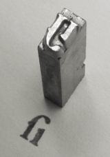
tracing its origins back to the first punches and dies used to make seal
Seal (device)
A seal can be a figure impressed in wax, clay, or some other medium, or embossed on paper, with the purpose of authenticating a document ; but the term can also mean the device for making such impressions, being essentially a mould with the mirror image of the design carved in sunken- relief or...
s and currency
Currency
In economics, currency refers to a generally accepted medium of exchange. These are usually the coins and banknotes of a particular government, which comprise the physical aspects of a nation's money supply...
in ancient times
Ancient history
Ancient history is the study of the written past from the beginning of recorded human history to the Early Middle Ages. The span of recorded history is roughly 5,000 years, with Cuneiform script, the oldest discovered form of coherent writing, from the protoliterate period around the 30th century BC...
. The basic elements of typography are at least as old as civilization
Civilization
Civilization is a sometimes controversial term that has been used in several related ways. Primarily, the term has been used to refer to the material and instrumental side of human cultures that are complex in terms of technology, science, and division of labor. Such civilizations are generally...
and the earliest writing system
Writing system
A writing system is a symbolic system used to represent elements or statements expressible in language.-General properties:Writing systems are distinguished from other possible symbolic communication systems in that the reader must usually understand something of the associated spoken language to...
s—a series of key developments that were eventually drawn together as a systematic craft.
Etymology
Typography (from the GreekGreek language
Greek is an independent branch of the Indo-European family of languages. Native to the southern Balkans, it has the longest documented history of any Indo-European language, spanning 34 centuries of written records. Its writing system has been the Greek alphabet for the majority of its history;...
roots typos = "impression" and -graphia = "writing").
Medieval design roots
Movable type
Movable type is the system of printing and typography that uses movable components to reproduce the elements of a document ....
printing
Printing press
A printing press is a device for applying pressure to an inked surface resting upon a print medium , thereby transferring the ink...
at the junction of the medieval era and the Renaissance
Renaissance
The Renaissance was a cultural movement that spanned roughly the 14th to the 17th century, beginning in Italy in the Late Middle Ages and later spreading to the rest of Europe. The term is also used more loosely to refer to the historical era, but since the changes of the Renaissance were not...
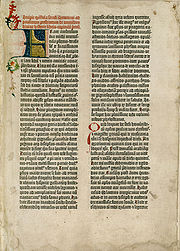
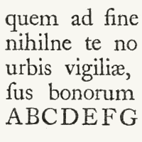
. Handwritten letterforms of the mid-15th century embodied 3000 years of evolved letter design, and were the natural models for letterforms in systematized typography. The scribal letter known as textur or textualis, produced by the strong gothic
Gothic art
Gothic art was a Medieval art movement that developed in France out of Romanesque art in the mid-12th century, led by the concurrent development of Gothic architecture. It spread to all of Western Europe, but took over art more completely north of the Alps, never quite effacing more classical...
spirit of blackletter
Blackletter
Blackletter, also known as Gothic script, Gothic minuscule, or Textura, was a script used throughout Western Europe from approximately 1150 to well into the 17th century. It continued to be used for the German language until the 20th century. Fraktur is a notable script of this type, and sometimes...
from the hands of German area scribes, served as the model for the first text types.
Johannes Gutenberg employed the scribe
Scribe
A scribe is a person who writes books or documents by hand as a profession and helps the city keep track of its records. The profession, previously found in all literate cultures in some form, lost most of its importance and status with the advent of printing...
Peter Schöffer
Peter Schöffer
Peter Schöffer or Petrus Schoeffer was an early German printer, who studied in Paris and worked as a manuscript copyist in 1451 before apprenticing with Johannes Gutenberg and joining Johann Fust, a goldsmith, lawyer, and money lender.-Life and works:Working for Fust, Schöffer was the principal...
to help design and cut the letterpunches for the first typeface—the D-K type of 202 characters used to print the first books in Europe. A second typeface of about 300 characters designed for the 42-line Bible
Gutenberg Bible
The Gutenberg Bible was the first major book printed with a movable type printing press, and marked the start of the "Gutenberg Revolution" and the age of the printed book. Widely praised for its high aesthetic and artistic qualities, the book has an iconic status...
c. 1455 was probably cut by the goldsmith Hans Dunne with the help of two others—Götz von Shlettstadt and Hans von Speyer.
Cultural tradition ensured that German typography and type design remained true to the gothic/blackletter spirit; but the parallel influence of the humanist and neo-classical typography in Italy catalyzed textur into four additional sub-styles that were distinct, structurally rich and highly disciplined: Bastarda
Bastarda
Bastarda was a Gothic script used in France and Germany during the 14th and 15th centuries. These scripts were designed to provide a simplified letter that was appropriate for the copying of books or documents of minor value or importance.The early printers produced regional versions in type...
, fraktur, rotunda, and Schwabacher
Schwabacher
The German word Schwabacher refers to a specific blackletter typeface. The term derives from the town of Schwabach.-Characteristics:The small-letter g and the capital-letter H have particularly distinctive forms.-History:...
.
The rapid spread of movable type printing across Europe produced additional Gothic, half-Gothic and Gothic-to-roman transitional types. Johann Bämler
Johann Bämler
Johann Bämler was a printer and bookseller from Augsburg.-References:...
's Schwabacher, Augsburg
Augsburg
Augsburg is a city in the south-west of Bavaria, Germany. It is a university town and home of the Regierungsbezirk Schwaben and the Bezirk Schwaben. Augsburg is an urban district and home to the institutions of the Landkreis Augsburg. It is, as of 2008, the third-largest city in Bavaria with a...
appeared in 1474. The half-Gothic Rotunda
Rotunda (script)
The Rotunda is a specific medieval blackletter script. It originates in Carolingian minuscule. Sometimes, it is not considered a blackletter script, but a script on its own. It was used mainly in southern Europe.-Characteristics:...
type of Erhard Ratdolt c. 1486 was cut to suit Venetian taste. In 1476 William Caxton
William Caxton
William Caxton was an English merchant, diplomat, writer and printer. As far as is known, he was the first English person to work as a printer and the first to introduce a printing press into England...
printed the first books in England with a so-called Bâtarde type (an early Schwabacher design), but soon abandoned it.
Classical revival
In ItalyItaly
Italy , officially the Italian Republic languages]] under the European Charter for Regional or Minority Languages. In each of these, Italy's official name is as follows:;;;;;;;;), is a unitary parliamentary republic in South-Central Europe. To the north it borders France, Switzerland, Austria and...
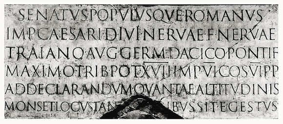
the heavy gothic styles were soon displaced by Venetian or "old style" Latin types, also called antiqua. The inscriptional capitals
Roman square capitals
Roman square capitals, also called capitalis monumentalis, inscriptional capitals, elegant capitals and quadrata, are an ancient Roman form of writing, and the basis for modern capital letters....
on Roman
Ancient Rome
Ancient Rome was a thriving civilization that grew on the Italian Peninsula as early as the 8th century BC. Located along the Mediterranean Sea and centered on the city of Rome, it expanded to one of the largest empires in the ancient world....
buildings and monument
Monument
A monument is a type of structure either explicitly created to commemorate a person or important event or which has become important to a social group as a part of their remembrance of historic times or cultural heritage, or simply as an example of historic architecture...
s were structured on a euclidean
Euclidean geometry
Euclidean geometry is a mathematical system attributed to the Alexandrian Greek mathematician Euclid, which he described in his textbook on geometry: the Elements. Euclid's method consists in assuming a small set of intuitively appealing axioms, and deducing many other propositions from these...
geometric
Geometry
Geometry arose as the field of knowledge dealing with spatial relationships. Geometry was one of the two fields of pre-modern mathematics, the other being the study of numbers ....
scheme and the discrete component-based model
Classical order
A classical order is one of the ancient styles of classical architecture, each distinguished by its proportions and characteristic profiles and details, and most readily recognizable by the type of column employed. Three ancient orders of architecture—the Doric, Ionic, and Corinthian—originated in...
of classical architecture
Classical architecture
Classical architecture is a mode of architecture employing vocabulary derived in part from the Greek and Roman architecture of classical antiquity, enriched by classicizing architectural practice in Europe since the Renaissance...
. Their structurally perfect design, near-perfect execution in stone, balanced angled stressing, contrasting thick and thin strokes, and incised serif
Serif
In typography, serifs are semi-structural details on the ends of some of the strokes that make up letters and symbols. A typeface with serifs is called a serif typeface . A typeface without serifs is called sans serif or sans-serif, from the French sans, meaning “without”...
s became the typographic ideal for western civilization
Western culture
Western culture, sometimes equated with Western civilization or European civilization, refers to cultures of European origin and is used very broadly to refer to a heritage of social norms, ethical values, traditional customs, religious beliefs, political systems, and specific artifacts and...
. The best-known example of Roman inscriptional capitals
Roman square capitals
Roman square capitals, also called capitalis monumentalis, inscriptional capitals, elegant capitals and quadrata, are an ancient Roman form of writing, and the basis for modern capital letters....
exists on the base of Trajan's Column, inscribed c. 113
113
Year 113 was a common year starting on Saturday of the Julian calendar. At the time, it was known as the Year of the Consulship of Celsus and Crispinus...
.
Neoclassicism
Neoclassicism is the name given to Western movements in the decorative and visual arts, literature, theatre, music, and architecture that draw inspiration from the "classical" art and culture of Ancient Greece or Ancient Rome...
, Italian scribes and humanist
Humanism
Humanism is an approach in study, philosophy, world view or practice that focuses on human values and concerns. In philosophy and social science, humanism is a perspective which affirms some notion of human nature, and is contrasted with anti-humanism....
scholars of the early 15th century searched for ancient minuscules to match the Roman inscriptional capitals. Practically all of the available manuscripts of classical writers had been rewritten during the Carolingian Renaissance
Carolingian Renaissance
In the history of ideas the Carolingian Renaissance stands out as a period of intellectual and cultural revival in Europe occurring from the late eighth century, in the generation of Alcuin, to the 9th century, and the generation of Heiric of Auxerre, with the peak of the activities coordinated...
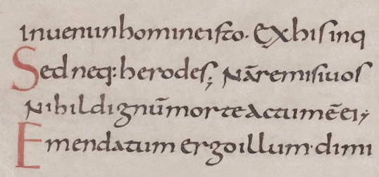
, and with a lapse of three hundred years since the widespread use of this style, the humanist scribes mistook Carolingian minuscule
Carolingian minuscule
Carolingian or Caroline minuscule is a script developed as a writing standard in Europe so that the Roman alphabet could be easily recognized by the literate class from one region to another. It was used in Charlemagne's empire between approximately 800 and 1200...
as the authentic writing style of the ancients. Dubbing it lettera antica, they began by copying the minuscule hand almost exactly, combining it with Roman capitals in the same manner as the manuscripts they were copying.
Movable type
Movable type is the system of printing and typography that uses movable components to reproduce the elements of a document ....
reached Italy several decades later, the humanistic writing had evolved into a consistent model known as humanistic minuscule, which served as the basis for type style we know today as Venetian.
Transition from humanistic minuscule to roman type
The classically endowed city of RomeRome
Rome is the capital of Italy and the country's largest and most populated city and comune, with over 2.7 million residents in . The city is located in the central-western portion of the Italian Peninsula, on the Tiber River within the Lazio region of Italy.Rome's history spans two and a half...
attracted the first printers known to have set up shop outside Germany, Arnold Pannartz and Konrad Sweynheim
Arnold Pannartz and Konrad Sweynheim
Arnold Pannartz and Konrad Sweinheim were two printers of the 15th century.Pannartz died about 1476, Sweinheim in 1477. Pannartz was, perhaps, a native of Prague, and Sweinheim of Eltville near Mainz. Zedler believes that Sweinheim worked at Eltville with Gutenberg in 1461-64. Whether Pannartz...
, closely followed by the brothers Johann and Wendelin of Speyer
Johann and Wendelin of Speyer
The brothers Johann and Wendelin of Speyer were German printers in Venice from 1468 to 1477....
(de Spira), and the Frenchman Nicolas Jenson
Nicolas Jenson
Nicolas Jenson was a French engraver, pioneer printer and type designer who carried out most of his work in Venice. Jenson acted as Master of the French Royal Mint at Tours, and is accredited with being the creator of the first model roman type...
. The sequence of appearance and production dates for types used by these printers have yet to be established with certainty; all four are known to have printed with types ranging from textur Gothic to fully developed romans inspired by the earlier humanistic writing, and within a few years the center of printing in Italy shifted from Rome to Venice
Venice
Venice is a city in northern Italy which is renowned for the beauty of its setting, its architecture and its artworks. It is the capital of the Veneto region...
.
Some time before 1472 in Venice, Johann and Wendelin issued material printed with a half-Gothic-half-roman type known as "Gotico-antiqua". This design paired simplified Gothic capitals with a rationalized humanistic minuscule letter set, itself combining Gothic minuscule forms with elements of Carolingian, in a one step forward, half step back blending of styles.
Around the same time (1468) in Rome, Pannartz and Sweynheim were using another typeface that closely mimicked humanistic minuscule, known as "Lactantius". Unlike the rigid fractured forms of Speyer's half-Gothic, the Lactantius is characterized by smoothly rendered letters with a restrained organic finish. The Lactantius a departed from both the Carolingian and Gothic models; a vertical backstem and right-angled top replaced the diagonal Carolingian structure, and a continuous curved stroke replaced the fractured Gothic bowl element.
For details on the evolution of lower case letterforms from Latin capitals, see Latin alphabet
Latin alphabet
The Latin alphabet, also called the Roman alphabet, is the most recognized alphabet used in the world today. It evolved from a western variety of the Greek alphabet called the Cumaean alphabet, which was adopted and modified by the Etruscans who ruled early Rome...
.
Individual letters: A
A
A is the first letter and a vowel in the basic modern Latin alphabet. It is similar to the Ancient Greek letter Alpha, from which it derives.- Origins :...
a B
B
B is the second letter in the basic modern Latin alphabet. It is used to represent a variety of bilabial sounds , most commonly a voiced bilabial plosive.-History:...
b C
C
Ĉ or ĉ is a consonant in Esperanto orthography, representing the sound .Esperanto orthography uses a diacritic for all four of its postalveolar consonants, as do the Latin-based Slavic alphabets...
c D
D
D is the fourth letter in the basic modern Latin alphabet.- History :The Semitic letter Dâlet may have developed from the logogram for a fish or a door. There are various Egyptian hieroglyphs that might have inspired this. In Semitic, Ancient Greek, and Latin, the letter represented ; in the...
d E
E
E is the fifth letter and a vowel in the basic modern Latin alphabet. It is the most commonly used letter in the Czech, Danish, Dutch, English, French, German, Hungarian, Latin, Norwegian, Spanish, and Swedish languages.-History:...
e F
F
F is the sixth letter in the basic modern Latin alphabet.-History:The origin of ⟨f⟩ is the Semitic letter vâv that represented a sound like or . Graphically, it originally probably depicted either a hook or a club...
f G
G
G is the seventh letter in the basic modern Latin alphabet.-History:The letter 'G' was introduced in the Old Latin period as a variant of ⟨c⟩ to distinguish voiced, from voiceless, . The recorded originator of ⟨g⟩ is freedman Spurius Carvilius Ruga, the first Roman to open a fee-paying school,...
g H
H
H .) is the eighth letter in the basic modern Latin alphabet.-History:The Semitic letter ⟨ח⟩ most likely represented the voiceless pharyngeal fricative . The form of the letter probably stood for a fence or posts....
h I
I
I is the ninth letter and a vowel in the basic modern Latin alphabet.-History:In Semitic, the letter may have originated in a hieroglyph for an arm that represented a voiced pharyngeal fricative in Egyptian, but was reassigned to by Semites, because their word for "arm" began with that sound...
i J
J
Ĵ or ĵ is a letter in Esperanto orthography representing the sound .While Esperanto orthography uses a diacritic for its four postalveolar consonants, as do the Latin-based Slavic alphabets, the base letters are Romano-Germanic...
j K
K
K is the eleventh letter of the English and basic modern Latin alphabet.-History and usage:In English, the letter K usually represents the voiceless velar plosive; this sound is also transcribed by in the International Phonetic Alphabet and X-SAMPA....
k L
L
Ł or ł, described in English as L with stroke, is a letter of the Polish, Kashubian, Sorbian, Łacinka , Łatynka , Wilamowicean, Navajo, Dene Suline, Inupiaq, Zuni, Hupa, and Dogrib alphabets, several proposed alphabets for the Venetian language, and the ISO 11940 romanization of the Thai alphabet...
l M
M
M is the thirteenth letter of the basic modern Latin alphabet.-History:The letter M is derived from the Phoenician Mem, via the Greek Mu . Semitic Mem probably originally pictured water...
m N
N
N is the fourteenth letter in the basic modern Latin alphabet.- History of the forms :One of the most common hieroglyphs, snake, was used in Egyptian writing to stand for a sound like English ⟨J⟩, because the Egyptian word for "snake" was djet...
n O
O
O is the fifteenth letter and a vowel in the basic modern Latin alphabet.The letter was derived from the Semitic `Ayin , which represented a consonant, probably , the sound represented by the Arabic letter ع called `Ayn. This Semitic letter in its original form seems to have been inspired by a...
o P
P
P is the sixteenth letter of the basic modern Latin alphabet.-Usage:In English and most other European languages, P is a voiceless bilabial plosive. Both initial and final Ps can be combined with many other discrete consonants in English words...
p Q
Q
Q is the seventeenth letter of the basic modern Latin alphabet.- History :The Semitic sound value of Qôp was , a sound common to Semitic languages, but not found in English or most Indo-European ones...
q R
R
R is the eighteenth letter of the basic modern Latin alphabet.-History:The original Semitic letter may have been inspired by an Egyptian hieroglyph for tp, "head". It was used for by Semites because in their language, the word for "head" was rêš . It developed into Greek Ρ and Latin R...
r S
S
S is the nineteenth letter in the ISO basic Latin alphabet.-History: Semitic Šîn represented a voiceless postalveolar fricative . Greek did not have this sound, so the Greek sigma came to represent...
s T
T
T is the 20th letter in the basic modern Latin alphabet. It is the most commonly used consonant and the second most common letter in the English language.- History :Taw was the last letter of the Western Semitic and Hebrew alphabets...
t U
U
U is the twenty-first letter and a vowel in the basic modern Latin alphabet.-History:The letter U ultimately comes from the Semitic letter Waw by way of the letter Y. See the letter Y for details....
u V
V
V is the twenty-second letter in the basic modern Latin alphabet.-Letter:The letter V comes from the Semitic letter Waw, as do the modern letters F, U, W, and Y. See F for details....
v W
W
W is the 23rd letter in the basic modern Latin alphabet.In other Germanic languages, including German, its pronunciation is similar or identical to that of English V...
w X
X
X is the twenty-fourth letter in the basic modern Latin alphabet.-Uses:In mathematics, x is commonly used as the name for an independent variable or unknown value. The usage of x to represent an independent or unknown variable can be traced back to the Arabic word šay شيء = “thing,” used in Arabic...
x Y
Y
Y is the twenty-fifth letter in the basic modern Latin alphabet and represents either a vowel or a consonant in English.-Name:In Latin, Y was named Y Graeca "Greek Y". This was pronounced as I Graeca "Greek I", since Latin speakers had trouble pronouncing , which was not a native sound...
y Z
Z
Z is the twenty-sixth and final letter of the basic modern Latin alphabet.-Name and pronunciation:In most dialects of English, the letter's name is zed , reflecting its derivation from the Greek zeta but in American English, its name is zee , deriving from a late 17th century English dialectal...
z
Development of roman type
Nicolas JensonNicolas Jenson
Nicolas Jenson was a French engraver, pioneer printer and type designer who carried out most of his work in Venice. Jenson acted as Master of the French Royal Mint at Tours, and is accredited with being the creator of the first model roman type...
began printing in Venice with his original roman font from 1470. Jenson's design and the very similar roman types cut by Francesco Griffo
Francesco Griffo
Francesco Griffo , also called Francesco da Bologna, was a fifteenth-century Venetian punchcutter. He worked for Aldus Manutius, designing that printer's more important typefaces, including the first italic type...
c. 1499 and Erhard Radolt c. 1486 are acknowledged as the definitive and archetypal
Archetype
An archetype is a universally understood symbol or term or pattern of behavior, a prototype upon which others are copied, patterned, or emulated...
roman faces that set the pattern for the majority of western text faces that followed.
The Jenson roman was an explicitly typographic letter designed on its own terms that declined to imitate the appearance of hand-lettering. Its effect is one of a unified cohesive whole, a seamless fusion of style with structure, and the successful convergence of the long progression of preceding letter styles. Jenson adapted the structural unity and component-based modular integration of Roman capitals to humanistic minuscule forms by masterful abstract
Abstraction
Abstraction is a process by which higher concepts are derived from the usage and classification of literal concepts, first principles, or other methods....
stylization. The carefully modelled serifs follow an artful logic
Logic
In philosophy, Logic is the formal systematic study of the principles of valid inference and correct reasoning. Logic is used in most intellectual activities, but is studied primarily in the disciplines of philosophy, mathematics, semantics, and computer science...
of asymmetry
Asymmetry
Asymmetry is the absence of, or a violation of, symmetry.-In organisms:Due to how cells divide in organisms, asymmetry in organisms is fairly usual in at least one dimension, with biological symmetry also being common in at least one dimension....
. The ratio
Ratio
In mathematics, a ratio is a relationship between two numbers of the same kind , usually expressed as "a to b" or a:b, sometimes expressed arithmetically as a dimensionless quotient of the two which explicitly indicates how many times the first number contains the second In mathematics, a ratio is...
of extender lengths to letter bodies and the distance between lines results in balanced, harmonious body of type. Jenson also mirrors the ideal expressed in renaissance painting of carving up space (typographic "white space") with figures (letters) to articulate the relationship between the two and make the white space dynamic.
Aldus Manutius
Aldus Pius Manutius , the Latinised name of Aldo Manuzio —sometimes called Aldus Manutius, the Elder to distinguish him from his grandson, Aldus Manutius, the Younger—was an Italian humanist who became a printer and publisher when he founded the Aldine Press at Venice.His publishing legacy includes...
(Italian: Manuzio). Roman faces based on those of Speyer and Jenson are also called Venetian.
Italic type
The humanist spirit driving the Renaissance produced its own unique style of formal writing, known as "cursiva humanistica". This slanted and rapidly written letter evolved from humanistic minuscule and the remaining Gothic current cursive hands in Italy, served as the model for cursiveCursive
Cursive, also known as joined-up writing, joint writing, or running writing, is any style of handwriting in which the symbols of the language are written in a simplified and/or flowing manner, generally for the purpose of making writing easier or faster...
or italic typefaces. As books printed with early roman types forced humanistic minuscule out of use, cursiva humanistica gained favor as a manuscript hand for the purpose of writing. The popularity of cursive writing itself may have created some demand for a type of this style. The more decisive catalyst was probably the printing of pocket editions of Latin classics
Latin literature
Latin literature includes the essays, histories, poems, plays, and other writings of the ancient Romans. In many ways, it seems to be a continuation of Greek literature, using many of the same forms...
by Aldus Manutius.
The "Aldino" italic type, commissioned by Manutius and cut by Franceso Griffo in 1499, was a closely spaced condensed type. Griffo's punches are a delicate translation of the Italian cursive hand, featuring letters of irregular slant angle and uneven height and vertical position, with some connected pairs (ligature
Ligature (typography)
In writing and typography, a ligature occurs where two or more graphemes are joined as a single glyph. Ligatures usually replace consecutive characters sharing common components and are part of a more general class of glyphs called "contextual forms", where the specific shape of a letter depends on...
s), and unslanted small roman capitals the height of the lower case t. The fame of Aldus Manutius and his editions made the Griffo italic widely copied and influential, although it was not the finest of the pioneer italics. The "Aldino" style quickly became known as "italic" from its Italian origin.
Around 1527 the Vatican chancellery scribe Ludovico Arrighi designed a superior italic type and had the punches cut by Lauticio di Bartolomeo dei Rotelli. The more modular structure of Arrighi's italic and its few ligatures made it less a copy of the cursive hand than Griffo's. Its slightly taller roman capitals, a gentler slant angle, taller ascenders and wider separation of lines gave the elegant effect of refined handwriting.
Swiss art historian Jakob Burckhardt described the classically inspired Renaissance modello of dual case roman and cursive italic types as "The model and ideal for the whole western world". Venetian pre-eminence in type design was brought to an end by the political and economic turmoil that concluded the Renaissance in Italy with the sack of Rome in 1527
Sack of Rome (1527)
The Sack of Rome on 6 May 1527 was a military event carried out by the mutinous troops of Charles V, Holy Roman Emperor in Rome, then part of the Papal States...
.
Renaissance Germany and Switzerland
Soon after 1500, roman typefaces began to gain popularity north of the Alps for printing of Latin literature. Johann FrobenJohann Froben
Johann Froben, in Latin: Johannes Frobenius , was a famous printer and publisher in Basel...
of Basel
Basel
Basel or Basle In the national languages of Switzerland the city is also known as Bâle , Basilea and Basilea is Switzerland's third most populous city with about 166,000 inhabitants. Located where the Swiss, French and German borders meet, Basel also has suburbs in France and Germany...
, Switzerland
Switzerland
Switzerland name of one of the Swiss cantons. ; ; ; or ), in its full name the Swiss Confederation , is a federal republic consisting of 26 cantons, with Bern as the seat of the federal authorities. The country is situated in Western Europe,Or Central Europe depending on the definition....
set up his press in 1491, and by about 1519 (when he printed Erasmus
Desiderius Erasmus
Desiderius Erasmus Roterodamus , known as Erasmus of Rotterdam, was a Dutch Renaissance humanist, Catholic priest, and a theologian....
's famous edition of the Greek New Testament
New Testament
The New Testament is the second major division of the Christian biblical canon, the first such division being the much longer Old Testament....
) he had established a set of standards for humanistic printing which were widely copied throughout the German-speaking world and also in Spain
Spain
Spain , officially the Kingdom of Spain languages]] under the European Charter for Regional or Minority Languages. In each of these, Spain's official name is as follows:;;;;;;), is a country and member state of the European Union located in southwestern Europe on the Iberian Peninsula...
and, to a lesser extent in England. His principal type is wholly roman in the shape of the characters but retains an echo of gothic influence in the angled serifs and the way the thick and thin strokes are organized; it was coupled with mated sets of woodcut initials (often designed by distinguished artists) and with two larger sizes of uppercase letters for use in title pages and headings—Froben was the first to use such 'display faces' consistently, breaking away from the Italian tradition in which title pages and headings tended to be set in the same size as the main text. By using these large faces, Froben developed the title page as a fully organized artistic whole. Froben's italic face is based on that of Aldus but more even and uniform in effect. These Swiss books are the first to have been designed in every detail as printed artifacts rather than as adaptations of manuscript technique.
After about 1550 this Swiss/German tradition was gradually overwhelmed by French influence. Towards the end of the century, the Wechel family of Frankfurt
Frankfurt
Frankfurt am Main , commonly known simply as Frankfurt, is the largest city in the German state of Hesse and the fifth-largest city in Germany, with a 2010 population of 688,249. The urban area had an estimated population of 2,300,000 in 2010...
was producing fine books which used French typefaces in conjunction with heavy but resplendent woodcut ornaments to achieve a splendid page effect; but soon after 1600 there was a general, marked decline in the quality of both skill and materials, from which German printing did not recover until the 20th century.
16th century France
Typography was introduced to France by the German printers Martin Crantz, Michael Freyburger and Ulrich Gering, who set up a press in ParisParis
Paris is the capital and largest city in France, situated on the river Seine, in northern France, at the heart of the Île-de-France region...
in 1470, where they printed with an inferior copy of the Lactantius type. Gothic types dominated in France until the end of the 15th century, when they were gradually supplanted by roman designs. Jodocus Badius Ascensius (Josse Bade) in partnership with Henri Estienne established a press in Paris in 1503. Printing with undeveloped Roman and half-Gothic types, the French pair were too occupied meeting the demand for Humanistic and classical texts to design any original types of their own. French books nonetheless began to follow the format established by Italian printers, and Lyon
Lyon
Lyon , is a city in east-central France in the Rhône-Alpes region, situated between Paris and Marseille. Lyon is located at from Paris, from Marseille, from Geneva, from Turin, and from Barcelona. The residents of the city are called Lyonnais....
and Paris became the new centers of activity.
De Colines, Estienne, and Augereau
After their 1494 invasion of Italy the French were greatly influenced by Renaissance culture, and later set about converting French culture from Gothic to neo-classical. The required phonetic and orthographic changes to French language hindered the evolution of type design in France until the late 1520s. At the end of this period roman types introduced by Robert EstienneRobert Estienne
Robert I Estienne , known as Robertus Stephanus in Latin and also referred to as Robert Stephens by 18th and 19th-century English writers, was a 16th century printer and classical scholar in Paris...
, Simon de Colines
Simon de Colines
Simon de Colines , a Parisian printer, one of the first printer type of the French Renaissance. He was active in Paris between 1520 and 1546. Colines used elegant roman and italic types and a Greek type, with accents, that was superior to its predecessors...
and Antoine Augereau began a phase of type design with a distinctly French character. Robert Estienne carried on the establishment of his father Henri Estienne, who had died in 1520. Simon de Colines had been the elder Estienne's assistant, married his widow, and set up his own press.
The de Colines roman of 1531 resembled Griffo's 1499 roman but did not copy it closely. Narrower forms and tighter letter fit; a with low angled bowl; elevated triangular stem serifs on i, j, m, n and r; flattened baseline
Baseline
A baseline is a line that is a base for measurement or for construction; see datum or point of reference .The word baseline may refer to:...
serifs, delicately modeled ascender serifs and graceful, fluid lines characterize the French style. Robert Estienne's roman of 1532 was similar to the de Colines face, which Estienne complemented with a fine italic type based on that of Arrighi. The craftsmen who cut the punches for the romans used by Estienne and de Colines remain unidentified. In 1532 Antoine Augereau cut the punches for a roman type very close to Estienne's. The lower cases of the Estienne and Augereau types became the basis for post-Renaissance old style typography, and were copied by French typographers for the next 150 years.
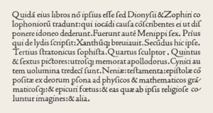
Garamond
Claude Garamond
Claude Garamond was a French publisher from Paris. He was one of the leading type designers of his time, and is credited with the introduction of the apostrophe, the accent and the cedilla to the French language. Several contemporary typefaces, including those currently known as Garamond, Granjon,...
(also Garamont). In 1541 Robert Estienne
Robert Estienne
Robert I Estienne , known as Robertus Stephanus in Latin and also referred to as Robert Stephens by 18th and 19th-century English writers, was a 16th century printer and classical scholar in Paris...
, printer to the king, helped Garamond obtain commissions to cut the sequence of Greek fonts for King Francis I of France
Francis I of France
Francis I was King of France from 1515 until his death. During his reign, huge cultural changes took place in France and he has been called France's original Renaissance monarch...
, known as the "grecs du roi
Grecs du roi
Les grecs du roi are a celebrated Greek typeface designed by Claude Garamond in 1541 and containing a very large number of ligatures.The grecs du roi were ordered by Robert Estienne on behalf of King Francis I of France. The design was based on the handwriting of the Cretan copyist Angelo Vergecio...
". A number of roman faces used in Garamond's publishing activities can be positively attributed to him as punch-cutter. From the dates of their appearance, and their similarity to romans used by Estienne, Christoffel Plantijn and the printer André Wechel, the types known as "Canon de Garamond" and "Petit Canon de Garamond" shown on a specimen sheet issued by the Egenolff-Berner foundry in 1592 are generally accepted as Claude Garamond's final roman types
Garamond
Garamond is the name given to a group of old-style serif typefaces named after the punch-cutter Claude Garamond . Most of the Garamond faces are more closely related to the work of a later punch-cutter, Jean Jannon...
.
Robert Granjon
Robert Granjon worked in the second half of the 16th century, mainly at Lyon, but was also recorded at Paris, Rome and Antwerp. He is still famous because of his CivilitéCivilité
Civilité type is a typeface invented in 1557 by the French engraver Robert Granjon. These characters imitate French cursive gothic letters of the Renaissance.-History:...
types, imitating French gothic cursive calligraphy. His main contribution was an italic type known as "Parangon de Granjon". Italic type design had apparently become corrupted since the Arrighi and Aldine models. Granjon's italic had a greater slant angle, slanted roman capitals, and reduced weight and rigor. These qualities and its contrasting thick and thin strokes gave it a dazzling appearance that made it difficult to read. It was nevertheless the main influence for italic type design until the Arrighi model was revived in 1920.
In the 16th century, Western printers also developed Oriental types, such as François Savary de Brèves
François Savary de Brèves
François Savary de Brèves was a French ambassador of the 16th and 17th centuries as well as an Orientalist.-Diplomacy:In 1585, François Savary de Brèves accompanied to Istanbul his relative Jacques Savary de Lancosme, who became ambassador to the Porte...
or Robert Granjon, usually with the objective of proselytizing the Catholic faith.
Transition to modern type: 17th and 18th century
BaroqueBaroque
The Baroque is a period and the style that used exaggerated motion and clear, easily interpreted detail to produce drama, tension, exuberance, and grandeur in sculpture, painting, literature, dance, and music...
and rococo
Rococo
Rococo , also referred to as "Late Baroque", is an 18th-century style which developed as Baroque artists gave up their symmetry and became increasingly ornate, florid, and playful...
aesthetic trends, use of the pointed-pen for writing, and steel engraving
Engraving
Engraving is the practice of incising a design on to a hard, usually flat surface, by cutting grooves into it. The result may be a decorated object in itself, as when silver, gold, steel, or glass are engraved, or may provide an intaglio printing plate, of copper or another metal, for printing...
techniques effected a gradual shift in typographic style. Contrast between thick and thin strokes increased. Tilted stressing transformed into vertical stressing; full rounds were compressed. Blunt bracketed serifs grew sharp and delicate until they were fine straight lines. Detail became clean and precise.
Transitional roman types combined the classical features of lettera antiqua with the vertical stressing and higher contrast between thick and thin strokes characteristic of the true modern romans to come.
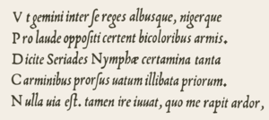
The roman types used c. 1618 by the Dutch printing firm of Elzevir
House of Elzevir
Elzevir is the name of a celebrated family of Dutch booksellers, publishers, and printers of the 17th and early 18th centuries. The duodecimo series of "Elzevirs" became very famous and very desirable among bibliophiles, who sought to obtain the tallest and freshest copies of these tiny...
in Leyden reiterated the 16th century French style with higher contrast, less rigor and a lighter page effect. After 1647 most Elziver faces were cut by the highly regarded Christoffel van Dyck, whose precise renditions were regarded by some experts at the time as finer than Garamond's.
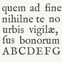
Fell types
Type foundry
A type foundry is a company that designs or distributes typefaces. Originally, type foundries manufactured and sold metal and wood typefaces and matrices for line-casting machines like the Linotype and Monotype machines designed to be printed on letterpress printers...
in England—most type used by 17th century English printers was of Dutch origin. The lack of material inspired Bishop of Oxford Doctor John Fell
John Fell (clergyman)
John Fell was an English churchman and influential academic. He served as Dean of Christ Church, Oxford, and later concomitantly as Bishop of Oxford.-Education:...
to purchase punches & matrices from Holland c. 1670–1672 for use by the Oxford University Press
Oxford University Press
Oxford University Press is the largest university press in the world. It is a department of the University of Oxford and is governed by a group of 15 academics appointed by the Vice-Chancellor known as the Delegates of the Press. They are headed by the Secretary to the Delegates, who serves as...
. The so-named Fell types, presumed to be the work of Dutch punchcutter Dirck Voskens, mark a noticeable jump from previous designs, with considerably shorter extenders, higher stroke contrast, narrowing of round letters, and flattened serifs on the baseline and descenders. The design retained a retrogressive old-style irregularity, smooth modeling from vertical to horizontal, and angled stressing of rounds (except a vertically stressed o). Fell capitals were condensed, even-width, with wide flattened serifs; all characteristics of the definitive modern romans of the late 18th century. Fell italic types were distinguished by high contrast matching the Fell romans; wider ovals; a split-branching stroke from the stems of m n r and u; and long, flat serifs—prefiguring modern. They repeated the non-uniform slant of French models, and the capitals included swash J and Q forms.
Caslon
William Caslon
William Caslon , also known as William Caslon I, was an English gunsmith and designer of typefaces. He was born at Cradley, Worcestershire, and in 1716 started business in London as an engraver of gun locks and barrels, and as a bookbinder's tool cutter...
spent 14 years creating the stable of typefaces on the specimen sheet issued in 1734
Caslon
Caslon refers to a number of serif typefaces designed by William Caslon I , and various revivals thereof.Caslon shares the irregularity characteristic of Dutch Baroque types. It is characterized by short ascenders and descenders, bracketed serifs, moderately-high contrast, robust texture, and...
. The complete canon included roman, italic, Greek, Hebrew, Arabic etc. Caslon's Great Primer roman and English roman were retrogressive designs that very closely followed the Fell types and the roman of Miklós (Nicholas) Kis c. 1685 falsely attributed to Anton Janson
Anton Janson
Anton Janson was a Dutch type founder and printer.The typeface Janson is named for him, although it can also be attributed to Hungarian punch-cutter and printer Miklós Kis -References:*Carter, Rob, Day, Ben, Meggs,Philip...
. Like the Fells, Caslon's slightly bracketed serifs and old-style irregularity gave it a homely charm—its precise cut and perpendicularity place it firmly in the 18th century however. Caslon's italic structures follow the Fell italics, but at a condensed width and with conventional branching from stems.
William Caslon's prodigious output was influential worldwide. Caslon type and its imitations were used throughout the expanding British empire
British Empire
The British Empire comprised the dominions, colonies, protectorates, mandates and other territories ruled or administered by the United Kingdom. It originated with the overseas colonies and trading posts established by England in the late 16th and early 17th centuries. At its height, it was the...
. It was the dominant type in the American colonies for the second half of the 18th century. Caslon marks the rise of England as the center of typographic activity.
Fleischmann
Johann Michael Fleischmann (1701–1768) was born in Nürnberg where he trained as a punchcutter. He found employment with Dutch type founders in Holland and settled there c. 1728. At the Enschedé foundry in HaarlemHaarlem
Haarlem is a municipality and a city in the Netherlands. It is the capital of the province of North Holland, the northern half of Holland, which at one time was the most powerful of the seven provinces of the Dutch Republic...
he cut punches for a large amount of material. Some time after 1743 he produced a distinguished roman design—related to the preceding transitional types but departing from them. It prefigured modern romans with sparse transaxial modeling joining the vertical stressing to hairline thins, and ball-ends. Fleischman borrowed from the general mode of Phillipe Grandjean’s and Louis Simonneau’s "Romain du Roi," commissioned by Louis XIV in 1692 for the Imprimerie Royale, but did not imitate that face. Fleischman's capitals were a new variety; an even-width scheme, compressed rounds, all-vertical stressing, and triangular beak ends of E F L T and Z, all characteristics prefiguring the "classical" moderns of Bodoni and Didot. Fleischman's italic bore some resemblance to Granjean's but had longer ascenders and followed the established Dutch structures for h v and w.
Fleischman was held in great esteem by his contemporaries, his designs exerting a decisive influence in the last quarter of the 18th century. Renowned French punchcutter Pierre Simon Fournier
Pierre Simon Fournier
Pierre Simon Fournier was a French mid-18th century punch-cutter, typefounder and typographic theoretician. He was both a collector and originator of types”. Fournier's contributions to printing were his creation of initials and ornaments, his design of letters, and his standardization of type...
(1712–1768), confessed to having copied Fleischman's design, and was first to dub "contrast" types like the Fells, Caslon and Fleischman "modern". Fournier's rococo-influenced designs—Fournier and Narcissus—and his Modèles des Caractères (1742) continued the romaine du roi style and adapted it for his own modern age. Like Baskerville, his italics were inspired by handwriting and the engraved lettering known as copperplate hand. Fournier also published a two volume Manuel Typographique, in which he recorded much European typographic history, and introduced the first standardized system of type size measurement—the "point".
Baskerville
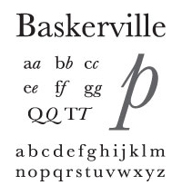
John Baskerville
John Baskerville was an English businessman, in areas including japanning and papier-mâché, but he is best remembered as a printer and typographer.-Life:...
c. 1772 appeared later than Fleischman's but are considered transitional and partly retrogressive with a return to lower contrast, smooth transaxial modeling, finely modeled bracketed serifs, and long stems. The exquisite design and finish of Baskerville's roman however, combining elegance and strength, was modern. His roman design, and especially his italic, were rococo-influenced. His designs did not visibly quote any previous types. They were informed by his prior experience as a writing master and the influences of his time. The types of Joseph Fry, Alexander Wilson, and John Bell closely followed Baskerville, and through his correspondence with European type founders Baskerville's influence penetrated most of western Europe. Baskerville was a meticulous artist who controlled all aspects of his creation, devising more accurate presses, blacker inks and paper sealed with hot rollers to ensure crisp impressions. Of particular note, the lower storey of his lowercase g does not fully close. Derivatives of Baskerville are often identified thus. A modern revival of Baskerville, a font called Mrs Eaves
Mrs Eaves
Mrs Eaves is a transitional serif typeface designed by Zuzana Licko in 1996, and licensed by Emigre, a typefoundry run by Licko and husband Rudy VanderLans...
, is named after Baskerville's wife who was the widow of Richard Eaves.
Modern romans
Giambattista Bodoni
Giambattista Bodoni was an Italian engraver, publisher, printer and typographer of high repute remembered for designing a family of different typefaces called Bodoni....
and the French Didot
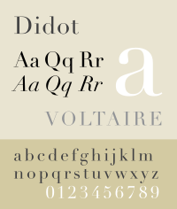
Didot
Didot is the name of a family of French printers, punch-cutters and publishers. Through its achievements and advancements in printing, publishing and typography, the family has lent its name to typographic measurements developed by François-Ambroise Didot and the Didot typeface developed by Firmin...
s. Completing trends begun by the Fell types, Fleischman, Fournier and Baskerville, the so-called "classical" modern romans eschewed chirographic
Chirography
Chirography is the study of penmanship and handwriting in all of its aspects ....
and organic influences, their synthetic symmetric
Symmetry
Symmetry generally conveys two primary meanings. The first is an imprecise sense of harmonious or aesthetically pleasing proportionality and balance; such that it reflects beauty or perfection...
geometry answering to a rationalized and reformed classical model driven by the strict cartesian grid
Cartesian coordinate system
A Cartesian coordinate system specifies each point uniquely in a plane by a pair of numerical coordinates, which are the signed distances from the point to two fixed perpendicular directed lines, measured in the same unit of length...
philosophy of René Descartes
René Descartes
René Descartes ; was a French philosopher and writer who spent most of his adult life in the Dutch Republic. He has been dubbed the 'Father of Modern Philosophy', and much subsequent Western philosophy is a response to his writings, which are studied closely to this day...
and the predictable clockwork universe of Isaac Newton
Isaac Newton
Sir Isaac Newton PRS was an English physicist, mathematician, astronomer, natural philosopher, alchemist, and theologian, who has been "considered by many to be the greatest and most influential scientist who ever lived."...
.
The "classical" appellation of modern romans stems from their return to long ascenders and descenders set on widely spaced lines, and a corresponding light page effect reminiscent of old-style—occurring at a time of classical revival.
Bodoni was foremost in progressing from rococo to the new classical style. He produced an italic very close to Baskerville's, and a French cursive script type falling in between italic type and joined scripts. The roman types of Francois Ambroise Didot and son Firmin Didot
Firmin Didot
Firmin Didot was a French printer, engraver, and type founder. He invented the word "stereotype", which in printing refers to the metal printing plate created for the actual printing of pages , and used the process extensively, revolutionizing the book trade by his cheap editions...
closely resemble the work of Bodoni, and opinion is divided over whether the Didots or Bodoni originated the first modern romans. At any rate the Didots' mathematical precision and vanishing of rococo design reflected the "enlightenment" of post-revolution France under Napoleon. Francois Ambroise also designed "maigre" and "gras" types corresponding to later condensed and expanded font formats.
The Spanish designer Joaquín Ibarra's roman was influenced by Baskerville, Didot and Bodoni, but hewn nearer to old-style and used in the same classical manner, including spaced capitals. In England modern romans resembling Bodoni's were cut for the printer William Bulmer c. 1786 by the punchcutter William Martin, who had been apprenticed to Baskerville and influenced by him. Martin's italic mirrored the open-tail g and overall finesse of Baskerville's.
Industrialization
The 19th century brought fewer stylistic innovations. The most notable invention was the rise of typefaces with strengthened serifs. Forerunners were the so-called EgyptienneSlab serif
In typography, a slab serif typeface is a type of serif typeface characterized by thick, block-like serifs. Serif terminals may be either blunt and angular , or rounded . Slab serif typefaces generally have no bracket...
fonts, which were used already at the beginning of the 19th century. Their name likely comes from the enthusiasm of the Napoleonic era for the orient, which in turn was started by Napoleon's invasion in Egypt. In fact slab-serif fonts (e. g. Clarendon
Clarendon (typeface)
Clarendon is an English slab-serif typeface that was created in England by Robert Besley for Thorowgood and Co. , a type company formerly known as the Fann Street Foundry until approximately 1838. The font was published in 1845 after Besley, an employee of the foundry since 1826, was made a partner...
from 1845) were newspaper fonts, whose serifs were strengthened in order to prevent damage during the printing process. Stylistically the serif fonts of the mid-19th century appeared very robust and otherwise had more or less neo-classical design features, which changed during the course of time: By the application of the slab serif design feature and by appending serifs to more and more typefaces, an independent intermediate group of heterogeneous fonts emerged during the 20th century. Meanwhile the slab serifs are listed as an independent group in most typeface classifications–besides both main groups serif and sans serif.
Above all the 19th century was innovative regarding technical aspects. Automatic manufacturing processes changed the print as well as the graphical illustrations. The illustration of printed matters could be considerably standardised due to the lithography
Lithography
Lithography is a method for printing using a stone or a metal plate with a completely smooth surface...
technique invented by Alois Senefelder
Alois Senefelder
Johann Alois Senefelder was a German actor and playwright who invented the printing technique of lithography in 1796.-Actor, playwright:...
. Finally, another invention was photography
Photography
Photography is the art, science and practice of creating durable images by recording light or other electromagnetic radiation, either electronically by means of an image sensor or chemically by means of a light-sensitive material such as photographic film...
, whose establishment at the end of the century led to the first halftoning
Halftone
Halftone is the reprographic technique that simulates continuous tone imagery through the use of dots, varying either in size, in shape or in spacing...
and reproduction procedures. The step-by-step development of a modern mass society provided a growing demand of printed matters. Besides the traditional letterpress beginnings of a newspaper landscape as well as a broad market for publications, advertisements, and posters of all kinds appeared. The challenges had changed: since printing and typography had been a straightforward craft for centuries, it now had to face the challenges of a industry-ruled mass society.
Hot type and phototypesetting in the 20th century
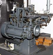
- The fabrication and application of typefaces more and more were affected by industrial manufacturing processes. Significant incidents were the invention of the hot typeHot metal typesettingIn printing and typography, hot metal typesetting refers to 19th-century technologies for typesetting text in letterpress printing. This method injects molten type metal into a mold that has the shape of one or more glyphs...
machine by Ottmar MergenthalerOttmar MergenthalerOttmar Mergenthaler was an inventor who has been called a second Gutenberg because of his invention of the Linotype machine, the first device that could easily and quickly set complete lines of type for use in printing presses...
(Linotype machineLinotype machineThe Linotype typesetting machine is a "line casting" machine used in printing. The name of the machine comes from the fact that it produces an entire line of metal type at once, hence a line-o'-type, a significant improvement over manual typesetting....
, 1886) and Tolbert LanstonTolbert LanstonTolbert Lanston was the American founder of Monotype, inventing a mechanical typesetting system patented in 1887 and the first hot metal typesetter a few years later.-His life:...
(Monotype machineMonotype CorporationMonotype Imaging Holdings is a Delaware corporation based in Woburn, Massachusetts and specializing in typesetting and typeface design as well as text and imaging solutions for use with consumer electronics devices. Monotype Imaging Holdings is the owner of Monotype Imaging Inc., Linotype,...
, 1887) and a few decades later the emergence of phototypesettingPhototypesettingPhototypesetting was a method of setting type, rendered obsolete with the popularity of the personal computer and desktop publishing software, that uses a photographic process to generate columns of type on a scroll of photographic paper...
. The result: Compilation and typographical design of the text could be more and more controlled by keyboards in contrast to manual typesetting. - A result of the industrialisation process was the unimagined number and distribution of new typefaces. Whether digitalDigitalA digital system is a data technology that uses discrete values. By contrast, non-digital systems use a continuous range of values to represent information...
variants of Garamond and Bodoni or new contemporary type designs like FuturaFutura (typeface)In typography, Futura is a geometric sans-serif typeface designed in 1927 by Paul Renner. It is based on geometric shapes that became representative visual elements of the Bauhaus design style of 1919–1933...
, TimesTimes RomanTimes New Roman is a serif typeface commissioned by the British newspaper The Times in 1931, created by Victor Lardent at the English branch of Monotype. It was commissioned after Stanley Morison had written an article criticizing The Times for being badly printed and typographically antiquated...
, and HelveticaHelveticaHelvetica is a widely used sans-serif typeface developed in 1957 by Swiss typeface designer Max Miedinger with Eduard Hoffmann.-Visual distinctive characteristics:Characteristics of this typeface are:lower case:square dot over the letter i....
: nearly all currently used typefaces have their origin either in the following and ongoing digital typesetting era or are based on designs of this epoch. The basis was the appearance of large type foundriesType foundryA type foundry is a company that designs or distributes typefaces. Originally, type foundries manufactured and sold metal and wood typefaces and matrices for line-casting machines like the Linotype and Monotype machines designed to be printed on letterpress printers...
and type manufacturers. The result: Successful typefaces could quickly gain the status of a trademark–and therefore were able to assign a unique "brandBrandThe American Marketing Association defines a brand as a "Name, term, design, symbol, or any other feature that identifies one seller's good or service as distinct from those of other sellers."...
ing" to products or publications. - Besides the traditional typography of books graphic designGraphic designGraphic design is a creative process – most often involving a client and a designer and usually completed in conjunction with producers of form – undertaken in order to convey a specific message to a targeted audience...
became a more or less independent branch. The tensions between those two branches significantly determined the stylistic development of 20th century's typography.
Art nouveau and New Book Art
Impressionism
Impressionism was a 19th-century art movement that originated with a group of Paris-based artists whose independent exhibitions brought them to prominence during the 1870s and 1880s...
the modern art styles were reflected in graphic design and typography too. Since 1890 the Art nouveau
Art Nouveau
Art Nouveau is an international philosophy and style of art, architecture and applied art—especially the decorative arts—that were most popular during 1890–1910. The name "Art Nouveau" is French for "new art"...
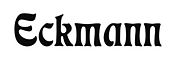
became popular. Its floral ornaments, the curved forms, as well as the emphasis on graphical realisation inspired the type designers of the turn of the century. A popular art nouveau font was the Eckmann
Eckmann
Eckmann is the surname of the following persons:* Beno Eckmann , Swiss mathematician* Chris M. Eckmann , Mayor of Anchorage, Alaska from 1926 to 1927...
designed by graphic artist Otto Eckmann
Otto Eckmann
Otto Eckmann was a German painter and graphic artist. He was a prominent member of the "floral" branch of Jugendstil. He created the Eckmann typeface, which was based on Japanese calligraphy....
. Furthermore, the influence of art nouveau was expressed in a lot of book illustrations and exlibris designs.
Altogether the return to the roots of book art become stronger at the turn of the century. It was initiated by British typographer, socialist, and private press
Private press
Private press is a term used in the field of book collecting to describe a printing press operated as an artistic or craft-based endeavor, rather than as a purely commercial venture...
publisher William Morris
William Morris
William Morris 24 March 18343 October 1896 was an English textile designer, artist, writer, and socialist associated with the Pre-Raphaelite Brotherhood and the English Arts and Crafts Movement...
as well as by the Arts and Crafts Movement
Arts and Crafts movement
Arts and Crafts was an international design philosophy that originated in England and flourished between 1860 and 1910 , continuing its influence until the 1930s...
, which refers to him. Essentially this movement initiated three things: a return to the antiqua-models of the Renaissance, clarity and simplicity of book illustrations, and straightforward technical processes during the production of printed matters. An immediate consequence of the Arts and Crafts Movement was the establishment of the private press movement, which more or less was committed to Morris' ideals, and whose remains partially are still present today. An established meeting point of these scene in Germany for example is the Mainzer Minipressen-Messe, which actually is held every two years.
Especially the New Book Art movement, which formed in the decade before World War I
World War I
World War I , which was predominantly called the World War or the Great War from its occurrence until 1939, and the First World War or World War I thereafter, was a major war centred in Europe that began on 28 July 1914 and lasted until 11 November 1918...
, was influenced by the Arts and Crafts Movement. The young type designers of the pre-war era, among them Fritz Helmuth Ehmcke and Friedrich Wilhelm Kleukens, rejected both the late typographical classicism and the ornaments of the popular Art nouveau. The new ideal became a tidy and straightforward book typography, which dedicated itself to the ideas of the Renaissance. Walter Tiemann in Leipzig, Friedrich Hermann Ernst Schneidler in Stuttgart, and Rudolf Koch
Rudolf Koch
thumb|250px|[[Fraktur]] fonts by Rudolf KochRudolf Koch was a leading German calligrapher, typographic artist and teacher, born in Nuremberg. He was primarily a calligrapher with the Gebr. Klingspor foundry. He created several typefaces, in both fraktur and roman styles...
in Offenbach as instructors were the mentors of this kind of typography. They stayed influential in the field of book typesetting until a long time after the end of World War II
World War II
World War II, or the Second World War , was a global conflict lasting from 1939 to 1945, involving most of the world's nations—including all of the great powers—eventually forming two opposing military alliances: the Allies and the Axis...
.
See also
- Movable typeMovable typeMovable type is the system of printing and typography that uses movable components to reproduce the elements of a document ....
- PrintingPrintingPrinting is a process for reproducing text and image, typically with ink on paper using a printing press. It is often carried out as a large-scale industrial process, and is an essential part of publishing and transaction printing....
- Printing PressPrinting pressA printing press is a device for applying pressure to an inked surface resting upon a print medium , thereby transferring the ink...
- PunchcuttingPunchcuttingIn traditional typography, punchcutting is the craft of cutting letter punches in steel from which matrices were made in copper for type founding in the letterpress era. Cutting punches and casting type was the first step of traditional typesetting. The cutting of letter punches was a highly...
- TypesettingTypesettingTypesetting is the composition of text by means of types.Typesetting requires the prior process of designing a font and storing it in some manner...
- TypographyTypographyTypography is the art and technique of arranging type in order to make language visible. The arrangement of type involves the selection of typefaces, point size, line length, leading , adjusting the spaces between groups of letters and adjusting the space between pairs of letters...
- VOX-ATypI classificationVOX-ATypI classificationIn typography, the Vox-ATypI classification makes it possible to classify typefaces in eleven general classes. Devised by Maximilien Vox in 1954, it was adopted in 1962 by the Association Typographique Internationale and in 1967 as a British Standard, as British Standards Classification of...
External links
- Colorado College picture catalogue of Incunabula
- Comp.fonts FAQ: General Info Section four of six of the newsgroup FAQ
- Twenty Faces
- Planet typography A magazine on contemporary typography + a directory, a manual and other topics related to typography
- The Printed Book
- ABC typography. A virtual type museum