
VOX-ATypI classification
Encyclopedia
In typography
, the Vox-ATypI classification makes it possible to classify typefaces in eleven general classes. Devised by Maximilien Vox
in 1954, it was adopted in 1962 by the Association Typographique Internationale
(ATypI) and in 1967 as a British Standard, as British Standards Classification of Typefaces (BS 2961:1967), which is a very basic interpretation of the earlier Vox-ATypI classification.
Originally a ten-part classification, Vox revised his original proposal within months to a more compact nine-part scheme.
This classification tends to group typefaces according to their main characteristics, often typical of a particular century (15th, 16th, 17th, 18th, 19th, 20th century), based on a number of formal criteria: downstroke and upstroke, forms of serif
s, stroke axis, x-height
, etc. Although the Vox-ATypI classification defines archetypes of typefaces, many typefaces can exhibit the characteristics of more than one class.
At the 2010 ATypI general meeting, the association voted to make a minor amendment to add Gaelic to the calligraphic group in the Vox-ATypI classification, to state that the Vox-ATypI system was seriously flawed, and to create a new working group on typeface classification.
 Humanist, humanistic, or humanes include the first Roman typefaces created during the 15th century by Venetian printers, such as Nicolas Jenson
(hence another name for these, Venetian). These typefaces sought to imitate the formal hands found in the humanistic (renaissance) manuscripts of the time. These typefaces, rather round in opposition to the gothics of the Middle Ages, are characterized by short and thick bracketed serifs, a slanted cross stroke on the lowercase 'e', ascenders with slanted serifs, and a low contrast between horizontals and verticals. These typefaces are inspired in particular by the Carolingian minuscule
, imposed by Charlemagne
during his reign of the Holy Roman Empire
.
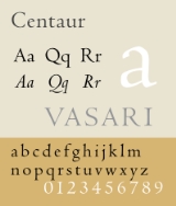
Examples of Humanes include Centaur
and Cloister.
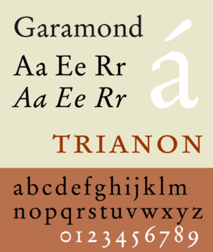 Also called Aldine, this group is named in homage to Claude Garamond
and Aldus Manutius
. In general, the garaldes have finer proportions than the humanists, and a stronger contrast between downstroke and upstroke. The weight of the garaldes are distributed according to an oblique axis. In France, under King Francis I
, the garaldes were the tool which supported the official fixing of grammar and orthography.
Examples of Garaldes include Bembo
, and Garamond
.
 The transitional, realist or réales are the typical typefaces of the traditional period, particularly embodying the rational spirit of the Enlightenment. Contrast between main and connecting strokes is marked even more than in the first two groups, weight is distributed now according to a quasi-vertical axis. The realists are the result of the wish of Louis XIV to invent new typographical forms, on the one hand to find a successor of the Garamond, on the other hand to compete in quality with the different printers of Europe. The term realist is unrelated to the artistic movement realism
, and derives from the Spanish for "royal", because of a typeface cast by Christophe Plantin
for King Philip II of Spain.
Examples of realist typefaces include Baskerville
, Times Roman
, and other contemporary redesigns of traditional faces.
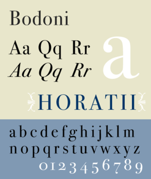 The Didones or modern typefaces draw their name from the typefounders Didot
and Bodoni
. These typefaces, dating from the end of the 18th and the beginning of the 19th century, make a very strong contrast between full and connecting strokes (the connecting strokes being extremely fine), the verticality of the characters and their unbracketed, hairline serifs. They correspond to the Didot of the Thibaudeau classification
. The didones in particular made it possible for the First French Empire
to employ typefaces very different from the typefaces used by the kings from the Ancien Régime.
Examples of Didones include Bodoni
and Walbaum.
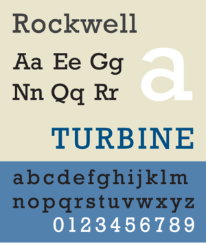 Also called mechanical, slab serif
, or mécanes, the name of this group evokes the mechanical aspect of these typefaces, which coincide with the Industrial Revolution at the beginning of the 19th century. The principal characteristics of these typefaces are a very low contrast and rectangular slab serifs. They correspond to the Egyptiennes of Thibaudeau classification
. This category includes both typefaces with bracketed serifs (clarendons or ionics) and typefaces with square or unbracketed serifs .
Examples of mechanical typefaces include Clarendon
, Egyptienne
, Ionic No. 5
, and Rockwell
.
, gothic, or grotesque
). These correspond to the Antiques of the Thibaudeau classification. The British Standard 2961 broke this group into 4 subcategories: Grotesque, Neo-Grotesque, Geometric, and humanist.
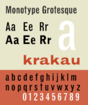 Grotesque typefaces are sans serif typefaces that originate in the nineteenth century. There is some degree of contrast between thick and thin strokes. The terminals of curves are usually horizontal, and the typeface frequently has a spurred "G" and an "R" with a curled leg.
Examples of grotesque lineal typeface include Headline, Monotype 215, and Grot no. 6.
Examples of neo-grotesque lineal typeface include Helvetica
and Univers
.
Examples of geometric lineal typefaces include Eurostile
and Futura
.
Examples of humanist lineal typefaces include Gill Sans
and Optima
.
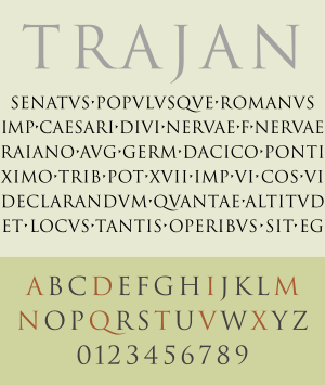 The gyphic, incised, or incise are typefaces which evoke the engraving or chiseling of characters in stone or metal, as opposed to calligraphic handwriting. They thus have small, triangular serifs or tapering downstrokes. There is usually a greater emphasis on the capital letters in glyphic typefaces, with some faces not containing a lowercase.
Examples of glyphic typefaces include Albertus
, Copperplate Gothic
, and Trajan
.
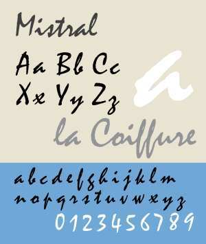 The scripts or scriptes include typefaces which evoke the formal penmanship or cursive
writing. They seem to be written with a quill, and have a strong slope. The letters can often be connected to each other. Typefaces imitating copperplate script
form part of this family. Scripts are distinct from italic type
.
Examples of script typefaces include Shelley, Mistral
and Francesca.
and uncial
faces in this categorization.
Examples of graphic typefaces include Banco
and Klang.
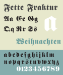 The original Vox classification contained the above 9 groups. ATypeI added two more classifications, the blackletters and the Non-Latins. The blackletter
s or fractures, which Vox included in the graphics, are characterized by pointed and angular forms, and are modeled on late medieval hands written with a broad-nibbed pen.
Examples of blackletter typefaces include Fraktur and Old English.
: Greek
, Cyrillic, Hebrew
, Arabic
, Chinese
, etc. English printers traditionally called these 'exotics'.
types, clarendons or ionics (that is bracketed slab serifs) and egyptians (that is square-ended, unbracketed slab serifs) are simply grouped together." Dixon challenges the prevalent focus on roman types as being dated, saying "distinctions between text and display are now increasingly irrelevant, with the greater subtlety that has been introduced into sans serifs and slab serif designs, leading to a wider application of such types for text purposes." Dixon's conclusion is that these systems have remained unchanged since 1967, and thus many contemporary typefaces render these systems inadequate.
may both be described as realist or transitional.
Typography
Typography is the art and technique of arranging type in order to make language visible. The arrangement of type involves the selection of typefaces, point size, line length, leading , adjusting the spaces between groups of letters and adjusting the space between pairs of letters...
, the Vox-ATypI classification makes it possible to classify typefaces in eleven general classes. Devised by Maximilien Vox
Maximilien Vox
Maximilien Vox was a French writer, cartoonist, illustrator, publisher, journalist, critic art theorist and historian of the French letter and typography. He was born on 16 December 1894 in Condé-sur-Noireau and died on 18 December 1974 in Lurs where he is buried. He created the VOX-ATypI...
in 1954, it was adopted in 1962 by the Association Typographique Internationale
ATypI
The ATypI or the Association Typographique Internationale is an international non-profit organisation dedicated to typography.-The organisation:...
(ATypI) and in 1967 as a British Standard, as British Standards Classification of Typefaces (BS 2961:1967), which is a very basic interpretation of the earlier Vox-ATypI classification.
Originally a ten-part classification, Vox revised his original proposal within months to a more compact nine-part scheme.
This classification tends to group typefaces according to their main characteristics, often typical of a particular century (15th, 16th, 17th, 18th, 19th, 20th century), based on a number of formal criteria: downstroke and upstroke, forms of serif
Serif
In typography, serifs are semi-structural details on the ends of some of the strokes that make up letters and symbols. A typeface with serifs is called a serif typeface . A typeface without serifs is called sans serif or sans-serif, from the French sans, meaning “without”...
s, stroke axis, x-height
X-height
In typography, the x-height or corpus size refers to the distance between the baseline and the mean line in a typeface. Typically, this is the height of the letter x in the font , as well as the u, v, w, and z...
, etc. Although the Vox-ATypI classification defines archetypes of typefaces, many typefaces can exhibit the characteristics of more than one class.
At the 2010 ATypI general meeting, the association voted to make a minor amendment to add Gaelic to the calligraphic group in the Vox-ATypI classification, to state that the Vox-ATypI system was seriously flawed, and to create a new working group on typeface classification.
Classicals
The classicals can be broken down into humanist, Garald and transitional categories, and are characterized by triangular serifs, oblique axis and low stroke contrast. In other classification systems, this group is often referred to as "oldstyle."Humanist
Nicolas Jenson
Nicolas Jenson was a French engraver, pioneer printer and type designer who carried out most of his work in Venice. Jenson acted as Master of the French Royal Mint at Tours, and is accredited with being the creator of the first model roman type...
(hence another name for these, Venetian). These typefaces sought to imitate the formal hands found in the humanistic (renaissance) manuscripts of the time. These typefaces, rather round in opposition to the gothics of the Middle Ages, are characterized by short and thick bracketed serifs, a slanted cross stroke on the lowercase 'e', ascenders with slanted serifs, and a low contrast between horizontals and verticals. These typefaces are inspired in particular by the Carolingian minuscule
Carolingian minuscule
Carolingian or Caroline minuscule is a script developed as a writing standard in Europe so that the Roman alphabet could be easily recognized by the literate class from one region to another. It was used in Charlemagne's empire between approximately 800 and 1200...
, imposed by Charlemagne
Charlemagne
Charlemagne was King of the Franks from 768 and Emperor of the Romans from 800 to his death in 814. He expanded the Frankish kingdom into an empire that incorporated much of Western and Central Europe. During his reign, he conquered Italy and was crowned by Pope Leo III on 25 December 800...
during his reign of the Holy Roman Empire
Holy Roman Empire
The Holy Roman Empire was a realm that existed from 962 to 1806 in Central Europe.It was ruled by the Holy Roman Emperor. Its character changed during the Middle Ages and the Early Modern period, when the power of the emperor gradually weakened in favour of the princes...
.
Examples of Humanes include Centaur
Centaur (typeface)
Centaur is a Humanist Type Family originally drawn as titling capitals by Bruce Rogers in 1914 for the Metropolitan Museum of Art. The matrices were cut by Robert Wiebking and the type was privately cast by the American Type Foundery. The typeface is based upon several Renaissance models...
and Cloister.
Garald
Claude Garamond
Claude Garamond was a French publisher from Paris. He was one of the leading type designers of his time, and is credited with the introduction of the apostrophe, the accent and the cedilla to the French language. Several contemporary typefaces, including those currently known as Garamond, Granjon,...
and Aldus Manutius
Aldus Manutius
Aldus Pius Manutius , the Latinised name of Aldo Manuzio —sometimes called Aldus Manutius, the Elder to distinguish him from his grandson, Aldus Manutius, the Younger—was an Italian humanist who became a printer and publisher when he founded the Aldine Press at Venice.His publishing legacy includes...
. In general, the garaldes have finer proportions than the humanists, and a stronger contrast between downstroke and upstroke. The weight of the garaldes are distributed according to an oblique axis. In France, under King Francis I
Francis I of France
Francis I was King of France from 1515 until his death. During his reign, huge cultural changes took place in France and he has been called France's original Renaissance monarch...
, the garaldes were the tool which supported the official fixing of grammar and orthography.
Examples of Garaldes include Bembo
Bembo
Bembo is the name given to a 20th-century revival of an old style serif or humanist typeface cut by Francesco Griffo around 1495.The typeface Bembo seen today is a revival designed under the direction of Stanley Morison for the Monotype Corporation in 1929.It is considered a good choice for...
, and Garamond
Garamond
Garamond is the name given to a group of old-style serif typefaces named after the punch-cutter Claude Garamond . Most of the Garamond faces are more closely related to the work of a later punch-cutter, Jean Jannon...
.
Transitional
Realism (arts)
Realism in the visual arts and literature refers to the general attempt to depict subjects "in accordance with secular, empirical rules", as they are considered to exist in third person objective reality, without embellishment or interpretation...
, and derives from the Spanish for "royal", because of a typeface cast by Christophe Plantin
Christophe Plantin
Christophe Plantin was an influential Renaissance humanist and book printer and publisher.-Life:...
for King Philip II of Spain.
Examples of realist typefaces include Baskerville
Baskerville
Baskerville is a transitional serif typeface designed in 1757 by John Baskerville in Birmingham, England. Baskerville is classified as a transitional typeface, positioned between the old style typefaces of William Caslon, and the modern styles of Giambattista Bodoni and Firmin Didot.The...
, Times Roman
Times Roman
Times New Roman is a serif typeface commissioned by the British newspaper The Times in 1931, created by Victor Lardent at the English branch of Monotype. It was commissioned after Stanley Morison had written an article criticizing The Times for being badly printed and typographically antiquated...
, and other contemporary redesigns of traditional faces.
Moderns
The moderns can be broken down into Didone, mechanistic and linear categories, and are characterized by a simple, functional feel that gained momentum during the industrial period.Didone
Didot (typeface)
Didot is a name given to a group of typefaces named after the famous French printing and type producing family. The classification is known as modern, or Didone. The typeface we know today was based on a collection of related types developed in the period 1784–1811. Firmin Didot cut the letters,...
and Bodoni
Bodoni
-Cold Type versions:As it had been a standard type for many years, Bodoni was widely available in cold type. Alphatype, Autologic, Berthold, Compugraphic, Dymo, Harris, Mergenthaler, MGD Graphic Systems, and Varityper, Hell AG, Monotype, all sold the face under the name ‘’Bodoni, while Graphic...
. These typefaces, dating from the end of the 18th and the beginning of the 19th century, make a very strong contrast between full and connecting strokes (the connecting strokes being extremely fine), the verticality of the characters and their unbracketed, hairline serifs. They correspond to the Didot of the Thibaudeau classification
Thibaudeau classification
In typography, the Thibaudeau Classification is a way to group typefaces into four general families, according to shape and serif character. Invented in 1921 by the French typographer Francis Thibaudeau, it was expanded by Maximilien Vox in 1954, and again in 1962 by Association Typographique...
. The didones in particular made it possible for the First French Empire
First French Empire
The First French Empire , also known as the Greater French Empire or Napoleonic Empire, was the empire of Napoleon I of France...
to employ typefaces very different from the typefaces used by the kings from the Ancien Régime.
Examples of Didones include Bodoni
Bodoni
-Cold Type versions:As it had been a standard type for many years, Bodoni was widely available in cold type. Alphatype, Autologic, Berthold, Compugraphic, Dymo, Harris, Mergenthaler, MGD Graphic Systems, and Varityper, Hell AG, Monotype, all sold the face under the name ‘’Bodoni, while Graphic...
and Walbaum.
Mechanistic
Slab serif
In typography, a slab serif typeface is a type of serif typeface characterized by thick, block-like serifs. Serif terminals may be either blunt and angular , or rounded . Slab serif typefaces generally have no bracket...
, or mécanes, the name of this group evokes the mechanical aspect of these typefaces, which coincide with the Industrial Revolution at the beginning of the 19th century. The principal characteristics of these typefaces are a very low contrast and rectangular slab serifs. They correspond to the Egyptiennes of Thibaudeau classification
Thibaudeau classification
In typography, the Thibaudeau Classification is a way to group typefaces into four general families, according to shape and serif character. Invented in 1921 by the French typographer Francis Thibaudeau, it was expanded by Maximilien Vox in 1954, and again in 1962 by Association Typographique...
. This category includes both typefaces with bracketed serifs (clarendons or ionics) and typefaces with square or unbracketed serifs .
Examples of mechanical typefaces include Clarendon
Clarendon (typeface)
Clarendon is an English slab-serif typeface that was created in England by Robert Besley for Thorowgood and Co. , a type company formerly known as the Fann Street Foundry until approximately 1838. The font was published in 1845 after Besley, an employee of the foundry since 1826, was made a partner...
, Egyptienne
Egyptienne
For the Royal Navy Frigate, see HMS Egyptienne Egyptienne is a serif typeface belonging to the classification slab serif, or Egyptian, where the serifs are unbracketed and similar in weight to the horizontal strokes of the letters...
, Ionic No. 5
Ionic No. 5
Ionic No. 5 is a serif typeface, designed by Chauncey H. Griffith, and presented by Mergenthaler Linotype in 1925. It is one of five typefaces in Griffith's 'Legibility Group' which contains typefaces especially well-suited to newsprint including Corona, Excelsior, Opticon, Paragon, and Textype...
, and Rockwell
Rockwell (typeface)
Rockwell is a serif typeface belonging to the classification slab serif, or Egyptian, where the serifs are unbracketed and similar in weight to the horizontal strokes of the letters. The typeface was designed at the Monotype foundry's in-house design studio in 1934. The project was supervised by...
.
Lineal
Lineals, or linéales, combine all typefaces without serifs (called sans-serifSans-serif
In typography, a sans-serif, sans serif or san serif typeface is one that does not have the small projecting features called "serifs" at the end of strokes. The term comes from the French word sans, meaning "without"....
, gothic, or grotesque
Grotesque (typeface classification)
Grotesque, or Grotesk in Germany, is a style of sans-serif typeface from the 19th century. The name was coined by William Thorowgood, the first person to produce a sans-serif type with lower case, in 1832...
). These correspond to the Antiques of the Thibaudeau classification. The British Standard 2961 broke this group into 4 subcategories: Grotesque, Neo-Grotesque, Geometric, and humanist.
Grotesque
Examples of grotesque lineal typeface include Headline, Monotype 215, and Grot no. 6.
Neo-grotesque
Neo-grotesque typefaces are derived from the earlier grotesque faces, but generally have less stroke contrast and a more regular design. Unlike the grotesque, they generally do not have a spurred "G", and the terminals of curves are usually slanted. Many neo-grotesque faces have a large degree of subtlety and variation of widths and weights to accommodate different means of production (Hot type, foundry type, phototypesetting, see History of typography, 20th century). "Realist sans-serif" is a commonly encountered synonym for neo-grotesque.Examples of neo-grotesque lineal typeface include Helvetica
Helvetica
Helvetica is a widely used sans-serif typeface developed in 1957 by Swiss typeface designer Max Miedinger with Eduard Hoffmann.-Visual distinctive characteristics:Characteristics of this typeface are:lower case:square dot over the letter i....
and Univers
Univers
Univers is the name of a realist sans-serif typeface designed by Adrian Frutiger in 1954.Originally conceived and released by Deberny & Peignot in 1957, the type library was acquired in 1972 by Haas. Haas'sche Schriftgiesserei was later folded into the D...
.
Geometric
Geometric typefaces are sans serif faces constructed from simple geometric shapes, circles and/or rectangles. The same curves and lines are often repeated throughout the letters, resulting in minimal differentiation between letters.Examples of geometric lineal typefaces include Eurostile
Eurostile
The Eurostile type font style is a geometric sans-serif typeface designed by Aldo Novarese in 1962. Novarese originally made Eurostile for one of the best-known Italian foundries, Nebiolo, in Turin....
and Futura
Futura (typeface)
In typography, Futura is a geometric sans-serif typeface designed in 1927 by Paul Renner. It is based on geometric shapes that became representative visual elements of the Bauhaus design style of 1919–1933...
.
Humanist
Humanist typefaces, instead of deriving from the 19th century grotesque faces, relate to the earlier, classical hand written monumental Roman capitals and a lowercase similar in form to the Carolingian script. Note that the term "humanist" is being used here in combination with lineal to create a subcategory, and these typefaces only slightly resemble those in the humanist serif category.Examples of humanist lineal typefaces include Gill Sans
Gill Sans
Gill Sans is a sans-serif typeface designed by Eric Gill.The original design appeared in 1926 when Douglas Cleverdon opened a bookshop in his home town of Bristol, where Eric Gill painted the fascia over the window in sans-serif capitals that would later be known as Gill Sans...
and Optima
Optima
Optima is a humanist sans-serif typeface designed by Hermann Zapf between 1952 and 1955 for the D. Stempel AG foundry, Frankfurt, Germany.-Characteristics:...
.
Calligraphics
The Calligraphics can be broken down into glyphic, script, graphic, blackletter, and Gaelic categories, and are characterized by a suggestion of being hand-crafted.Glyphic
Examples of glyphic typefaces include Albertus
Albertus (typeface)
Albertus is a glyphic, serif typeface designed by Berthold Wolpe in the period 1932 to 1940 for the Monotype Corporation type foundry. Wolpe named the font after Albertus Magnus, the thirteenth-century German philosopher and theologian....
, Copperplate Gothic
Copperplate Gothic
Copperplate Gothic is a typeface designed by Frederic W. Goudy and released by the American Type Founders in 1901. While termed a "Gothic" , the face has small glyphic serifs that act to emphasize the blunt terminus of vertical and horizontal strokes...
, and Trajan
Trajan (typeface)
Trajan is an old style serif typeface designed in 1989 by Carol Twombly for Adobe. The design is based on the letterforms of capitalis monumentalis or Roman square capitals, as used for the inscription at the base of Trajan's Column from which the typeface takes its name. Since the inscription and...
.
Script
Cursive
Cursive, also known as joined-up writing, joint writing, or running writing, is any style of handwriting in which the symbols of the language are written in a simplified and/or flowing manner, generally for the purpose of making writing easier or faster...
writing. They seem to be written with a quill, and have a strong slope. The letters can often be connected to each other. Typefaces imitating copperplate script
Copperplate script
Copperplate, or English round hand, is a style of calligraphic writing, using a sharp pointed nib instead of the flat nib used in most calligraphic writing. Its name comes from the fact that the copybooks from which students learned it were printed from etched copper plates...
form part of this family. Scripts are distinct from italic type
Italic type
In typography, italic type is a cursive typeface based on a stylized form of calligraphic handwriting. Owing to the influence from calligraphy, such typefaces often slant slightly to the right. Different glyph shapes from roman type are also usually used—another influence from calligraphy...
.
Examples of script typefaces include Shelley, Mistral
Mistral (typeface)
Mistral is a casual script typeface designed by Roger Excoffon for the Fonderie Olive type foundry, and released in 1953. The Amsterdam Type foundry released a version in 1955....
and Francesca.
Graphic
The graphic, manual, or manuaires, are based on hand-drawn originals which are slowly written with either a brush, pen, pencil, or other writing instrument. These typefaces generally do not represent writing, and are not intended for body text, but instead display or headline purposes. Vox originally included the blackletterBlackletter
Blackletter, also known as Gothic script, Gothic minuscule, or Textura, was a script used throughout Western Europe from approximately 1150 to well into the 17th century. It continued to be used for the German language until the 20th century. Fraktur is a notable script of this type, and sometimes...
and uncial
Uncial
Uncial is a majuscule script commonly used from the 3rd to 8th centuries AD by Latin and Greek scribes. Uncial letters are written in either Greek, Latin, or Gothic.-Development:...
faces in this categorization.
Examples of graphic typefaces include Banco
Banco (typeface)
Banco is an inclined titling typeface. It was designed by Roger Excoffon for the Fonderie Olive foundry in 1951. Excoffon did not design a matching lower case alphabet for the capitals....
and Klang.
Blackletter
Blackletter
Blackletter, also known as Gothic script, Gothic minuscule, or Textura, was a script used throughout Western Europe from approximately 1150 to well into the 17th century. It continued to be used for the German language until the 20th century. Fraktur is a notable script of this type, and sometimes...
s or fractures, which Vox included in the graphics, are characterized by pointed and angular forms, and are modeled on late medieval hands written with a broad-nibbed pen.
Examples of blackletter typefaces include Fraktur and Old English.
Gaelic
Gaelic type was added to the classification at the AGM of the Dublin meeting of ATypI, on 12 September 2010.Non-Latin
This heterogeneous family, not included in the original 9 Vox groups, gathers (without distinction of style) all writing systems not based on the Latin alphabetLatin alphabet
The Latin alphabet, also called the Roman alphabet, is the most recognized alphabet used in the world today. It evolved from a western variety of the Greek alphabet called the Cumaean alphabet, which was adopted and modified by the Etruscans who ruled early Rome...
: Greek
Greek alphabet
The Greek alphabet is the script that has been used to write the Greek language since at least 730 BC . The alphabet in its classical and modern form consists of 24 letters ordered in sequence from alpha to omega...
, Cyrillic, Hebrew
Hebrew alphabet
The Hebrew alphabet , known variously by scholars as the Jewish script, square script, block script, or more historically, the Assyrian script, is used in the writing of the Hebrew language, as well as other Jewish languages, most notably Yiddish, Ladino, and Judeo-Arabic. There have been two...
, Arabic
Arabic alphabet
The Arabic alphabet or Arabic abjad is the Arabic script as it is codified for writing the Arabic language. It is written from right to left, in a cursive style, and includes 28 letters. Because letters usually stand for consonants, it is classified as an abjad.-Consonants:The Arabic alphabet has...
, Chinese
Chinese character
Chinese characters are logograms used in the writing of Chinese and Japanese , less frequently Korean , formerly Vietnamese , or other languages...
, etc. English printers traditionally called these 'exotics'.
Criticisms
Catherine Dixon, in a 2002 paper, criticized both the Vox and British Standard categories for favoring roman typefaces over display typefaces, which derives from early twentieth century design culture. As an example, Dixon notes that in these classification systems "'humanist' types are formally distinguished from 'garalde', even though the formal differences are very subtle and such a distinction is only appropriate for very few types. But large numbers of slab serifSlab serif
In typography, a slab serif typeface is a type of serif typeface characterized by thick, block-like serifs. Serif terminals may be either blunt and angular , or rounded . Slab serif typefaces generally have no bracket...
types, clarendons or ionics (that is bracketed slab serifs) and egyptians (that is square-ended, unbracketed slab serifs) are simply grouped together." Dixon challenges the prevalent focus on roman types as being dated, saying "distinctions between text and display are now increasingly irrelevant, with the greater subtlety that has been introduced into sans serifs and slab serif designs, leading to a wider application of such types for text purposes." Dixon's conclusion is that these systems have remained unchanged since 1967, and thus many contemporary typefaces render these systems inadequate.
Name ambiguities
The Vox classifications can be used in combination. Notably, "transitional" (and its synonym "realist") and "humanist" are used to distinguish between groups of sans-serif (also called "lineal", "gothic", or "grotesque") typefaces, sometimes with the term "sans-serif" omitted. The sans-serif realists have more constant line weight, while the sans-serif humanists have a varying line weight which harks back to Carolingian miniscule. So very different typefaces may be described by the same term: for example, Times Roman and DIN 1451DIN 1451
DIN 1451 is a realist sans-serif typeface that is widely used for traffic, administration and business applications. It has been defined by the German standards body Deutsches Institut für Normung since 1936.-Overview:...
may both be described as realist or transitional.