
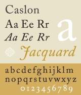
Caslon
Encyclopedia
Serif
In typography, serifs are semi-structural details on the ends of some of the strokes that make up letters and symbols. A typeface with serifs is called a serif typeface . A typeface without serifs is called sans serif or sans-serif, from the French sans, meaning “without”...
typeface
Typeface
In typography, a typeface is the artistic representation or interpretation of characters; it is the way the type looks. Each type is designed and there are thousands of different typefaces in existence, with new ones being developed constantly....
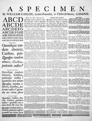
s designed by William Caslon I
William Caslon
William Caslon , also known as William Caslon I, was an English gunsmith and designer of typefaces. He was born at Cradley, Worcestershire, and in 1716 started business in London as an engraver of gun locks and barrels, and as a bookbinder's tool cutter...
(1692–1766), and various revivals thereof.
Caslon shares the irregularity characteristic of Dutch Baroque types. It is characterized by short ascenders and descenders, bracketed serifs, moderately-high contrast, robust texture, and moderate modulation of stroke. The A has a concave hollow at the apex, the G is without a spur. Caslon's italics have a rhythmic calligraphic stoke. Characters A, V, and W have an acute slant. The lowercase italic p, q, v, w, and z all have a suggestion of a swash
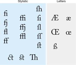
Swash (typography)
A swash is a typographical flourish on a glyph, like an exaggerated serif.Capital swash characters, which extended to the left, were historically often used to begin sentences. There were also minuscule swash characters, which came either extending to the left, to begin words, or to the right to...
.
History
Caslon's earliest design dates to 1722. Caslon is cited as the first original typeface of English origin, but type historians like Stanley MorisonStanley Morison
Stanley Morison was an English typographer, designer and historian of printing.Born in Wanstead, Essex, Morison spent most of his childhood and early adult years at the family home in Fairfax Road, Harringay...
and Alfred F. Johnson, a scientist who worked at the British Museum, did point out the close similarity of Caslon's design to the Dutch Fell types cut by Voskens and other type cut by the Dutchman Van Dyck.
The earliest information about William Caslon as punch-cutter and typefounders can be found in:
- Rowe More, Dissertation 1778
- John Nicols, Biographical and Litarary Anecdotes of William Bowyer 1782, start at: pag. 316
- John Nicols, Litarary Anecdotes, 1812–1815
The two next authors fully based their writings on the three publications previously mentioned.
- Reed Talbot Baines, A History of Old English Letter Foundries, 1897
- Daniel Berkeley Updike, Printing types, their History, forms and use, 1937
The first founts cut by William Caslon were:
- Arabic, used in a "Psalter" in 1725
- Hebrew, used for John Selden's Works in 1726.
- KopticCoptic alphabetThe Coptic alphabet is the script used for writing the Coptic language. The repertoire of glyphs is based on the Greek alphabet augmented by letters borrowed from the Demotic and is the first alphabetic script used for the Egyptian language...
, used for the bi-language Pentateuch of Dr. David Wilkins in LatinLatinLatin is an Italic language originally spoken in Latium and Ancient Rome. It, along with most European languages, is a descendant of the ancient Proto-Indo-European language. Although it is considered a dead language, a number of scholars and members of the Christian clergy speak it fluently, and...
and Hebrew in 1731
There is much uncertainty about the first roman and italic Latin characters cut by Caslon himself, and the literature on this is partly incorrect.
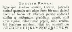
Nicols writes: "he (Caslon) cut the beautiful fount of English which is used in printing Selden's Works 1726. Nicols describes this character as far superior over comtemporary Dutch founts used in English books at this period. Rowe More does not give any comment on this.
Dutch founts were in use by several printers in England at that time. The Oxford University Press used the "Fell-types", character cut by the Dutch typefounder Voskens. The Cambridge University Press had received in January 1698 some 52 series of alphabets from Holland, all cut by Van Dyck. But even before that in 1697 thay used the Text-sized roman and italic of Van Dyck in an edition of Gratulatio Cantabrigiences. Character of Van Dyck and Voskens is found also in: William Harison, Woodstock Park, Tonson, 1706.
Although Nicols attributes this character to Caslon, the fount used in Seldens Works is actually cut by Van Dyck. The italic is identical to the Van Dycks Augustijn Cursijf fount in specimen sheets issued in 1681 by the widow Daniel Elzevir. This woman had bought the typefoundry of Van Dyck after Van Dyck died.
The roman in this book is a Garamond. This fount is used in the first volume and in the greater part of the second volume, It is found in a specimen sheet of the Amsterdam printer Johannes Kannewet, in accompagny with Van Dyck's Augustijn Cursijf. The only thing known about this Kannewet is that he was a printer, not a typefounder. This specimen-sheet is preserved in the Bagford-collection in the British Museum, and can be dated 1715 or earlier because Bagford died in 1716. There is no reason to suppose anything is added on a later date to this collection. The roman is named: Groote Mediaan Romyn. This fount is also found on a specimen sheet of the widow of Voskens. Therefore it can be assumed to be the work of Voskens. The earliest use of it at Amsterdam is 1684.
The earliest use of a roman and italic cut by Caslon can be identified in books printed William Bowyer in:
- 1725: roman and italic Pica-size, in the notes in Anacreon in Greek and Latin.
- 1726: roman and cursief, Pica-size, in: Reliquæ Baxterianæ
- 1730: roman and italic, English size, in the preface of Richard Baker's Chronicles of the Kings of England. The text-part is set in the Caslon Pica.
The founts cut by Caslon and his son, were close copies of the Dutch Old face cut by Van Dyck. These founts were rather fasionable at that time. The alternative founts they cut for text were a smaller, rather than a condensed letter.
The Caslon types were distributed throughout the British Empire, including British North America. Much of the decayed appearance of early American printing is thought to be due to oxidation caused by long exposure to seawater during transport from England to the Americas. Caslon's types were immediately successful and used in many historic documents, including the U.S. Declaration of Independence. After William Caslon I’s death, the use of his types diminished, but saw a revival between 1840–80 as a part of the British Arts and Crafts movement
Arts and Crafts movement
Arts and Crafts was an international design philosophy that originated in England and flourished between 1860 and 1910 , continuing its influence until the 1930s...
. The Caslon design is still widely used today. For many years a common rule of thumb
Rule of thumb
A rule of thumb is a principle with broad application that is not intended to be strictly accurate or reliable for every situation. It is an easily learned and easily applied procedure for approximately calculating or recalling some value, or for making some determination...
of printers and typesetters was When in doubt, use Caslon.
Several revivals of Caslon do not include a bold weight. This is because it was unusual practice to use bold weights in typesetting during the 18th century, and Caslon never designed one. For emphasis, italics or a larger point size, and sometimes caps and small caps would be used instead.
It should be noted, that some revivals have little or nothing in common with the 18th century type cut by Caslon, besides the serifs and the name.
Revivals
With the rise of hot metal typesettingHot metal typesetting
In printing and typography, hot metal typesetting refers to 19th-century technologies for typesetting text in letterpress printing. This method injects molten type metal into a mold that has the shape of one or more glyphs...
beginning at the close of the 19th century, existing foundry metal typefaces such as Caslon's had to be adapted to specific typesetting technology. This was true again with phototypesetting
Phototypesetting
Phototypesetting was a method of setting type, rendered obsolete with the popularity of the personal computer and desktop publishing software, that uses a photographic process to generate columns of type on a scroll of photographic paper...
, mostly in the 1960s and 1970s, and then again with digital typesetting technology, mostly since the mid 1980s. As a result of that, and the lack of trademark on the name "Caslon" by itself, there are many typefaces called "Caslon" with some other distinguishing element, which reproduce the original designs in varying degrees of faithfulness.
Ludlow Typograph Company, Chicago, Illinois, USA
Ludlow had a wide variety of Caslon-types. The type-number is added between brackets behind the name.- Ludlow True-Cut Caslon (1-TC)
- 8, 10, 12, 14, 18, 22, 24, 30, 36, 42, 48, 60, 72 punt
- Ludlow True-Cut Caslon Italic (1-TCI)
- 8, 10, 12, 14, 18, 22, 24, 30, 36, 42, 48, 60, 72 punt
- Ludlow Caslon-Light (1-L)
- 6, 8, 10, 12, 14, 18, 22, 24, 30, 36, 42, 48, 60, 72 punt
- Ludlow Caslon-Light Italic (1-)
- 6, 8, 10, 12, 14, 18, 22, 24, 30, 36, 42, 48, 60, 72 punt
- Ludlow Calson Bold (1-B)
- 6, 8, 10, 12, 14, 18, 22, 24, 30, 36, 42, 48, 60, 72 punt
- Ludlow Caslon Bold Italic (1-BI)
- 6, 8, 10, 12, 14, 18, 22, 24, 30, 36, 42, 48, 60, 72 punt
-
- 6, 8 en 10 punt op matrijzen voor romein
- Ludlow Caslon Bold Condensed (1-BC)
- 6, 8, 10, 12, 14, 18, 22, 24, 30, 36, 42, 48, 60, 72 punt
- Ludlow Calson Bold Extra Condensed (1-BEC)
- 12, 14, 18, 22, 24, 30, 36, 42, 48, 60, 72 punt
- Ludlow Caslon Old Face Heavy (1-OFH)
- 6, 8, 10, 12, 14, 18, 22, 24, 30, 36, 42, 48, 60, 72 punt
- Ludlow Caslon Heavy Italic (1-HE)
- 14, 18, 22, 24, 30, 36, 42, 48, 60, 72 punt
The Monotype Corporation Limited at Salfords, UK
This company produced three Caslon revivals:- 1903, Series 20 Old Face (special) after 1967 out of production
- 1906, Series 45 Old Face Standard, after 1967 out of production
- 1915, Series 128 & 209, Caslon & Caslon Titling.
Adobe Caslon (1990)
Adobe Caslon is a variant designed by Carol TwomblyCarol Twombly
Carol Twombly is an American calligrapher and typeface designer who has designed many typefaces, including Trajan, Myriad and Adobe Caslon. She worked as a type designer at Adobe Systems from 1988 through 1999, during which time she designed, or contributed to the design of, many typefaces...
and based on the Caslon's own specimen pages printed between 1734 and 1770. Small caps, old style figures, swash letters, ligatures, alternate letters, fractions, subscripts and superscripts, and ornaments were included with the Adobe Caslon Expert family.
Adobe Caslon Pro incorporates the previous expert letters, adds ordinals, arbitrary fractions, and extends the language coverage to include central European languages.
Adobe Caslon is the typeface used for body text in The New Yorker
The New Yorker
The New Yorker is an American magazine of reportage, commentary, criticism, essays, fiction, satire, cartoons and poetry published by Condé Nast...
.
Caslon Old Face
Caslon Old Face nowadays is a generic term used to describe a typeface that appears to be true to those designed by William Caslon himself. Originally it referred to the Caslon matrices and type which were property of the H.W. Caslon & Sons foundry. In 1937 the H.W. Caslon & Sons foundry was acquired by Stephenson Blake & Co who thereafter added 'the Caslon Letter Foundry' to their name.George Ostrochulski adapted the designs from Stephenson Blake & Co for photocomposition at Mergenthaler Linotype with skill and understanding during the 1950s.
A variety of typefaces called Caslon Old Face are available commercially. Visual differences exist between typefaces from different companies and the authenticity of some of these typefaces is debatable.
Caslon 471
Caslon 471 was designed by the staff of American Type Founders as their first revival of Caslon. It is based on the Old Style No. 1 typeface used in an 1865 specimen book from the L.J. Johnson foundry in Philadelphia.Caslon 540
Caslon 540 was designed by the staff of American Type Founders and released in 1902. The typeface was originally intended for use in advertising and is based on Caslon 471 with shortened descenders. It does not include a bold weight.Caslon 3
A slighter bolder version of Caslon 540, released by American Type Founders in 1905. BitStream sells Caslon 3 under the name of Caslon Bold.Caslon 224
Caslon 224 was designed by Ed BenguiatEd Benguiat
Ed Benguiat is an American typographer. He has crafted over 600 typefaces including Tiffany, Bookman, Panache, Edwardian Script, and the self-titled typefaces Benguiat and Benguiat Gothic...
of ITC, and released in 1983. The result of his efforts is a highly readable typeface, featuring a large x-height, smooth weight transitions, and careful structuring of hairline strokes, offered in four weights (book, medium, bold, and black) each with a matching italic.
In lectures, Benguiat has frequently said he chose the number 224 because it was the address of the building where he did most of his work.
Big Caslon
Big Caslon is a revival based on the three largest sizes of type from the H.W. Caslon & Sons foundry by Matthew CarterMatthew Carter
Matthew Carter is a type designer. He lives in Cambridge, Massachusetts, United States. Carter's career in type design has witnessed the transition from physical metal type to digital type...
of Carter & Cone in 1994. The typeface is intended for use at eighteen point and above. It is bundled with Apple's OS X operating system.
Caslon Openface
A decorative openface serif typeface with very high ascenders, designed by Barnhart Brothers and Spindler in 1915, that is only loosely based on the typefaces designed by William Caslon himself.ITC Founder's Caslon (1998)
ITC Founder's Caslon was digitized by Justin Howes. He used the resources of the St. Bride Printing Library in London to thoroughly research William Caslon and his types. Unlike previous digital revivals, this family closely follows the tradition of building separate typefaces intended for different sizes, despite the use of scalable typefaces in the digital counterpart.This family was released by ITC in December 1998. It includes separate fonts for 12 point, 30 point, 42 point, and Poster sizes, and a typeface for ornaments. Also following the original Caslon types, it does not include bold typefaces, but uses old style figures for all numbers.
Another feature in the Windows TrueType version of the typeface is the allocation of extra ligatures and alternate forms to Basic Latin and ISO Latin-1 blocks, replacing |, <, >, =.
The OpenType Std version of the typeface adds small caps to the family and updates the character set to support the Adobe Western 2 character set.
H. W. Caslon version
Following the release of ITC Founder's Caslon, Justin Howes revived the H.W. Caslon & Company name, and released an expanded version of the ITC typefaces under the Founders Caslon name.Caslon Old Face is a typeface with multiple optical sizes, including 8, 10, 12, 14, 18, 22, 24, 30, 36, 42, 48, 60, 72, 96 points. Each font has small capitals, long esses and swash characters. The 96 point font came in roman only and without small capitals. Caslon Old Face was released in July 2001.
Caslon Ornaments is a typeface containing ornament glyphs.
These typefaces are packaged in the following formats:
- Founders Caslon 1776: Caslon Old Face (14), Caslon Ornaments.
- Founders Caslon Text: Caslon Old Face (8, 10, 12, 14, 18), Caslon Ornaments.
- Founders Caslon Display: Caslon Old Face (22, 24, 30, 36, 42, 48, 60, 72), Caslon Ornaments.
However, following the death of Justin Howes, the revived H.W. Caslon & Company went out of business, and the expanded Founders Caslon is no longer offered in the retail market.
LTC Caslon (2005)
LTC Caslon is a remastering of the Lanston Type Company's 14 point size of their revival of Lanston Monotype's Caslon 337 of 1915 (itself a revival of the original Caslon types). This family include fonts in 2 weights, complementary italics, and long descender typefaces The character sets are expanded to include fractions, ligatures, swashes (italics only), and Central European characters.LTC Caslon Remix
The LTC Caslon Remix typeface is a variant of LTC Caslon Pro found in the P22 Records music CD William Caslon Experience, an album by The William Caslon Experience (Nate Butler, Mart Schaefer) remixed by Odiorne. The CD is included with the purchase of the LTC Caslon family.Wyld
A modern day recreation of Caslon by David Manthey which is intended to exactly match the typeface found in The Practical Surveyor, by Samuel Wyld, published in London in 1725. The typeface contains glyphs for several ligatures commonly used in printing during the early 18th century. It does not include a bold weight.Williams Caslon Text
A modern attempt to capture the spirit of Caslon by William Berkson currently used in Boston magazineBoston magazine
Boston is a monthly magazine concerning life in the Greater Boston area and has been in publication for more than 40 years.-About the magazine:The magazine is self-described as:...
. Although not aimed at being fully authentic in every respect, the typeface closely follows Caslon's original specimen sheet in many respects, including varied slopes for the italic letters. The weight is heavier, to compensate for changes in printing processes.
Franklin Caslon
This 2006 creation by P22P22 type foundry
P22 type foundry is a digital type foundry from Buffalo, New York, that develops and markets typefaces for the Macintosh and Windows platforms. The name P22 has no specific significance and was used prior to the type foundry as a label for various art projects including an ambitious mail art...
is based on the pages produced by Benjamin Franklin
Benjamin Franklin
Dr. Benjamin Franklin was one of the Founding Fathers of the United States. A noted polymath, Franklin was a leading author, printer, political theorist, politician, postmaster, scientist, musician, inventor, satirist, civic activist, statesman, and diplomat...
circa 1750. It has a distressed appearance.
Caslon Antique
This decorative serif typeface was originally called Fifteenth Century, but later renamed Caslon AntiqueCaslon Antique
Caslon Antique is a decorative American typeface that was designed in 1894 by Berne Nadall. It was originally called "Fifteenth Century", but was renamed "Caslon Antique" by Nadall's foundry, Barnhart Bros. & Spindler, in the mid-1920s....
. It is not generally considered to be a member of the Caslon family of typefaces, because its design appears unrelated, and the Caslon name was only applied retroactively.
Caslon Roman
Caslon Roman is a Unicode-based typeface for computer display, developed by George Williams.External links
- Typowiki: Caslon
- Typowiki: Caslon Old Face
- U&lc Online Issue: 25.3.2: ITC Founder's Caslon
- What's Hot From ITC: August 2004
- H. W. Caslon and Company home page
- Microsoft Typography: H. W. Caslon & Company
- Justin Howes: Expert on letter forms, preserver of original typefaces and curator of the Type Museum in London
- Founder’s Caslon character sets
- Wyld typeface