
.gif)
Futura (typeface)
Encyclopedia
In typography
, Futura is a geometric sans-serif typeface
designed in 1927 by Paul Renner
. It is based on geometric shapes that became representative visual elements of the Bauhaus
design style of 1919–1933. Commissioned by the Bauer Type Foundry
, in reaction to Ludwig & Mayer's
seminal Erbar
of 1922, Futura was commercially released in 1927.
The family was originally cast in Light, Medium, Bold, and Bold Oblique fonts in 1928. Light Oblique, Medium Oblique, Demibold, and Demibold Oblique fonts were later released in 1930. Book font was released in 1932. Book Oblique font was released in 1939. Extra Bold font was designed by Edwin W. Shaar in 1952. Extra Bold Italic font was designed in 1955 by Edwin W. Shaar and Tommy Thompson. Matrices for machine composition were made by Intertype
.
Although Renner was not associated with the Bauhaus
, he shared many of its idioms and believed that a modern typeface should express modern models, rather than be a revival of a previous design. Renner's initial design included several geometrically constructed alternative characters and ranging (old-style) figures, which can be found in the typeface Architype Renner
.
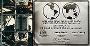
Futura has an appearance of efficiency and forwardness. The typeface is derived from simple geometric forms (near-perfect circles, triangles and squares) and is based on strokes of near-even weight, which are low in contrast. This is most visible in the almost perfectly round stroke of the o, which is nonetheless slightly ovoid. In designing Futura, Renner avoided the decorative, eliminating non-essential elements. The lowercase has tall ascenders, which rise above the cap line. The uppercase characters present proportions similar to those of classical Roman capitals.
Original Futura design also included small capitals and the old-style figures, which were dropped from the original metal issue of the type. The digital versions of these glyphs were first produced by Neufville Digital under the Futura ND family.
The public safety departments (Police, Fire, EMS and others) of Boston, Massachusetts use Futura Black as a typeface for their department vehicles.
This is also the font used on the covers of the classic Region 2 Doctor Who
DVD covers.
The work on the type family continued in the 1940s, but Renner's poor health had slowed down the development. Renner started to work again on this project in 1951 under the name of Steile Futura (steil in German means "upright" or "steep").
The font family released by Bauer consist of mager (light), halbfett (medium), fett (bold), kursiv halbfett (medium italic), and kursiv fett (bold italic). The font family was released in 1952–1953. It was sold in German, English, Spanish, and French markets as Steile Futura, Bauer Topic, Vox, Zénith respectively.
The font family has rounder letters than Futura Display. For the first time, italic type features are incorporated in the italic fonts. The fonts incorporate handwriting features, especially in italic version.
Neufville Digital issued Futura, Futura Black, Futura Condensed, and Futura Display (Futura Schlagzeile) under the Futura ND family.
in Dubai as a complement for Futura Extra Bold. The design was based on Kufi script, but using shortened descenders.
was the first of the new geometric sans-serif faces, the enormous success of Futura fostered the creation of many new geometric sans-serif faces by competing foundries including Kabel
, Metro, Vogue, Spartan
, Twentieth Century
, and Century Gothic
among others. Some were near identical copies as in Spartan and Vogue, but others, were uniquely different including Nobel
and Kabel
.
Typeface designer Adrian Frutiger
acknowledges Futura as one of his inspirations for his 1988 typeface Avenir
. More recently Futura has been the basis of Ikea Sans and Opel Sans, fonts designed (for Ikea
and Opel
, respectively) by Robin Nicholas.
Tasse
is a revival of Steile Futura.
Beteckna
is inspired by Futura.
Braggadocio
is based on Futura Black.
Fujiyama is a clone of Futura.
The 2000 typeface Gotham
is similarly geometric and based on 1920s signage.
Passata
is a modernised version of Futura specifically designed to replace Futura as the corporate branding font of Aarhus University.
 Futura's success spawned a range of new geometric sans-serif typefaces from competing foundries, and remains one of the most used sans-serif types into the twenty-first century. Futura remains an important typeface family and is used on a daily basis for print and digital purposes as both a headline and body font. The font is also used extensively in advertisements and logos, notably by IKEA (until 2010), Volkswagen, Shell Petrol and HP in their print ads. For example, the font is used for the title logo of the 1999 film American Beauty
. It was also used in other TV shows like Doug
, Lost
, Warehouse 13
, the American version of Sesame Street
, etc. Futura also features ubiquitously throughout the film adaptation of V for Vendetta
, used for everything from the title logo and ending credits, to signs, newspapers, computer screens and other props. Wes Anderson
is also fond of the font and has used it for all of his films. Futura was also Stanley Kubrick
's favorite font. In 1997, the Pittsburgh Steelers
(an American Football
team) switched to rounded numbers on the jersey to match the number font (Futura Condensed) on their helmets. It is also used on the Bell Canada
and the current TV5 (Philippines)
logo. Futura is also Animax Asia
's main typeface. The Boston Celtics
' championship banners are also in Futura Condensed. 2008 science fiction
-fantasy
film City of Ember
features Futura Medium in many prints through the story. The condensed version was mostly used in the 2011 role-playing video game The Elder Scrolls V: Skyrim
.
Typography
Typography is the art and technique of arranging type in order to make language visible. The arrangement of type involves the selection of typefaces, point size, line length, leading , adjusting the spaces between groups of letters and adjusting the space between pairs of letters...
, Futura is a geometric sans-serif typeface
Typeface
In typography, a typeface is the artistic representation or interpretation of characters; it is the way the type looks. Each type is designed and there are thousands of different typefaces in existence, with new ones being developed constantly....
designed in 1927 by Paul Renner
Paul Renner
Paul Renner was a typeface designer, most notably of Futura. He was born in Wernigerode, Germany and died in Hödingen....
. It is based on geometric shapes that became representative visual elements of the Bauhaus
Bauhaus
', commonly known simply as Bauhaus, was a school in Germany that combined crafts and the fine arts, and was famous for the approach to design that it publicized and taught. It operated from 1919 to 1933. At that time the German term stood for "School of Building".The Bauhaus school was founded by...
design style of 1919–1933. Commissioned by the Bauer Type Foundry
Bauer Type Foundry
The Bauer Type Foundry was a German type foundry founded in 1837 by Johann Christian Bauer in Frankfurt am Main. Noted typeface designers, among them Lucian Bernhard, Konrad Friedrich Bauer , Walter Baum, Heinrich Jost, Imre Reiner, Friedrich Hermann Ernst Schneidler, Emil Rudolf Weiß, and Heinrich...
, in reaction to Ludwig & Mayer's
Ludwig & Mayer
Ludwig & Mayer was a German type foundry in Frankfurt am Main, Germany. Many important designers worked for the Ludwig and Mayer type foundry, including Heinrich Jost, Karlgeorg Hoefer, Helmut Matheis, and most notably Jakob Erbar, whose Erbar Book was one of the first geometric sans-serif...
seminal Erbar
Erbar (typeface)
In typography, Erbar or Erbar-Grotesk was the first geometric sans-serif typeface ever created. Designer Jakob Erbar's aim was to design a printing type which would be free of all individual characteristics, possess thoroughly legible letter forms, and be a purely typographic creation...
of 1922, Futura was commercially released in 1927.
The family was originally cast in Light, Medium, Bold, and Bold Oblique fonts in 1928. Light Oblique, Medium Oblique, Demibold, and Demibold Oblique fonts were later released in 1930. Book font was released in 1932. Book Oblique font was released in 1939. Extra Bold font was designed by Edwin W. Shaar in 1952. Extra Bold Italic font was designed in 1955 by Edwin W. Shaar and Tommy Thompson. Matrices for machine composition were made by Intertype
Intertype Corporation
The Intertype Corporation produced the Intertype, a typecasting machine closely resembling the Linotype, and using the same matrices as the Linotype...
.
Although Renner was not associated with the Bauhaus
Bauhaus
', commonly known simply as Bauhaus, was a school in Germany that combined crafts and the fine arts, and was famous for the approach to design that it publicized and taught. It operated from 1919 to 1933. At that time the German term stood for "School of Building".The Bauhaus school was founded by...
, he shared many of its idioms and believed that a modern typeface should express modern models, rather than be a revival of a previous design. Renner's initial design included several geometrically constructed alternative characters and ranging (old-style) figures, which can be found in the typeface Architype Renner
Architype Renner
Architype Renner is a geometric sans-serif typeface reproducing the experimental alternate characters of Paul Renner's 1927–29 typeface Futura for the Bauer foundry. Renner's original design for Futura shows the influence of Herbert Bayer's experimental "Universal" alphabet...
.
Futura has an appearance of efficiency and forwardness. The typeface is derived from simple geometric forms (near-perfect circles, triangles and squares) and is based on strokes of near-even weight, which are low in contrast. This is most visible in the almost perfectly round stroke of the o, which is nonetheless slightly ovoid. In designing Futura, Renner avoided the decorative, eliminating non-essential elements. The lowercase has tall ascenders, which rise above the cap line. The uppercase characters present proportions similar to those of classical Roman capitals.
Original Futura design also included small capitals and the old-style figures, which were dropped from the original metal issue of the type. The digital versions of these glyphs were first produced by Neufville Digital under the Futura ND family.
Futura Black
Released in 1929, Futura Black is an alternate design that uses stencil letter forms.The public safety departments (Police, Fire, EMS and others) of Boston, Massachusetts use Futura Black as a typeface for their department vehicles.
Futura Display (Futura Schlagzeile)
Released in 1932, Futura Display uses more angular strokes, resulting in rectangular letter forms.This is also the font used on the covers of the classic Region 2 Doctor Who
Doctor Who
Doctor Who is a British science fiction television programme produced by the BBC. The programme depicts the adventures of a time-travelling humanoid alien known as the Doctor who explores the universe in a sentient time machine called the TARDIS that flies through time and space, whose exterior...
DVD covers.
Futura Condensed
Futura Condensed is a condensed version of the original Futura font family. Bold and bold oblique fonts were released in 1930. Medium, medium oblique, extra bold, and extra bold oblique fonts were released in 1936. Light and light oblique fonts were released in 1950.Steile Futura
Steile Futura was Paul Renner's attempt to create a typeface that would be closer to the nineteenth century sans serifs than to the geometric model. During the course of development, Renner developed several intermediate versions. Some of the early design could be found in the experimental font called Renner-Grotesk, which appeared as a trial type casting from the Stempel type foundry in 1936. Renner kursiv, a true italic companion to the regular version, was made after Stempel had been taken over by Bauer in 1938.The work on the type family continued in the 1940s, but Renner's poor health had slowed down the development. Renner started to work again on this project in 1951 under the name of Steile Futura (steil in German means "upright" or "steep").
The font family released by Bauer consist of mager (light), halbfett (medium), fett (bold), kursiv halbfett (medium italic), and kursiv fett (bold italic). The font family was released in 1952–1953. It was sold in German, English, Spanish, and French markets as Steile Futura, Bauer Topic, Vox, Zénith respectively.
The font family has rounder letters than Futura Display. For the first time, italic type features are incorporated in the italic fonts. The fonts incorporate handwriting features, especially in italic version.
Futura ND
This version is based on the original sources of the Bauersche Giesserei, which had passed its typefaces to its Barcelona branch, Fundición Tipográfica Bauer SL. Released in 1999 by Neufville Digital – a joint venture of Fundición Tipográfica Bauer SL and Visualogik Technology & Design b.v – it includes small capitals and the old-style figures that had not been made in metal types.Neufville Digital issued Futura, Futura Black, Futura Condensed, and Futura Display (Futura Schlagzeile) under the Futura ND family.
ParaType version
The ParaType fonts added Cyrillic characters. They were developed at ParaType (ParaGraph) in 1995 by Vladimir Yefimov. They came in only Light, Book, Medium, Demi weights.Futura Futuris
Futuris is a redesign at ParaType (ParaGraph) in 1991 by Vladimir Yefimov that includes Cyrillic characters. Condensed styles were added by in 1993 by Vladimir Yefimov and Alexander Tarbeev. It is available in Light, Medium, Bold, Black (without oblique) weights, while condensed fonts were made in Bold, Extra Bold, all without obliques. Also available are Cameo Extra Bold (black in reverse), Shadow Light, Shadow Extra Bold (black with shadow), Volume Light.Futura PT
This version is based on the previous ParaType design by Vladimir Yefimov, but expanded to include 7 weights, with Book, Medium, Bold, Extra Bold weights for condensed fonts. Additional Cyrillic styles were developed in 2007 by Isabella Chaeva.Futura Eugenia
This version is based on the Futura Black, but designed at the Polygraphmash type design bureau in 1987 by Elvira Slysh.Bukra
Bukra is an Arabic variant designed by Pascal Zoghbi. It consists of Bukra Extra Bold, which was used as an Arabic display typeface for Ibn Battuta MallIbn Battuta Mall
The Ibn Battuta Mall is a large shopping mall on the Sheikh Zayed Road in Dubai close to Interchange 6 for Jebel Ali Village. It is named after Berber Moroccan famous traveller and explorer Ibn Battuta. This project was completed by the Nakheel Properties group in early 2005...
in Dubai as a complement for Futura Extra Bold. The design was based on Kufi script, but using shortened descenders.
Influence on other typefaces
Though ErbarErbar (typeface)
In typography, Erbar or Erbar-Grotesk was the first geometric sans-serif typeface ever created. Designer Jakob Erbar's aim was to design a printing type which would be free of all individual characteristics, possess thoroughly legible letter forms, and be a purely typographic creation...
was the first of the new geometric sans-serif faces, the enormous success of Futura fostered the creation of many new geometric sans-serif faces by competing foundries including Kabel
Kabel (typeface)
Kabel is a geometric sans-serif typeface designed by German typeface designer Rudolf Koch, and released by the Klingspor foundry in 1927. The face was named to honor the newly completed trans-Atlantic telephone cable...
, Metro, Vogue, Spartan
Spartan (typeface)
Spartan is a geometric sans-serif typeface created by staff designers of Mergenthaler Linotype Company as a direct competitor to Bauer's Futura. The face was made for machine composition by Linotype, while identical foundry type was issued by American Type Founders...
, Twentieth Century
Twentieth Century (typeface)
Twentieth Century is a geometric sans-serif foundry typeface designed by Sol Hess for Lanston Monotype as a competitor to the successful Futura typeface, but with a larger x-height and more even stroke width...
, and Century Gothic
Century Gothic
Century Gothic is a geometric sans-serif typeface designed for Monotype Imaging in 1991. It is a digital typeface that has never been made into actual foundry type...
among others. Some were near identical copies as in Spartan and Vogue, but others, were uniquely different including Nobel
Nobel (typeface)
Nobel is a geometric sans-serif typeface designed by Sjoerd Henrik de Roos and Dick Dooijes in the period 1929–1935 for the Amsterdam Type foundry). Capitalizing upon Lettergieterij Amsterdam's substantial financial interest in the Berlin typefoundry H. Berthold AG, de Roos conceived of a revival...
and Kabel
Kabel (typeface)
Kabel is a geometric sans-serif typeface designed by German typeface designer Rudolf Koch, and released by the Klingspor foundry in 1927. The face was named to honor the newly completed trans-Atlantic telephone cable...
.
Typeface designer Adrian Frutiger
Adrian Frutiger
Adrian Frutiger is one of the prominent typeface designers of the 20th century, who continues to influence the direction of digital typography in the 21st century; he is best known for creating the typefaces Univers and Frutiger.-Early life:Adrian Frutiger was born in Unterseen, Canton of Bern, as...
acknowledges Futura as one of his inspirations for his 1988 typeface Avenir
Avenir (typeface)
Avenir is a geometric sans-serif typeface designed by Adrian Frutiger in 1988, and released by Linotype GmbH, now a subsidiary of Monotype Corporation....
. More recently Futura has been the basis of Ikea Sans and Opel Sans, fonts designed (for Ikea
IKEA
IKEA is a privately held, international home products company that designs and sells ready-to-assemble furniture such as beds and desks, appliances and home accessories. The company is the world's largest furniture retailer...
and Opel
Opel
Adam Opel AG, generally shortened to Opel, is a German automobile company founded by Adam Opel in 1862. Opel has been building automobiles since 1899, and became an Aktiengesellschaft in 1929...
, respectively) by Robin Nicholas.
Tasse
Tasse
Tasse is a revival of Paul Renner's Steile Futura. The family consists of 4 weights and 5 widths each, but no italic fonts were made. Nelson maintained Renner's alternative characters, adding additional alternate characters. The face is licensed by Font Bureau.Tasse shows influence of pen-written...
is a revival of Steile Futura.
Beteckna
Beteckna
Beteckna is a sans-serif typeface created by Johan Mattson, and released under the GPL. It features Normal, Bold, Italic, Bold Italic and Small Caps weights. It is inspired by Paul Renner's popular Futura typeface, but bears some obvious dissimilarities, most noticeably in the terminals of some of...
is inspired by Futura.
Braggadocio
Braggadocio (typeface)
Braggadocio is a geometrically constructed sans-serif stencil typeface designed by W.A. Woolley in 1930 for the Monotype Corporation. The design was based on Futura Black....
is based on Futura Black.
Fujiyama is a clone of Futura.
The 2000 typeface Gotham
Gotham (typeface)
Gotham is a family of geometric sans-serif digital typefaces designed by American type designer Tobias Frere-Jones in 2000. Gotham's letterforms are inspired by a form of architectural signage that achieved popularity in the mid-twentieth century, and are especially popular throughout New York...
is similarly geometric and based on 1920s signage.
Passata
Passata (font)
Passata is a sans-serif font designed specially for Aarhus University as part of a new visual identity implemented in late 2008 . It is a modernised version of Futura, which it replaced as their corporate branding font....
is a modernised version of Futura specifically designed to replace Futura as the corporate branding font of Aarhus University.
Usage
American Beauty (film)
American Beauty is a 1999 American drama film directed by Sam Mendes and written by Alan Ball. Kevin Spacey stars as Lester Burnham, a middle-aged magazine writer who has a midlife crisis when he becomes infatuated with his teenage daughter's best friend, Angela...
. It was also used in other TV shows like Doug
Doug
Doug is an American animated sitcom created by Jim Jinkins and co-produced by his studio, Jumbo Pictures . Doug centers on the surreal and imaginative exploits of its title character, Douglas "Doug" Funnie, who experiences common predicaments while attending middle school. The series lampoons...
, Lost
Lost (TV series)
Lost is an American television series that originally aired on ABC from September 22, 2004 to May 23, 2010, consisting of six seasons. Lost is a drama series that follows the survivors of the crash of a commercial passenger jet flying between Sydney and Los Angeles, on a mysterious tropical island...
, Warehouse 13
Warehouse 13
Warehouse 13 is an American fantasy television series that premiered on July 7, 2009 on the Syfy network.Executive-produced by Jack Kenny and David Simkins, the dramatic comedy from Universal Media Studios has been described as borrowing much from 1980s television series Friday the 13th: The...
, the American version of Sesame Street
Sesame Street
Sesame Street has undergone significant changes in its history. According to writer Michael Davis, by the mid-1970s the show had become "an American institution". The cast and crew expanded during this time, including the hiring of women in the crew and additional minorities in the cast. The...
, etc. Futura also features ubiquitously throughout the film adaptation of V for Vendetta
V for Vendetta (film)
V for Vendetta is a 2005 dystopian thriller film directed by James McTeigue and produced by Joel Silver and the Wachowski brothers, who also wrote the screenplay. It is an adaptation of the V for Vendetta comic book by Alan Moore and David Lloyd...
, used for everything from the title logo and ending credits, to signs, newspapers, computer screens and other props. Wes Anderson
Wes Anderson
Wesley Wales Anderson is an American film director, screenwriter, actor, and producer of features, short films and commercials....
is also fond of the font and has used it for all of his films. Futura was also Stanley Kubrick
Stanley Kubrick
Stanley Kubrick was an American film director, writer, producer, and photographer who lived in England during most of the last four decades of his career...
's favorite font. In 1997, the Pittsburgh Steelers
Pittsburgh Steelers
The Pittsburgh Steelers are a professional football team based in Pittsburgh, Pennsylvania. The team currently belongs to the North Division of the American Football Conference in the National Football League . Founded in , the Steelers are the oldest franchise in the AFC...
(an American Football
American football
American football is a sport played between two teams of eleven with the objective of scoring points by advancing the ball into the opposing team's end zone. Known in the United States simply as football, it may also be referred to informally as gridiron football. The ball can be advanced by...
team) switched to rounded numbers on the jersey to match the number font (Futura Condensed) on their helmets. It is also used on the Bell Canada
Bell Canada
Bell Canada is a major Canadian telecommunications company. Including its subsidiaries such as Bell Aliant, Northwestel, Télébec, and NorthernTel, it is the incumbent local exchange carrier for telephone and DSL Internet services in most of Canada east of Manitoba and in the northern territories,...
and the current TV5 (Philippines)
Associated Broadcasting Company
The Associated Broadcasting Company, Inc is a television network in the Philippines, with main broadcast facilities and transmitter located at 762 Quirino Highway, San Bartolome, Novaliches, Quezon City. The network was previously known as the , Associated Broadcasting Company remains the legal...
logo. Futura is also Animax Asia
Animax Asia
Animax Asia is the Japanese anime TV network Animaxs English language feeds in Southeast Asia and South Asia, as well as its feeds across other regions of mainland Asia, including Hong Kong and Taiwan...
's main typeface. The Boston Celtics
Boston Celtics
The Boston Celtics are a National Basketball Association team based in Boston, Massachusetts. They play in the Atlantic Division of the Eastern Conference. Founded in 1946, the team is currently owned by Boston Basketball Partners LLC. The Celtics play their home games at the TD Garden, which...
' championship banners are also in Futura Condensed. 2008 science fiction
Science fiction
Science fiction is a genre of fiction dealing with imaginary but more or less plausible content such as future settings, futuristic science and technology, space travel, aliens, and paranormal abilities...
-fantasy
Fantasy
Fantasy is a genre of fiction that commonly uses magic and other supernatural phenomena as a primary element of plot, theme, or setting. Many works within the genre take place in imaginary worlds where magic is common...
film City of Ember
City of Ember
City of Ember is a 2008 science fiction-fantasy film based on the 2003 novel of the same name by Jeanne DuPrau. It was directed by Gil Kenan from a screenplay by Caroline Thompson, and stars Saoirse Ronan, Harry Treadaway, Bill Murray, Mackenzie Crook, Martin Landau and Tim Robbins.-Plot:In the...
features Futura Medium in many prints through the story. The condensed version was mostly used in the 2011 role-playing video game The Elder Scrolls V: Skyrim
The Elder Scrolls V: Skyrim
The Elder Scrolls V: Skyrim is a role-playing video game developed by Bethesda Game Studios and published by Bethesda Softworks. It is the fifth installment in The Elder Scrolls action role-playing video game series, following The Elder Scrolls IV: Oblivion...
.
Further reading
Alexandre Dumas de Rauly, Michel Wlassikoff, Futura Une gloire typographique, Paris, Éditions NORMA, 2011, ISBN 978-2-9155-4239-4.- Burke, Christopher, Paul Renner: the art of typography. London: Hyphen Press, 1998. ISBN 0-907259-12-X.
- Haley, Allen. Type: Hot Designers Make Cool Fonts. Rockport Publishers Inc, Gloucester; 1998. ISBN 1-56496-317-9
- Jaspert, Berry and Johnson. Encyclopaedia of Type Faces. Cassell Paperback, London; 2001. ISBN 1-84188-139-2
- Lawson, Alexander S., Anatomy of a TypefaceAnatomy of a TypefaceAnatomy of a Typeface is a book on typefaces written by Alexander Lawson. The book is notable for devoting entire chapters to the development and uses of individual or small groupings of typefaces. Beyond Anatomy of a Typeface Lawson has considered and discussed the classification of types. Within...
. Godine: 1990. ISBN 978-0879233334. - Meggs, Philip. B and McKelvey, Roy. Revival of the Fittest: Digital Versions of Classic Typefaces. RC Publications; 2002. ISBN 1-883915-08-2
- Ronson, Jon. "Citizen Kubrick", The Guardian, London, March 27, 2004.
External links
- Typowiki: Futura
- Book in french about the history of the Futura typeface.
- Identifont: Futura Black
- Identifont: Futura Display
- Berthold Fonts: Steile Futura - Berthold BQ version
- URW Topic
- ParaType Futura: Futura, Futura PT, Futura Eugenia, Futura Futuris
- Bauertypes Futura ND
- Neufville Digital Futura: Futura, Futura Black, Futura Condensed, Futura Display
- MyFonts: Futura ND, Futura No. 2
- The Guardians visual review of Futura
- The Futura Story on Fonts.com