
.gif)
Clarendon (typeface)
Encyclopedia
Clarendon is an English
slab-serif typeface that was created in England
by Robert Besley
for Thorowgood and Co. (or Thorowgood and Besley.), a type company formerly known as the Fann Street Foundry until approximately 1838. The font was published in 1845 after Besley, an employee of the foundry since 1826, was made a partner in the firm. Due to its popularity, Besley registered the typeface under Britain's Ornamental Designs Act of 1842. The patent expired three years later, and other foundries were quick to copy it. Clarendon is considered the first registered typeface, with the original matrices and punches remaining at Stephenson Blake
and later residing at the Type Museum, London. They were marketed by Stephenson Blake as Consort, though some additional weights (a bold and italics) were cut in the 1950s.
It was named after the Clarendon Press in Oxford
. Designs for wood type were made from the mid 1840s on. The typeface was reworked by the Monotype foundry in 1935. It was also revised by Hermann Eidenbenz and Edouard Hoffmann in 1953, Freeman Craw as Craw Clarendon, an American version released by American Type Founders
, in 1955, and by Aldo Novarese
as Egizio, complete with italics, in 1958, among others.
The font was used extensively by the government of the German Empire
for proclamations during World War I
, and was also common in wanted poster
s of the American Old West
.
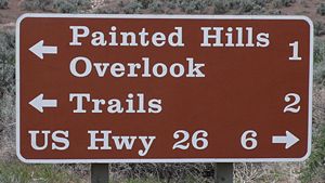 Clarendon was used by the United States
National Park Service
on traffic sign
s, but has been replaced by NPS Rawlinson Roadway. In 2008, the typeface was utilized extensively by the Ruby Tuesday
restaurant chain in the re-launch of their corporate identity. Via, the travel magazine of the American Automobile Association
, uses the typeface for its logo and headline copy.
Clarendon can also be seen in the logotypes of corporations such as Sony
, Pitchfork Media
, Wells Fargo
, the Spanish newspaper El País and the Swedish house manufacturer Älvsbyhus. Fortune, or Volta, a typeface based on Clarendon designed by Konrad F. Bauer and Walter Baum in 1956, was used for the wedge spaces on the Wheel of Fortune
dollar amount wheel. Hermann Eidenbenz's Clarendon Bold is now used. The American rock band Switchfoot
also utilizes a slightly distressed and altered version of the font for the band name on all of their albums and publications since the release of The Beautiful Letdown
in 2003.
resulting in the production of the French Clarendon type with enlarged block serifs. This devlopement is usually recognized as the type used in circus posters and wanted notices in western movies. Other names are also used for this type. Jasper's Encyclopedia of Typefaces refers to the type as Reversed Egyptian, while DeVinne
calls it Italian and says "To be hated, it needs but to be seen." P. T. Barnum is an example of this typeface.
United Kingdom
The United Kingdom of Great Britain and Northern IrelandIn the United Kingdom and Dependencies, other languages have been officially recognised as legitimate autochthonous languages under the European Charter for Regional or Minority Languages...
slab-serif typeface that was created in England
England
England is a country that is part of the United Kingdom. It shares land borders with Scotland to the north and Wales to the west; the Irish Sea is to the north west, the Celtic Sea to the south west, with the North Sea to the east and the English Channel to the south separating it from continental...
by Robert Besley
Robert Besley
Robert Besley was an English typographer, creator of Clarendon in 1845 and the Lord Mayor of London in 1869.-Career:...
for Thorowgood and Co. (or Thorowgood and Besley.), a type company formerly known as the Fann Street Foundry until approximately 1838. The font was published in 1845 after Besley, an employee of the foundry since 1826, was made a partner in the firm. Due to its popularity, Besley registered the typeface under Britain's Ornamental Designs Act of 1842. The patent expired three years later, and other foundries were quick to copy it. Clarendon is considered the first registered typeface, with the original matrices and punches remaining at Stephenson Blake
Stephenson Blake
Stephenson Blake was a British Type foundry, based in Sheffield, England. Active from the 19th century until the 1990s, it remained the last active typefoundry in Britain.-Type Founding:...
and later residing at the Type Museum, London. They were marketed by Stephenson Blake as Consort, though some additional weights (a bold and italics) were cut in the 1950s.
It was named after the Clarendon Press in Oxford
Oxford
The city of Oxford is the county town of Oxfordshire, England. The city, made prominent by its medieval university, has a population of just under 165,000, with 153,900 living within the district boundary. It lies about 50 miles north-west of London. The rivers Cherwell and Thames run through...
. Designs for wood type were made from the mid 1840s on. The typeface was reworked by the Monotype foundry in 1935. It was also revised by Hermann Eidenbenz and Edouard Hoffmann in 1953, Freeman Craw as Craw Clarendon, an American version released by American Type Founders
American Type Founders
American Type Founders was a business trust created in 1892 by the merger of 23 type foundries, representing about 85% of all type manufactured in the United States...
, in 1955, and by Aldo Novarese
Aldo Novarese
Aldo Novarese was an Italian type designer who lived and worked mostly in Turin where he produced an impressive number of unique designs.-Training and Career:...
as Egizio, complete with italics, in 1958, among others.
The font was used extensively by the government of the German Empire
German Empire
The German Empire refers to Germany during the "Second Reich" period from the unification of Germany and proclamation of Wilhelm I as German Emperor on 18 January 1871, to 1918, when it became a federal republic after defeat in World War I and the abdication of the Emperor, Wilhelm II.The German...
for proclamations during World War I
World War I
World War I , which was predominantly called the World War or the Great War from its occurrence until 1939, and the First World War or World War I thereafter, was a major war centred in Europe that began on 28 July 1914 and lasted until 11 November 1918...
, and was also common in wanted poster
Wanted poster
A wanted poster is a poster distributed to let the public know of an alleged criminal whom authorities wish to apprehend. They will generally include either a picture of the alleged criminal when a photograph is available, or of a facial composite image produced by a police artist...
s of the American Old West
American Old West
The American Old West, or the Wild West, comprises the history, geography, people, lore, and cultural expression of life in the Western United States, most often referring to the latter half of the 19th century, between the American Civil War and the end of the century...
.
Appearances
United States
The United States of America is a federal constitutional republic comprising fifty states and a federal district...
National Park Service
National Park Service
The National Park Service is the U.S. federal agency that manages all national parks, many national monuments, and other conservation and historical properties with various title designations...
on traffic sign
Traffic sign
Traffic signs or road signs are signs erected at the side of roads to provide information to road users. With traffic volumes increasing over the last eight decades, many countries have adopted pictorial signs or otherwise simplified and standardized their signs to facilitate international travel...
s, but has been replaced by NPS Rawlinson Roadway. In 2008, the typeface was utilized extensively by the Ruby Tuesday
Ruby Tuesday (restaurant)
Ruby Tuesday is an American casual dining restaurant chain named after the Rolling Stones' song of the same name.- History :The first restaurant was founded in 1972 by five University of Tennessee students, and is now headquartered in Maryville, Tennessee. The first location was adjacent to UT's...
restaurant chain in the re-launch of their corporate identity. Via, the travel magazine of the American Automobile Association
American Automobile Association
AAA , formerly known as the American Automobile Association, is a federation of 51 independently operated motor clubs throughout North America. AAA is a not-for-profit member service organization with more than 51 million members. AAA provides services to its members such as travel, automotive,...
, uses the typeface for its logo and headline copy.
Clarendon can also be seen in the logotypes of corporations such as Sony
Sony
, commonly referred to as Sony, is a Japanese multinational conglomerate corporation headquartered in Minato, Tokyo, Japan and the world's fifth largest media conglomerate measured by revenues....
, Pitchfork Media
Pitchfork Media
Pitchfork Media, usually known simply as Pitchfork or P4k, is a Chicago-based daily Internet publication established in 1995 that is devoted to music criticism and commentary, music news, and artist interviews. Its focus is on underground and independent music, especially indie rock...
, Wells Fargo
Wells Fargo
Wells Fargo & Company is an American multinational diversified financial services company with operations around the world. Wells Fargo is the fourth largest bank in the U.S. by assets and the largest bank by market capitalization. Wells Fargo is the second largest bank in deposits, home...
, the Spanish newspaper El País and the Swedish house manufacturer Älvsbyhus. Fortune, or Volta, a typeface based on Clarendon designed by Konrad F. Bauer and Walter Baum in 1956, was used for the wedge spaces on the Wheel of Fortune
Wheel of Fortune (U.S. game show)
Wheel of Fortune is an American television game show created by Merv Griffin, which premiered in 1975. Contestants compete to solve word puzzles, similar to those used in Hangman, to win cash and prizes determined by spinning a large wheel. The title refers to the show's giant carnival wheel that...
dollar amount wheel. Hermann Eidenbenz's Clarendon Bold is now used. The American rock band Switchfoot
Switchfoot
Switchfoot is an American rock band from San Diego, California. The band's members are Jon Foreman , Tim Foreman , Chad Butler , Jerome Fontamillas , and Drew Shirley .After early successes in the Christian rock scene, Switchfoot first gained mainstream...
also utilizes a slightly distressed and altered version of the font for the band name on all of their albums and publications since the release of The Beautiful Letdown
The Beautiful Letdown
The Beautiful Letdown is the fourth studio album by alternative rock band Switchfoot. Released in early 2003, it launched the band into the mainstream on the strength of two top 20 singles: "Meant to Live" and "Dare You to Move." The album was hugely popular and remained a staple on the Billboard...
in 2003.
French Clarendon
In the late nineteenth century the basic Clarendon face was radically altered by foundries in the United StatesUnited States
The United States of America is a federal constitutional republic comprising fifty states and a federal district...
resulting in the production of the French Clarendon type with enlarged block serifs. This devlopement is usually recognized as the type used in circus posters and wanted notices in western movies. Other names are also used for this type. Jasper's Encyclopedia of Typefaces refers to the type as Reversed Egyptian, while DeVinne
Theodore Low De Vinne
Theodore Low De Vinne was an American printer and scholarly author on typography.De Vinne was born at Stamford, Connecticut, and educated in the common schools of the various towns where his father had pastorates. He developed the ability to be a printer while employed in a shop at Fishkill, New...
calls it Italian and says "To be hated, it needs but to be seen." P. T. Barnum is an example of this typeface.
External links
- How wood type tamed the west
- List of fonts of the Clarendon typeface family at MyFonts.com
- List of fonts of the Clarendon typeface family at Fonts.com
- List of fonts of the Clarendon typeface family at Linotype.com