
Frutiger
Encyclopedia
Frutiger is a series of typeface
s named after its designer, Adrian Frutiger
. Initially available as a sans serif, it was later expanded to include ornamental and serif
typefaces.
lower case:
square dot over the letter i.
double storey a.
upper case:
the capital Q's tail is centered under the figure, the uppercase J has a slight hook, and there are two versions of uppercase R, one with a straight tail and one with a curved tail.
figures:
typeface by the Swiss type designer Adrian Frutiger
. It was commissioned in 1968 by the newly built Charles De Gaulle International Airport
at Roissy, France
, which needed a new directional sign system. Instead of using one of his previously designed typefaces like Univers
, Frutiger chose to design a new one. The new typeface, originally called Roissy, was completed in 1975 and installed at the airport the same year.
Frutiger's goal was to create a sans serif typeface with the rationality and cleanliness of Univers, but with the organic and proportional aspects of Gill Sans
. The result is that Frutiger is a distinctive and legible typeface. The letter properties were suited to the needs of Charles De Gaulle – modern appearance and legibility at various angles, sizes, and distances. Ascenders and descenders are very prominent, and apertures are wide to easily distinguish letters from each other.
The Frutiger family was released publicly in 1976, by the Stempel type foundry in conjunction with Linotype. Frutiger's simple and legible, yet warm and casual character has made it popular today in advertising and small print. Some major uses of Frutiger are in the corporate identity of Raytheon
, the National Health Service
in England, Telefónica O2, the British Royal Navy
, the London School of Economics and Political Science, the Canadian Broadcasting Corporation
, the Conservative Party of Canada
, the Banco Bradesco
in Brazil, the Finnish Defence Forces
and on road signs in Switzerland
. The typeface has also been used across the public transport network in Oslo
, Norway
, since the 1980s. In 2008 it was the fifth best-selling typeface of the Linotype foundry.
Frutiger is also used by DHL Globally and by DPWN Deutsche Post in Germany.
Frutiger was also produced by Bitstream under the name 'Humanist 777'.
Frutiger Linotype can be found in Microsoft products featuring Microsoft Reader
, as well as the standalone Microsoft Reader package.
A family of two fonts were made, called ASTRA-Frutiger-Standard/standard, and ASTRA-Frutiger-Autobahn/autoroute.
in Munich
. The new version, named Frutiger Next, changed a number of details and adds a true italic style in place of the oblique roman of the original.
Frutiger Next was commercially available in 2000 under Linotype. The family include 6 font weights, with bonus Ultra Light weight for the OpenType version. It supports ISO Adobe 2, Adobe CE, Latin Extended characters. OpenType features include small caps, old style figures, superscript/subscript, ordinals, proportional lining figures, case forms. Fonts names are no longer numbered with the Frutiger system. Frutiger Black was renamed to Frutiger Next Heavy, and Frutiger Ultra Black was changed to Frutiger Next Black. Condensed fonts no longer include italic variants. In addition to italic type
, characters such as cent sign (¢), copyright symbol
(©), ampersand
(&), at sign
(@), sharp S (ß
), Omega
(Ω) and integral symbol (∫) are redesigned. Cyrillic letters had not been produced until Frutiger Next W1G.
during the 1950s.
The family consists of roman and italic fonts in 5 weights and 2 widths each.
The family has 20 fonts in 10 weights and 1 width, with complementary oblique. It supports ISO Adobe, Adobe CE, Latin Extended characters. OpenType features include subscript/superscript.
's Myriad and Microsoft
's Segoe UI
are two prominent typefaces whose similarities to Frutiger have aroused controversy. However, in an interview, Adrian Frutiger commended the work of Myriad's designer, Robert Slimbach
, "except the unnecessary doubt concerning Myriad, his work is also very good."
Others include:
Frutiger Next Greek won the TDC2 2006 award under the Type System / Superfamily category.
Brunel's ss Great Britain
uses Frutiger as its official sans serif based typeface along with Trajan as a serif based font for branding.
Cornell University
uses Frutiger as its secondary typeface, along with Palatino
.
Xavier University uses Frutiger as its official typeface along with Bembo
.
The University of Southern California
uses Frutiger as its official typeface along with Caslon 540.
Ohio University
uses Frutiger as its official typeface along with Galliard.
Temple University
uses Frutiger as its official typeface along with Goudy (and Garamond
for body text correspondence).
Central Washington University
uses Frutiger as its official typeface along with Hoefler Text
.
Claremont McKenna College
uses Frutiger as its official typeface along with Janson
.
Emmanuel College and the University of Massachusetts Amherst
with its sister Dartmouth
and Lowell
(but not Boston
) use Frutiger as its official typeface along with Sabon
.
The University of Lausanne
uses Frutiger as its official typeface.
The University of Iceland
uses Frutiger as its official typeface.
The Connexions (agency) in the UK also uses Frutiger as its official typeface
The Finnish Defence Forces
uses Frutiger as its official typeface
The Hong Kong Institute of Certified Public Accountants
in the Hong Kong also uses Frutiger as its official typeface
The Citizens Advice service uses Frutiger as its official typeface.
The London school of Economics
service uses Frutiger as its official typeface.
The University of Miami
uses Frutiger (Linotype) as its primary sans serif typeface.
Bay Area Rapid Transit
, a rapid transit system serving the San Francisco Bay Area
, uses Frutiger for all signage.
Arriva
uses Frutiger as its official typeface.
Kieser Training AG and Kieser Training Australia also use Frutiger as its official typeface.
CDI Corporation
uses Frutiger as its official typeface, according to the CDI Identity Guide.
The ETAS Group
uses Frutiger LT as its official typeface.
The British band Muse (band)
use Frutiger in their band logo.
Schindler Group
uses Frutiger as part of their brand. Company name is in Frutiger in the official website.
Lucent Technologies used Frutiger in their logo.
The U.S. National Park Service
uses Frutiger as one of two fonts across the entire agency.
Typeface
In typography, a typeface is the artistic representation or interpretation of characters; it is the way the type looks. Each type is designed and there are thousands of different typefaces in existence, with new ones being developed constantly....
s named after its designer, Adrian Frutiger
Adrian Frutiger
Adrian Frutiger is one of the prominent typeface designers of the 20th century, who continues to influence the direction of digital typography in the 21st century; he is best known for creating the typefaces Univers and Frutiger.-Early life:Adrian Frutiger was born in Unterseen, Canton of Bern, as...
. Initially available as a sans serif, it was later expanded to include ornamental and serif
Serif
In typography, serifs are semi-structural details on the ends of some of the strokes that make up letters and symbols. A typeface with serifs is called a serif typeface . A typeface without serifs is called sans serif or sans-serif, from the French sans, meaning “without”...
typefaces.
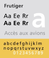
Distinctive characteristics
Characteristics of this typeface are:lower case:
square dot over the letter i.
double storey a.
upper case:
the capital Q's tail is centered under the figure, the uppercase J has a slight hook, and there are two versions of uppercase R, one with a straight tail and one with a curved tail.
figures:
History
Frutiger is a sans-serifSans-serif
In typography, a sans-serif, sans serif or san serif typeface is one that does not have the small projecting features called "serifs" at the end of strokes. The term comes from the French word sans, meaning "without"....
typeface by the Swiss type designer Adrian Frutiger
Adrian Frutiger
Adrian Frutiger is one of the prominent typeface designers of the 20th century, who continues to influence the direction of digital typography in the 21st century; he is best known for creating the typefaces Univers and Frutiger.-Early life:Adrian Frutiger was born in Unterseen, Canton of Bern, as...
. It was commissioned in 1968 by the newly built Charles De Gaulle International Airport
Charles de Gaulle International Airport
Paris-Charles de Gaulle Airport , also known as Roissy Airport , in the Paris area, is one of the world's principal aviation centres, as well as France's largest airport. It is named after Charles de Gaulle , leader of the Free French Forces and founder of the French Fifth Republic...
at Roissy, France
France
The French Republic , The French Republic , The French Republic , (commonly known as France , is a unitary semi-presidential republic in Western Europe with several overseas territories and islands located on other continents and in the Indian, Pacific, and Atlantic oceans. Metropolitan France...
, which needed a new directional sign system. Instead of using one of his previously designed typefaces like Univers
Univers
Univers is the name of a realist sans-serif typeface designed by Adrian Frutiger in 1954.Originally conceived and released by Deberny & Peignot in 1957, the type library was acquired in 1972 by Haas. Haas'sche Schriftgiesserei was later folded into the D...
, Frutiger chose to design a new one. The new typeface, originally called Roissy, was completed in 1975 and installed at the airport the same year.
Frutiger's goal was to create a sans serif typeface with the rationality and cleanliness of Univers, but with the organic and proportional aspects of Gill Sans
Gill Sans
Gill Sans is a sans-serif typeface designed by Eric Gill.The original design appeared in 1926 when Douglas Cleverdon opened a bookshop in his home town of Bristol, where Eric Gill painted the fascia over the window in sans-serif capitals that would later be known as Gill Sans...
. The result is that Frutiger is a distinctive and legible typeface. The letter properties were suited to the needs of Charles De Gaulle – modern appearance and legibility at various angles, sizes, and distances. Ascenders and descenders are very prominent, and apertures are wide to easily distinguish letters from each other.
The Frutiger family was released publicly in 1976, by the Stempel type foundry in conjunction with Linotype. Frutiger's simple and legible, yet warm and casual character has made it popular today in advertising and small print. Some major uses of Frutiger are in the corporate identity of Raytheon
Raytheon
Raytheon Company is a major American defense contractor and industrial corporation with core manufacturing concentrations in weapons and military and commercial electronics. It was previously involved in corporate and special-mission aircraft until early 2007...
, the National Health Service
National Health Service
The National Health Service is the shared name of three of the four publicly funded healthcare systems in the United Kingdom. They provide a comprehensive range of health services, the vast majority of which are free at the point of use to residents of the United Kingdom...
in England, Telefónica O2, the British Royal Navy
Royal Navy
The Royal Navy is the naval warfare service branch of the British Armed Forces. Founded in the 16th century, it is the oldest service branch and is known as the Senior Service...
, the London School of Economics and Political Science, the Canadian Broadcasting Corporation
Canadian Broadcasting Corporation
The Canadian Broadcasting Corporation, commonly known as CBC and officially as CBC/Radio-Canada, is a Canadian crown corporation that serves as the national public radio and television broadcaster...
, the Conservative Party of Canada
Conservative Party of Canada
The Conservative Party of Canada , is a political party in Canada which was formed by the merger of the Canadian Alliance and the Progressive Conservative Party of Canada in 2003. It is positioned on the right of the Canadian political spectrum...
, the Banco Bradesco
Banco Bradesco
Bradesco is one of the Big Four banks in Brazil, the others being Banco do Brasil, Itaú Unibanco and CEF. Bradesco was the largest private bank in Brazil until Banco Itaú and Unibanco merged in 2009. Bradesco is headquartered in Osasco, has 3,945 branches and 38,772 Automatic Teller Machines...
in Brazil, the Finnish Defence Forces
Finnish Defence Forces
The Finnish Defence Forces are responsible for the defence of Finland. It is a cadre army of 15,000, of which 8,900 are professional soldiers , extended with conscripts and reservists such that the standard readiness strength is 34,700 people in uniform...
and on road signs in Switzerland
Switzerland
Switzerland name of one of the Swiss cantons. ; ; ; or ), in its full name the Swiss Confederation , is a federal republic consisting of 26 cantons, with Bern as the seat of the federal authorities. The country is situated in Western Europe,Or Central Europe depending on the definition....
. The typeface has also been used across the public transport network in Oslo
Oslo
Oslo is a municipality, as well as the capital and most populous city in Norway. As a municipality , it was established on 1 January 1838. Founded around 1048 by King Harald III of Norway, the city was largely destroyed by fire in 1624. The city was moved under the reign of Denmark–Norway's King...
, Norway
Norway
Norway , officially the Kingdom of Norway, is a Nordic unitary constitutional monarchy whose territory comprises the western portion of the Scandinavian Peninsula, Jan Mayen, and the Arctic archipelago of Svalbard and Bouvet Island. Norway has a total area of and a population of about 4.9 million...
, since the 1980s. In 2008 it was the fifth best-selling typeface of the Linotype foundry.
Frutiger is also used by DHL Globally and by DPWN Deutsche Post in Germany.
Frutiger was also produced by Bitstream under the name 'Humanist 777'.
Frutiger Linotype
This is a version of the original Frutiger font family licensed to Microsoft. This family consists of Frutiger 55, 56, 65, 66. It does not include OpenType features and kerning, but it adds support to Latin Extended-B and Greek characters, with Frutiger 55 supporting extra IPA characters, spacing modifier letters. Unlike most Frutiger variants Frutiger Linotype features old style figures as the default numeral style.Frutiger Linotype can be found in Microsoft products featuring Microsoft Reader
Microsoft Reader
Microsoft Reader is a Microsoft program for the reading of e-books, originally released in August 2000.Microsoft Reader is available for download from Microsoft as a free program for computers running Windows. It can also be used on a Pocket PC, where it has been built into the ROM since Windows CE...
, as well as the standalone Microsoft Reader package.
ASTRA-Frutiger
This is a variant of Frutiger used by Swiss authorities as the new font for traffic signs, replacing VSS since 2003. It was based on Frutiger 57 Condensed, but with widening ascenders and descenders, which are intended to give the eye a better hold than was the case with the earlier version.A family of two fonts were made, called ASTRA-Frutiger-Standard/standard, and ASTRA-Frutiger-Autobahn/autoroute.
Frutiger Next
The Frutiger family was updated in 1997 for signage at the Alte PinakothekAlte Pinakothek
The Alte Pinakothek is an art museum situated in the Kunstareal in Munich, Germany. It is one of the oldest galleries in the world and houses one of the most famous collections of Old Master paintings...
in Munich
Munich
Munich The city's motto is "" . Before 2006, it was "Weltstadt mit Herz" . Its native name, , is derived from the Old High German Munichen, meaning "by the monks' place". The city's name derives from the monks of the Benedictine order who founded the city; hence the monk depicted on the city's coat...
. The new version, named Frutiger Next, changed a number of details and adds a true italic style in place of the oblique roman of the original.
Frutiger Next was commercially available in 2000 under Linotype. The family include 6 font weights, with bonus Ultra Light weight for the OpenType version. It supports ISO Adobe 2, Adobe CE, Latin Extended characters. OpenType features include small caps, old style figures, superscript/subscript, ordinals, proportional lining figures, case forms. Fonts names are no longer numbered with the Frutiger system. Frutiger Black was renamed to Frutiger Next Heavy, and Frutiger Ultra Black was changed to Frutiger Next Black. Condensed fonts no longer include italic variants. In addition to italic type
Italic type
In typography, italic type is a cursive typeface based on a stylized form of calligraphic handwriting. Owing to the influence from calligraphy, such typefaces often slant slightly to the right. Different glyph shapes from roman type are also usually used—another influence from calligraphy...
, characters such as cent sign (¢), copyright symbol
Copyright symbol
The copyright symbol, or copyright sign, designated by © , is the symbol used in copyright notices for works other than sound recordings . The use of the symbol is described in United States copyright law, and, internationally, by the Universal Copyright Convention...
(©), ampersand
Ampersand
An ampersand is a logogram representing the conjunction word "and". The symbol is a ligature of the letters in et, Latin for "and".-Etymology:...
(&), at sign
At sign
The at sign , also called the ampersat, apetail, arroba, atmark, at symbol, commercial at or monkey tail, is formally an abbreviation of the accounting and commercial invoice term "at the rate of"...
(@), sharp S (ß
ß
In the German alphabet, ß is a letter that originated as a ligature of ss or sz. Like double "s", it is pronounced as an , but in standard spelling, it is only used after long vowels and diphthongs, while ss is used after short vowels...
), Omega
Omega
Omega is the 24th and last letter of the Greek alphabet. In the Greek numeric system, it has a value of 800. The word literally means "great O" , as opposed to omicron, which means "little O"...
(Ω) and integral symbol (∫) are redesigned. Cyrillic letters had not been produced until Frutiger Next W1G.
Frutiger Next Greek (2005)
This is a variant of Frutiger Next designed with Eva Masoura for Linotype, originally published as a TDC2 2006 entry.Frutiger Next W1G (2009)
This is an expanded version of Frutiger Next W1G. It added Greek (from Frutiger Next Greek) and Cyrillic character sets, but advertised OpenType features were reduced to superscript/subscript. Only OpenType version has been produced.Frutiger Stones (1998)
This is a family of casual fonts inspired by natural elements. Using polished pebbles as the boundary, the family consists of Regular, Positive, Negative fonts. Frutiger Stones Positive is Regular without the stone outline, while Negative is a reverse fill of the Regular.Frutiger Symbols (1998)
This is a family of symbol fonts. The fonts contain plants, animals and stars as well as religious and mythological symbols. Naming convention follows Frutiger Stones.Frutiger Capitalis (2005)
This is a family of casual fonts consists of Regular, Outline, Signs fonts. Frutiger Capitalis Outline is the outline version of Frutiger Capitalis Regular. Frutiger Capitalis contains only ornamental glyphs of religions, hand signs, astrological signs.Frutiger Arabic (2007)
This is a font family designed by Lebanese designer Nadine Chahine as a companion to the Latin typeface Frutiger and with the consulting of Adrian Frutiger. It is based on the Kufi style but incorporates aspects of Ruqaa and Naskh in the letter form designs, which results in what Linotype called 'humanist Kufi'. The fonts consist of Basic Latin and ISO-Latin characters derived from the original Frutiger family, with Arabic characters supporting presentation forms A and B. 4 font weights were produced.Frutiger Serif (2008)
This is a serif font family designed by Adrian Frutiger and Akira Kobayashi. It is a re-envisioning of the metal type version of Meridien, a typeface first released by Deberny & PeignotDeberny & Peignot
Deberny & Peignot was a French type foundry, created by the 1923 merger of Peignot foundry and the Laurent & Deberny foundry. It was bought by the Haas Type Foundry of Switzerland in 1972, which in turn was merged into D...
during the 1950s.
The family consists of roman and italic fonts in 5 weights and 2 widths each.
Neue Frutiger (2009)
This is an expanded version of the original Frutiger family designed by Adrian Frutiger and Akira Kobayashi. Unlike the original family, the Frutiger numbering scheme is not used.The family has 20 fonts in 10 weights and 1 width, with complementary oblique. It supports ISO Adobe, Adobe CE, Latin Extended characters. OpenType features include subscript/superscript.
Similar types
AdobeAdobe Systems
Adobe Systems Incorporated is an American computer software company founded in 1982 and headquartered in San Jose, California, United States...
's Myriad and Microsoft
Microsoft
Microsoft Corporation is an American public multinational corporation headquartered in Redmond, Washington, USA that develops, manufactures, licenses, and supports a wide range of products and services predominantly related to computing through its various product divisions...
's Segoe UI
Segoe UI
Segoe is a Humanist typeface family that is best known for its usage by Microsoft. The company uses Segoe in their online and printed marketing materials, including recent logos for a number of products...
are two prominent typefaces whose similarities to Frutiger have aroused controversy. However, in an interview, Adrian Frutiger commended the work of Myriad's designer, Robert Slimbach
Robert Slimbach
Robert Slimbach is a type designer, who has worked at Adobe Systems since 1987. He has won many awards for his digital typeface designs, including the rarely-awarded Charles Peignot Award from the Association Typographique Internationale, and repeated TDC2 awards from the Type Directors Club.-...
, "except the unnecessary doubt concerning Myriad, his work is also very good."
Others include:
- "M+ 2P" - a free font designed in Japan,
Awards
Frutiger Next won buvka:raz! competition under the Latin category.Frutiger Next Greek won the TDC2 2006 award under the Type System / Superfamily category.
Frutiger in branding
The National Health Service in the UK currently uses the Frutiger font as its standard typeface.Brunel's ss Great Britain
SS Great Britain
SS Great Britain was an advanced passenger steamship designed by Isambard Kingdom Brunel for the Great Western Steamship Company's transatlantic service between Bristol and New York. While other ships had previously been built of iron or equipped with a screw propeller, Great Britain was the first...
uses Frutiger as its official sans serif based typeface along with Trajan as a serif based font for branding.
Cornell University
Cornell University
Cornell University is an Ivy League university located in Ithaca, New York, United States. It is a private land-grant university, receiving annual funding from the State of New York for certain educational missions...
uses Frutiger as its secondary typeface, along with Palatino
Palatino
Palatino is the name of a large typeface family that began as an old style serif typeface designed by Hermann Zapf initially released in 1948 by the Linotype foundry.In 1999, Zapf revised Palatino for Linotype and Microsoft, called Palatino Linotype...
.
Xavier University uses Frutiger as its official typeface along with Bembo
Bembo
Bembo is the name given to a 20th-century revival of an old style serif or humanist typeface cut by Francesco Griffo around 1495.The typeface Bembo seen today is a revival designed under the direction of Stanley Morison for the Monotype Corporation in 1929.It is considered a good choice for...
.
The University of Southern California
University of Southern California
The University of Southern California is a private, not-for-profit, nonsectarian, research university located in Los Angeles, California, United States. USC was founded in 1880, making it California's oldest private research university...
uses Frutiger as its official typeface along with Caslon 540.
Ohio University
Ohio University
Ohio University is a public university located in the Midwestern United States in Athens, Ohio, situated on an campus...
uses Frutiger as its official typeface along with Galliard.
Temple University
Temple University
Temple University is a comprehensive public research university in Philadelphia, Pennsylvania, United States. Originally founded in 1884 by Dr. Russell Conwell, Temple University is among the nation's largest providers of professional education and prepares the largest body of professional...
uses Frutiger as its official typeface along with Goudy (and Garamond
Garamond
Garamond is the name given to a group of old-style serif typefaces named after the punch-cutter Claude Garamond . Most of the Garamond faces are more closely related to the work of a later punch-cutter, Jean Jannon...
for body text correspondence).
Central Washington University
Central Washington University
Central Washington University, often abbreviated CWU, is a public university in Ellensburg, Washington in the United States.This location was selected by the state legislature as a consolation prize after Ellensburg lost its bid to be state capital...
uses Frutiger as its official typeface along with Hoefler Text
Hoefler Text
Hoefler Text is a contemporary serif Antiqua font that was designed for Apple Computer to demonstrate advanced type technologies. Hoefler Text was created to allow the composition of complex typography; as such it takes cues from a range of classic fonts, such as Garamond and Janson.Designed by...
.
Claremont McKenna College
Claremont McKenna College
Claremont McKenna College is a private, coeducational liberal arts college and a member of the Claremont Colleges located in Claremont, California. The campus is located east of Downtown Los Angeles...
uses Frutiger as its official typeface along with Janson
Janson
Janson is the name given to an old-style serif typeface named for Dutch punch-cutter and printer Anton Janson. Research in the 1970s and early 1980s, however, concluded that the typeface was the work of a Hungarian punch-cutter named Miklós Tótfalusi Kis...
.
Emmanuel College and the University of Massachusetts Amherst
University of Massachusetts Amherst
The University of Massachusetts Amherst is a public research and land-grant university in Amherst, Massachusetts, United States and the flagship of the University of Massachusetts system...
with its sister Dartmouth
University of Massachusetts Dartmouth
The University of Massachusetts Dartmouth is one of five campuses and operating subdivisions of the University of Massachusetts . It is located in North Dartmouth, Massachusetts, United States, in the center of the South Coast region, between the cities of New Bedford to the east and Fall River...
and Lowell
University of Massachusetts Lowell
The University of Massachusetts Lowell is a public university in Lowell, Massachusetts, and part of the University of Massachusetts system...
(but not Boston
University of Massachusetts Boston
The University of Massachusetts Boston, also known as UMass Boston, is an urban public research university and the second largest campus in the five-campus University of Massachusetts system. The university is located on on Harbor Point in the City of Boston, Massachusetts, United States...
) use Frutiger as its official typeface along with Sabon
Sabon
Sabon is the name of an old style serif typeface designed by the German-born typographer and designer Jan Tschichold in the period 1964–1967...
.
The University of Lausanne
University of Lausanne
The University of Lausanne in Lausanne, Switzerland was founded in 1537 as a school of theology, before being made a university in 1890. Today about 12,000 students and 2200 researchers study and work at the university...
uses Frutiger as its official typeface.
The University of Iceland
University of Iceland
The University of Iceland is a public research university in Reykjavík, Iceland, and the country's oldest and largest institution of higher education. Founded in 1911, it has grown steadily from a small civil servants' school to a modern comprehensive university, providing instruction for about...
uses Frutiger as its official typeface.
The Connexions (agency) in the UK also uses Frutiger as its official typeface
The Finnish Defence Forces
Finnish Defence Forces
The Finnish Defence Forces are responsible for the defence of Finland. It is a cadre army of 15,000, of which 8,900 are professional soldiers , extended with conscripts and reservists such that the standard readiness strength is 34,700 people in uniform...
uses Frutiger as its official typeface
The Hong Kong Institute of Certified Public Accountants
Hong Kong Institute of Certified Public Accountants
The Hong Kong Institute of Certified Public Accountants is the professional accounting body of Hong Kong.Its main responsibilities are:*Registration and regulation of profession accountants in Hong Kong....
in the Hong Kong also uses Frutiger as its official typeface
The Citizens Advice service uses Frutiger as its official typeface.
The London school of Economics
London School of Economics
The London School of Economics and Political Science is a public research university specialised in the social sciences located in London, United Kingdom, and a constituent college of the federal University of London...
service uses Frutiger as its official typeface.
The University of Miami
University of Miami
The University of Miami is a private, non-sectarian university founded in 1925 with its main campus in Coral Gables, Florida, a medical campus in Miami city proper at Civic Center, and an oceanographic research facility on Virginia Key., the university currently enrolls 15,629 students in 12...
uses Frutiger (Linotype) as its primary sans serif typeface.
Bay Area Rapid Transit
Bay Area Rapid Transit
Bay Area Rapid Transit is a rapid transit system serving the San Francisco Bay Area. The heavy-rail public transit and subway system connects San Francisco with cities in the East Bay and suburbs in northern San Mateo County. BART operates five lines on of track with 44 stations in four counties...
, a rapid transit system serving the San Francisco Bay Area
San Francisco Bay Area
The San Francisco Bay Area, commonly known as the Bay Area, is a populated region that surrounds the San Francisco and San Pablo estuaries in Northern California. The region encompasses metropolitan areas of San Francisco, Oakland, and San Jose, along with smaller urban and rural areas...
, uses Frutiger for all signage.
Arriva
Arriva
Arriva plc is a multinational public transport company owned by Deutsche Bahn and headquartered in Sunderland, United Kingdom. It has bus, coach, train, tram and waterbus operations in 12 countries across Europe, employs more than 47,500 people and services over 1.5 billion passenger journeys each...
uses Frutiger as its official typeface.
Kieser Training AG and Kieser Training Australia also use Frutiger as its official typeface.
CDI Corporation
CDI Corporation
CDI Corporation supplies engineering, information technology and staffing services to customers in the United States, Canada and the United Kingdom...
uses Frutiger as its official typeface, according to the CDI Identity Guide.
The ETAS Group
ETAS Group
The ETAS Group designs and markets development and diagnostic tools essential to both development and service of automotive electronic control units .- Business :...
uses Frutiger LT as its official typeface.
The British band Muse (band)
Muse (band)
Muse are an English alternative rock band from Teignmouth, Devon, formed in 1994. The band consists of school friends Matthew Bellamy , Christopher Wolstenholme and Dominic Howard...
use Frutiger in their band logo.
Schindler Group
Schindler Group
thumb|200px|Schindler Test Tower in Ebikon, Lucerne, SwitzerlandSchindler was founded in Switzerland in 1874 and is the largest manufacturer of escalators and the second largest manufacturer of elevators world wide. Schindler produces, installs, maintains and modernizes elevators and escalators in...
uses Frutiger as part of their brand. Company name is in Frutiger in the official website.
Lucent Technologies used Frutiger in their logo.
The U.S. National Park Service
National Park Service
The National Park Service is the U.S. federal agency that manages all national parks, many national monuments, and other conservation and historical properties with various title designations...
uses Frutiger as one of two fonts across the entire agency.