
Adrian Frutiger
Encyclopedia
Adrian Frutiger is one of the prominent typeface designers of the 20th century, who continues to influence the direction of digital typography in the 21st century; he is best known for creating the typefaces Univers
and Frutiger
.
, Canton of Bern, as the son of a weaver. As a boy, he experimented with invented scripts and stylized handwriting in negative reaction to the formal, cursive penmanship then required by Swiss schools. His early interest in sculpture was discouraged by his father and by his secondary school teachers; they encouraged him to work in printing. Though in the world of print, he maintains the love of sculpture that has influenced his type forms.
; between 1949 and 1951 he studied under Walter Käch and Alfred Willimann in the Kunstgewerbeschule
(school of applied arts) in Zürich, where students studied monumental inscriptions from Roman forum rubbings. At the Kunstgewerbeschule, Frutiger primarily concentrated on calligraphy — a craft favouring the nib and the brush, instead of drafting tools.
 Charles Peignot, of the Paris foundry Deberny Et Peignot
, recruited Frutiger based upon the quality of the illustrated essay Schrift / Écriture / Lettering: the development of European letter types carved in wood. Frutiger's wood-engraved illustrations of the essay demonstrated his skill, meticulousness, and knowledge of letterforms. At Deberny & Peignot foundry, Frutiger designed the typefaces "Président", "Méridien", and "Ondine". In the event, Charles Peignot set Frutiger to work upon converting extant typefaces for the new phototypesetting
Linotype equipment.
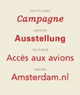
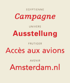
Adrian Frutiger's first, commercial typeface was Président – a set of titling capital letters with small, bracketed serifs, released in 1954. A calligraphic, informal, script face, Ondine ("wave" in French), also was released in 1954. In 1955, Méridien, a glyphic, old-style, serif text face was released. The typeface shows inspiration by Nicholas Jenson, and, in the Méridien type, Frutiger's ideas of letter construction, unity, and organic form, are first expressed together. In 1956, he designed his first-of-three, slab-serif typefaces – Egyptienne
, on the Clarendon model; after Univers, it was the second, new text face commissioned for photocomposition processing.
Charles Peignot envisioned a large, unified font family, that might be set in both the metal and the photocomposition systems. Impressed by the success of the Bauer foundry's Futura
typeface, Peignot encouraged a new, geometric sans-serif type in competition. Frutiger disliked the regimentation of Futura, and persuaded Peignot that the new sans-serif should be based on the realist (neo-grotesque) model. The 1896 face, Akzidenz Grotesk
, is cited as the primary model. To maintain unity across the 21 variants, each weight and width, in roman and italic, was drawn and approved before any matrices were cut. In the Univers font, Frutiger introduced his two-digit numeration; the first digit (3 though 8) indicates the weight, "3" the lightest, "8" the heaviest. The second digit indicates the face-width and either roman or oblique. The response to Univers was immediate and positive; he claimed it became the model for his future typefaces: Serifa (1967) and Glypha (1977) are based upon it.
In the early 1970s, the RATP, the public transport authority of Paris, asked him to examine the Paris Metro
signage. He created a Univers font variation – a set of capitals and numbers specifically for white-on-dark-blue backgrounds in poor light. The success of this modern, yet human, typeface, spurred the French airport authority's commissioning a "way-finding signage" alphabet for the new Charles de Gaulle International Airport
in the Roissy suburb of Paris. The "way-finding-signage" commission brief required a typeface both legible from afar and from an angle. Frutiger considered adapting Univers, but decided it was dated as too Sixties. The resultant typeface is an amalgamation of Univers tempered with organic influences of the Gill Sans
, a humanist sans-serif typeface by Eric Gill, and Edward Johnston's type for the London Transport, and Roger Excoffon's Antique Olive. Originally titled Roissy, the typeface was renamed Frutiger when the Mergenthaler Linotype Company released it for public use in 1976.
Frutiger's 1984 typeface Versailles is an old-style serif text with capitals like those in the earlier Président. In Versailles, the serifs are small and glyphic. In 1988, Frutiger completed Avenir
("future" in French), inspired by Futura, with structural likeness to the neo-grotesques; Avenir has a full series of unified weights. In 1991, he finished Vectora, a design influenced by Morris Fuller Benton's
type faces Franklin Gothic
and News Gothic
. The resultant face has a tall x-height
and is legible in small-point sizes.
In the late 1990s, Frutiger began collaborating on refining and expanding the Univers, Frutiger, and Avenir, in addressing hinting for screen display. Univers was reissued with sixty-three variants; Frutiger was reissued as Frutiger Next with true italic and additional weights. Collaborating with Linotype designer Akira Kobayashi, Frutiger expanded the Avenir font family with light weights, heavy weights, and a condensed version that were released as the Avenir Next font.
Adrian Frutiger's career and typeface development spans the hot metal
, phototypesetting
, and digital typesetting eras. Currently, he lives near Bern.
He also designed a wordmark for the National Institute of Design in Ahmedabad, India. Originally, the institute was named National Design Institute, however, the institute re-named itself to match Adrian Frutiger's stylized NID logotype alongside the name "National Institute of Design."
Univers
Univers is the name of a realist sans-serif typeface designed by Adrian Frutiger in 1954.Originally conceived and released by Deberny & Peignot in 1957, the type library was acquired in 1972 by Haas. Haas'sche Schriftgiesserei was later folded into the D...
and Frutiger
Frutiger
Frutiger is a series of typefaces named after its designer, Adrian Frutiger. Initially available as a sans serif, it was later expanded to include ornamental and serif typefaces.-Distinctive characteristics:Characteristics of this typeface are:...
.
Early life
Adrian Frutiger was born in UnterseenUnterseen
Unterseen is a municipality in the Interlaken-Oberhasli administrative district in the canton of Bern in Switzerland.It is the highest town on the Aare, in the Bödeli watershed, between Lake Thun and Lake Brienz...
, Canton of Bern, as the son of a weaver. As a boy, he experimented with invented scripts and stylized handwriting in negative reaction to the formal, cursive penmanship then required by Swiss schools. His early interest in sculpture was discouraged by his father and by his secondary school teachers; they encouraged him to work in printing. Though in the world of print, he maintains the love of sculpture that has influenced his type forms.
Formative years
At the age of sixteen, he was apprenticed four years, as a compositor, to the printer Otto Schaerffli in InterlakenInterlaken
Interlaken is a municipality in the Interlaken-Oberhasli administrative district in the Canton of Bern in Switzerland, a well-known tourist destination in the Bernese Oberland.-History:...
; between 1949 and 1951 he studied under Walter Käch and Alfred Willimann in the Kunstgewerbeschule
Kunstgewerbeschule
A Kunstgewerbeschule was the old name for an advanced school of applied arts in German-speaking countries. The first such schools were opened in Kassel in 1867 and Berlin and Munich in 1868 with other German towns following. They are now merged into universities....
(school of applied arts) in Zürich, where students studied monumental inscriptions from Roman forum rubbings. At the Kunstgewerbeschule, Frutiger primarily concentrated on calligraphy — a craft favouring the nib and the brush, instead of drafting tools.
Work summary
Deberny & Peignot
Deberny & Peignot was a French type foundry, created by the 1923 merger of Peignot foundry and the Laurent & Deberny foundry. It was bought by the Haas Type Foundry of Switzerland in 1972, which in turn was merged into D...
, recruited Frutiger based upon the quality of the illustrated essay Schrift / Écriture / Lettering: the development of European letter types carved in wood. Frutiger's wood-engraved illustrations of the essay demonstrated his skill, meticulousness, and knowledge of letterforms. At Deberny & Peignot foundry, Frutiger designed the typefaces "Président", "Méridien", and "Ondine". In the event, Charles Peignot set Frutiger to work upon converting extant typefaces for the new phototypesetting
Phototypesetting
Phototypesetting was a method of setting type, rendered obsolete with the popularity of the personal computer and desktop publishing software, that uses a photographic process to generate columns of type on a scroll of photographic paper...
Linotype equipment.
Adrian Frutiger's first, commercial typeface was Président – a set of titling capital letters with small, bracketed serifs, released in 1954. A calligraphic, informal, script face, Ondine ("wave" in French), also was released in 1954. In 1955, Méridien, a glyphic, old-style, serif text face was released. The typeface shows inspiration by Nicholas Jenson, and, in the Méridien type, Frutiger's ideas of letter construction, unity, and organic form, are first expressed together. In 1956, he designed his first-of-three, slab-serif typefaces – Egyptienne
Egyptienne
For the Royal Navy Frigate, see HMS Egyptienne Egyptienne is a serif typeface belonging to the classification slab serif, or Egyptian, where the serifs are unbracketed and similar in weight to the horizontal strokes of the letters...
, on the Clarendon model; after Univers, it was the second, new text face commissioned for photocomposition processing.
Charles Peignot envisioned a large, unified font family, that might be set in both the metal and the photocomposition systems. Impressed by the success of the Bauer foundry's Futura
Futura (typeface)
In typography, Futura is a geometric sans-serif typeface designed in 1927 by Paul Renner. It is based on geometric shapes that became representative visual elements of the Bauhaus design style of 1919–1933...
typeface, Peignot encouraged a new, geometric sans-serif type in competition. Frutiger disliked the regimentation of Futura, and persuaded Peignot that the new sans-serif should be based on the realist (neo-grotesque) model. The 1896 face, Akzidenz Grotesk
Akzidenz Grotesk
Akzidenz-Grotesk is a grotesque typeface originally released by the Berthold Type Foundry in 1896 under the name Accidenz-Grotesk...
, is cited as the primary model. To maintain unity across the 21 variants, each weight and width, in roman and italic, was drawn and approved before any matrices were cut. In the Univers font, Frutiger introduced his two-digit numeration; the first digit (3 though 8) indicates the weight, "3" the lightest, "8" the heaviest. The second digit indicates the face-width and either roman or oblique. The response to Univers was immediate and positive; he claimed it became the model for his future typefaces: Serifa (1967) and Glypha (1977) are based upon it.
In the early 1970s, the RATP, the public transport authority of Paris, asked him to examine the Paris Metro
Paris Métro
The Paris Métro or Métropolitain is the rapid transit metro system in Paris, France. It has become a symbol of the city, noted for its density within the city limits and its uniform architecture influenced by Art Nouveau. The network's sixteen lines are mostly underground and run to 214 km ...
signage. He created a Univers font variation – a set of capitals and numbers specifically for white-on-dark-blue backgrounds in poor light. The success of this modern, yet human, typeface, spurred the French airport authority's commissioning a "way-finding signage" alphabet for the new Charles de Gaulle International Airport
Charles de Gaulle International Airport
Paris-Charles de Gaulle Airport , also known as Roissy Airport , in the Paris area, is one of the world's principal aviation centres, as well as France's largest airport. It is named after Charles de Gaulle , leader of the Free French Forces and founder of the French Fifth Republic...
in the Roissy suburb of Paris. The "way-finding-signage" commission brief required a typeface both legible from afar and from an angle. Frutiger considered adapting Univers, but decided it was dated as too Sixties. The resultant typeface is an amalgamation of Univers tempered with organic influences of the Gill Sans
Gill Sans
Gill Sans is a sans-serif typeface designed by Eric Gill.The original design appeared in 1926 when Douglas Cleverdon opened a bookshop in his home town of Bristol, where Eric Gill painted the fascia over the window in sans-serif capitals that would later be known as Gill Sans...
, a humanist sans-serif typeface by Eric Gill, and Edward Johnston's type for the London Transport, and Roger Excoffon's Antique Olive. Originally titled Roissy, the typeface was renamed Frutiger when the Mergenthaler Linotype Company released it for public use in 1976.
Frutiger's 1984 typeface Versailles is an old-style serif text with capitals like those in the earlier Président. In Versailles, the serifs are small and glyphic. In 1988, Frutiger completed Avenir
Avenir
Avenir may refer to:* Avenir , designed by Adrian Frutiger* Avenir Business Solutions, a IT resourcing and Software Development company based in London,UK* Avenir Telecom, a telecommunications company based in Marseille, France...
("future" in French), inspired by Futura, with structural likeness to the neo-grotesques; Avenir has a full series of unified weights. In 1991, he finished Vectora, a design influenced by Morris Fuller Benton's
Morris Fuller Benton
Morris Fuller Benton was an influential American typeface designer who headed the design department of the American Type Founders , for which he was the chief type designer from 1900 to 1937...
type faces Franklin Gothic
Franklin Gothic
Franklin Gothic and its related faces are realist sans-serif typefaces originated by Morris Fuller Benton in 1902. “Gothic” is an increasingly archaic term meaning sans-serif. Franklin Gothic has been used in many advertisements and headlines in newspapers. The typeface continues to maintain a...
and News Gothic
News Gothic
News Gothic is a realist sans-serif typeface designed by Morris Fuller Benton, and released by the American Type Founders in 1908. The typeface was originally drawn in two lighter weights, a medium text weight using the title News Gothic, and a closely related light weight marketed under the name...
. The resultant face has a tall x-height
X-height
In typography, the x-height or corpus size refers to the distance between the baseline and the mean line in a typeface. Typically, this is the height of the letter x in the font , as well as the u, v, w, and z...
and is legible in small-point sizes.
In the late 1990s, Frutiger began collaborating on refining and expanding the Univers, Frutiger, and Avenir, in addressing hinting for screen display. Univers was reissued with sixty-three variants; Frutiger was reissued as Frutiger Next with true italic and additional weights. Collaborating with Linotype designer Akira Kobayashi, Frutiger expanded the Avenir font family with light weights, heavy weights, and a condensed version that were released as the Avenir Next font.
Adrian Frutiger's career and typeface development spans the hot metal
Hot metal typesetting
In printing and typography, hot metal typesetting refers to 19th-century technologies for typesetting text in letterpress printing. This method injects molten type metal into a mold that has the shape of one or more glyphs...
, phototypesetting
Phototypesetting
Phototypesetting was a method of setting type, rendered obsolete with the popularity of the personal computer and desktop publishing software, that uses a photographic process to generate columns of type on a scroll of photographic paper...
, and digital typesetting eras. Currently, he lives near Bern.
Typefaces
Frutiger's typefaces include:- Ondine (1954)
- President (1954)
- Meridien (1955)
- EgyptienneEgyptienneFor the Royal Navy Frigate, see HMS Egyptienne Egyptienne is a serif typeface belonging to the classification slab serif, or Egyptian, where the serifs are unbracketed and similar in weight to the horizontal strokes of the letters...
(1956) - UniversUniversUnivers is the name of a realist sans-serif typeface designed by Adrian Frutiger in 1954.Originally conceived and released by Deberny & Peignot in 1957, the type library was acquired in 1972 by Haas. Haas'sche Schriftgiesserei was later folded into the D...
(1957) - Apollo (1962)
- Serifa (1967)
- OCR-BOCR-BThe OCR-B is a set of monospace font developed in 1968 by Adrian Frutiger for Monotype by following the European Computer Manufacturer's Association standard. Its function was to facilitate the optical character recognition operations by specific electronic devices. It has been accepted as world...
(1968) - Iridium (1975)
- FrutigerFrutigerFrutiger is a series of typefaces named after its designer, Adrian Frutiger. Initially available as a sans serif, it was later expanded to include ornamental and serif typefaces.-Distinctive characteristics:Characteristics of this typeface are:...
(for Charles de Gaulle Airport 1975, Linotype 1976)
- Glypha (1977)
- Icone (1980)
- Breughel (1982)
- Versailles (1982)
- Linotype Centennial (1986)
- AvenirAvenir (typeface)Avenir is a geometric sans-serif typeface designed by Adrian Frutiger in 1988, and released by Linotype GmbH, now a subsidiary of Monotype Corporation....
(1988) - Westside (1989)
- Herculanum (1990)
- Vectora (1990)
- Linotype DidotDidot (typeface)Didot is a name given to a group of typefaces named after the famous French printing and type producing family. The classification is known as modern, or Didone. The typeface we know today was based on a collection of related types developed in the period 1784–1811. Firmin Didot cut the letters,...
(1991)
- Pompeijana (1992)
- Rusticana (1993)
- Frutiger Stones (1998)
- Frutiger Symbols (1998)
- Linotype Univers (1999)
- Frutiger Next (2000)
- Nami (2006)
- Frutiger Arabic (2007)
- Frutiger Serif (2008)
- Neue Frutiger (2009)
Awards
- 1986 - The Gutenberg Prize of the City of Mainz (Germany)
- 1987 - Medal of the Type Directors Club of New York
- 1993 - Officier medallion, awarded by the Ordre des Arts et des LettresOrdre des Arts et des LettresThe Ordre des Arts et des Lettres is an Order of France, established on 2 May 1957 by the Minister of Culture, and confirmed as part of the Ordre national du Mérite by President Charles de Gaulle in 1963...
(Order of Arts and Letters) - 1993 - Grand Prix National des Arts Graphiques (France).
- 2006 - Typography Award from The Society of Typographic AficionadosSociety of Typographic AficionadosThe Society of Typographic Aficionados is an international not-for-profit organization dedicated to the promotion, study, and support of type, its history and development, its use in the world of print and digital imagery, its designers, and its admirers....
(SOTA) - 2006 – TDC2 award in the Type System / Superfamily category
- 2009 – European Design Hall of Fame
Current work
In 2003, the Swiss watchmaker Ventura commissioned him to design a new watch face for a limited-edition line of wristwatches.He also designed a wordmark for the National Institute of Design in Ahmedabad, India. Originally, the institute was named National Design Institute, however, the institute re-named itself to match Adrian Frutiger's stylized NID logotype alongside the name "National Institute of Design."
Select bibliography
- Erich Alb (Ed.): Adrian Frutiger - Formen und Gegenformen/Forms and Counterforms, Syndor Press 1998; Niggli: ISBN 3-7212-0440-9
- Adrian Frutiger: Ein Leben für die Schrift, Schlaefli & Maurer 2003, ISBN 3-858-84015-7
- Adrian Frutiger, Horst Heiderhoff: Der Mensch und seine Zeichen, Marixverlag 2004, ISBN 3-937-71563-0
- Adrian Frutiger: Nachdenken über Zeichen und Schrift, Haupt 2005, ISBN 3-258-06811-9
- Anne Cuneo: Adrian Frutiger – Schriftengestalter, DVD 2005, EAN 7611372200269, ISANIsanIsan is the northeastern region of Thailand. It is located on the Khorat Plateau, bordered by the Mekong River to the north and east, by Cambodia to the southeast and the Prachinburi mountains south of Nakhon Ratchasima...
0000-0000-D4FB-0000-F - Adrian Frutiger: Symbole. Geheimnisvolle Bilder-Schriften, Zeichen, Signale, Labyrinthe, Heraldik, Haupt 2008, ISBN 3-258-07323-6
- Schweiz. Stiftung Schrift und Typographie, Heidrun Osterer, Philipp Stamm (Eds.): Adrian Frutiger - Typefaces. The Complete Works, Birkhäuser 2009, ISBN 978-3-7643-8581-1
- Adrian Frutiger – Der Mann von Schwarz und Weiss, DVD Artfilm 2005, ISBN 3-722-50049-4, EAN 9783722500492, ISANIsanIsan is the northeastern region of Thailand. It is located on the Khorat Plateau, bordered by the Mekong River to the north and east, by Cambodia to the southeast and the Prachinburi mountains south of Nakhon Ratchasima...
0000-0001-83B9-0000-W - Anja Bodmer und Jürg Brühlmann: Read Me – mit Adrian Frutiger durch die Welt der Zeichen und Buchstaben, Hochparterre Bücher AG, 2008, ISBN 978-3-909928-09-5