
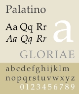
Palatino
Encyclopedia
Palatino is the name of a large typeface
family that began as an old style serif
typeface designed by Hermann Zapf
initially released in 1948 by the Linotype foundry.
In 1999, Zapf revised Palatino for Linotype and Microsoft
, called Palatino Linotype. The revised family incorporated extended Latin
, Greek
, and Cyrillic
character sets.
Under the collaboration of Zapf and Akira Kobayashi, the Palatino typeface family was expanded. Linotype released the Palatino nova, Palatino Sans, and Palatino Sans Informal families, expanding the Palatino typeface families to include humanist sans-serif typefaces. Palatino nova was released in 2005, while the others were released in 2006.
master of calligraphy
Giambattista Palatino, Palatino is based on the humanist fonts of the Italian Renaissance
, which mirror the letters formed by a broad nib pen; this gives a calligraphic
grace. But where the Renaissance faces tend to use smaller letters with longer vertical lines (ascenders and descender
s) with lighter strokes, Palatino has larger proportions, and is considered to be a much easier to read typeface
.
It remains one of the most widely-used (and copied) text typefaces, has been adapted to virtually every type of technology, and is one of the ten most used serif typefaces. It is one of several related typefaces by Zapf, each showing influence of the Italian Renaissance letter forms. The group includes Palatine, Sistina, Michaelangelo Titling, and Aldus
, which takes inspiration from printing types cut by Francesco Griffo
c. 1495 in the print shop of Aldus Manutius
.
.
Palatino nova has reduced support on extended Latin, Greek, Cyrillic characters. In particular, Greek and Cyrillic is only available in Regular and Bold weight fonts. However, extended accented Latin characters, ligatures, small letter forms, symbols are available in Private Use Area block. Palatino nova Titling replaces lowercase characters with true small capitals, and the supports for Greek Extended and Cyrillic characters are reduced.
The font family was premiered on 2005-11-24, the same day as Hermann Zapf’s 87th birthday celebration.
but have a softer, more organic feel. Unlike the serifed counterpart, the Sans families do not have full Greek or Cyrillic characters.
in style but with a strong influence of Thuluth
style.
This family only comes in 1 font, corresponding to Palatino nova Regular. It supports basic Latin, Arabic, Persian, and Urdu scripts. It also includes proportional and tabular numerals for the supported languages.
Linotype and Adobe Systems
sell authentic versions of Palatino and derivative families. Certain hot metal
versions of Palatino, of smaller x-height, are considered both more legible and elegant to many people. In the Bitstream
font collection, the Palatino equivalent is called Zapf Calligraphic.
Palatino Linotype is shipped with Windows 2000 or later, and Microsoft Office Professional Edition 2003.
 Zapf also designed Aldus
, which appeared in the D. Stempel AG catalog in 1954. Both Aldus and Palatino were Zapf’s new form of old style typefaces inspired by the Renaissance. Originally intended as the book or text weight for Zapf's Palatino font family, it was instead released as a separate family.
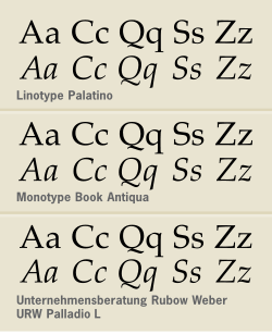
Microsoft
distributes a similar typeface, Book Antiqua (originally by Monotype
), which is considered by many to be an imitation. Book Antiqua was designed as an alternative to licensing the fonts mandated by Adobe
's PostScript
standard. Both Book Antiqua and Arial
(the alternative for Helvetica
) share the original typefaces' character width, spacing and kerning
properties. However, Book Antiqua resembles Palatino much more than Arial does Helvetica; indeed, the two are quite difficult to tell apart. Discernable differences include in the following characters:
In 1993, Zapf resigned from l'Association Typographique Internationale (ATypI
) over what he viewed as its hypocritical attitude toward unauthorized copying by prominent ATypI members. In the United States, the abstract design of a typeface is not protected by copyright, and can be imitated freely (unless the typeface is protected by a design patent, which is of much more limited duration and rarely applied for). Copyright protection is available for the representation of a typeface in software (a computer font), and the names of typefaces can be protected by trademark.
Microsoft has since licensed and distributes a version of Zapf's original design called Palatino Linotype in Windows 2000
, XP
and Vista
.
URW Palladio L, another similar typeface is available, this time by URW (Unternehmensberatung Rubow Weber — from the founders' names now retitled URW++). Zapf actually did work with URW on this typeface, but it could not have the same name because Linotype has a trademark on the name Palatino.
TeX Gyre Pagella is another similar typeface based on the URW Palladio L font. Pagella includes accents for European languages as well as glyphs for a few non-European languages. This typeface is released in formats compatible with LaTeX
as well as with modern OpenType
compatible systems.
FPL Neu is yet another typeface based on URW Palladio L font. It has both text figures
and lining figures. It is available both in Type 1
-format and OpenType
-format.
Zapf Renaissance Antiqua was a newer interpretation by Zapf of the same general design.
Zapf Calligraphic 801 is a version of Palatino from the Bitstream type foundry, again with Zapf's blessing.
Type Design Competition 2007 award under Type System / Superfamily category.
Palatino Arabic won 2008 Type Directors Club
TDC2 2008 award under Text / Type Family category.
Typeface
In typography, a typeface is the artistic representation or interpretation of characters; it is the way the type looks. Each type is designed and there are thousands of different typefaces in existence, with new ones being developed constantly....
family that began as an old style serif
Serif
In typography, serifs are semi-structural details on the ends of some of the strokes that make up letters and symbols. A typeface with serifs is called a serif typeface . A typeface without serifs is called sans serif or sans-serif, from the French sans, meaning “without”...
typeface designed by Hermann Zapf
Hermann Zapf
Hermann Zapf is a German typeface designer who lives in Darmstadt, Germany. He is married to calligrapher and typeface designer Gudrun Zapf von Hesse....
initially released in 1948 by the Linotype foundry.
In 1999, Zapf revised Palatino for Linotype and Microsoft
Microsoft
Microsoft Corporation is an American public multinational corporation headquartered in Redmond, Washington, USA that develops, manufactures, licenses, and supports a wide range of products and services predominantly related to computing through its various product divisions...
, called Palatino Linotype. The revised family incorporated extended Latin
Latin alphabet
The Latin alphabet, also called the Roman alphabet, is the most recognized alphabet used in the world today. It evolved from a western variety of the Greek alphabet called the Cumaean alphabet, which was adopted and modified by the Etruscans who ruled early Rome...
, Greek
Greek alphabet
The Greek alphabet is the script that has been used to write the Greek language since at least 730 BC . The alphabet in its classical and modern form consists of 24 letters ordered in sequence from alpha to omega...
, and Cyrillic
Cyrillic alphabet
The Cyrillic script or azbuka is an alphabetic writing system developed in the First Bulgarian Empire during the 10th century AD at the Preslav Literary School...
character sets.
Under the collaboration of Zapf and Akira Kobayashi, the Palatino typeface family was expanded. Linotype released the Palatino nova, Palatino Sans, and Palatino Sans Informal families, expanding the Palatino typeface families to include humanist sans-serif typefaces. Palatino nova was released in 2005, while the others were released in 2006.
Palatino
Named after 16th century ItalianItaly
Italy , officially the Italian Republic languages]] under the European Charter for Regional or Minority Languages. In each of these, Italy's official name is as follows:;;;;;;;;), is a unitary parliamentary republic in South-Central Europe. To the north it borders France, Switzerland, Austria and...
master of calligraphy
Calligraphy
Calligraphy is a type of visual art. It is often called the art of fancy lettering . A contemporary definition of calligraphic practice is "the art of giving form to signs in an expressive, harmonious and skillful manner"...
Giambattista Palatino, Palatino is based on the humanist fonts of the Italian Renaissance
Renaissance
The Renaissance was a cultural movement that spanned roughly the 14th to the 17th century, beginning in Italy in the Late Middle Ages and later spreading to the rest of Europe. The term is also used more loosely to refer to the historical era, but since the changes of the Renaissance were not...
, which mirror the letters formed by a broad nib pen; this gives a calligraphic
Calligraphy
Calligraphy is a type of visual art. It is often called the art of fancy lettering . A contemporary definition of calligraphic practice is "the art of giving form to signs in an expressive, harmonious and skillful manner"...
grace. But where the Renaissance faces tend to use smaller letters with longer vertical lines (ascenders and descender
Descender
In typography, a descender is the portion of a letter that extends below the baseline of a font. The line that descenders reach down to is known as the beard line....
s) with lighter strokes, Palatino has larger proportions, and is considered to be a much easier to read typeface
Typeface
In typography, a typeface is the artistic representation or interpretation of characters; it is the way the type looks. Each type is designed and there are thousands of different typefaces in existence, with new ones being developed constantly....
.
It remains one of the most widely-used (and copied) text typefaces, has been adapted to virtually every type of technology, and is one of the ten most used serif typefaces. It is one of several related typefaces by Zapf, each showing influence of the Italian Renaissance letter forms. The group includes Palatine, Sistina, Michaelangelo Titling, and Aldus
Aldus (typeface)
Aldus is an old style serif typeface designed by Hermann Zapf in 1954. It is named for Aldus Manutius, the famous fifteenth century Venetian printer....
, which takes inspiration from printing types cut by Francesco Griffo
Francesco Griffo
Francesco Griffo , also called Francesco da Bologna, was a fifteenth-century Venetian punchcutter. He worked for Aldus Manutius, designing that printer's more important typefaces, including the first italic type...
c. 1495 in the print shop of Aldus Manutius
Aldus Manutius
Aldus Pius Manutius , the Latinised name of Aldo Manuzio —sometimes called Aldus Manutius, the Elder to distinguish him from his grandson, Aldus Manutius, the Younger—was an Italian humanist who became a printer and publisher when he founded the Aldine Press at Venice.His publishing legacy includes...
.
Palatino Linotype
Palatino Linotype is a version of the Palatino family that incorporates extended Latin, Greek, Cyrillic characters, as well as currency signs, subscripts and superscripts, and fractions. The family includes roman and italic in text and bold weights. It is one of the few fonts to incorporate an interrobangInterrobang
The interrobang, interabang , , is a nonstandard punctuation mark used in various written languages and intended to combine the functions of the question mark and the exclamation mark or exclamation point . The glyph is a superimposition of these two marks...
.
Palatino nova
Palatino nova is a redesigned version of Palatino, by Hermann Zapf and Akira Kobayashi. This Palatino nova typeface family includes roman and italics in the light, text, medium, and bold weights, a titling face formerly called Michelangelo Titling, and a large and small capital face called Palatino nova Imperial formerly called Sistina.Palatino nova has reduced support on extended Latin, Greek, Cyrillic characters. In particular, Greek and Cyrillic is only available in Regular and Bold weight fonts. However, extended accented Latin characters, ligatures, small letter forms, symbols are available in Private Use Area block. Palatino nova Titling replaces lowercase characters with true small capitals, and the supports for Greek Extended and Cyrillic characters are reduced.
The font family was premiered on 2005-11-24, the same day as Hermann Zapf’s 87th birthday celebration.
Palatino Sans
In Palatino Sans, the specimens shown in the preannouncement resemble OptimaOptima
Optima is a humanist sans-serif typeface designed by Hermann Zapf between 1952 and 1955 for the D. Stempel AG foundry, Frankfurt, Germany.-Characteristics:...
but have a softer, more organic feel. Unlike the serifed counterpart, the Sans families do not have full Greek or Cyrillic characters.
Palatino Sans Informal
Palatino Sans Informal incorporates informal characteristics to the Palatino Sans, such as asymmetrical A, K, N, W, X, Y, w.Palatino Arabic
It is a family designed by Lebanese designer Nadine Chahine and Hermann Zapf. The design is based on the Al-Ahram typeface designed by Zapf in 1956 but reworked and modified to fit the Palatino nova family. The design is NaskhNaskh (script)
Naskh is a specific calligraphic style for writing in the Arabic alphabet, thought to be invented by the Iranian calligrapher Ibn Muqlah Shirazi . The root of this Arabic term means "to copy". It either refers to the fact that it replaced its predecessor, Kufic script, or that this style allows...
in style but with a strong influence of Thuluth
Thuluth
Thuluth is a script variety of Islamic calligraphy invented by the Persian Ibn Muqlah Shirazi, which made its first appearance in the 11th century CE . The straight angular forms of Kufic were replaced in the new script by curved and oblique lines. In Thuluth, one-third of each letter slopes, from...
style.
This family only comes in 1 font, corresponding to Palatino nova Regular. It supports basic Latin, Arabic, Persian, and Urdu scripts. It also includes proportional and tabular numerals for the supported languages.
Availability
The digital type foundriesType foundry
A type foundry is a company that designs or distributes typefaces. Originally, type foundries manufactured and sold metal and wood typefaces and matrices for line-casting machines like the Linotype and Monotype machines designed to be printed on letterpress printers...
Linotype and Adobe Systems
Adobe Systems
Adobe Systems Incorporated is an American computer software company founded in 1982 and headquartered in San Jose, California, United States...
sell authentic versions of Palatino and derivative families. Certain hot metal
Hot metal typesetting
In printing and typography, hot metal typesetting refers to 19th-century technologies for typesetting text in letterpress printing. This method injects molten type metal into a mold that has the shape of one or more glyphs...
versions of Palatino, of smaller x-height, are considered both more legible and elegant to many people. In the Bitstream
Bitstream Inc.
Bitstream Inc. is a type foundry that produces digital typefaces . Founded in 1981 by Matthew Carter and Mike Parker among others, it claims to be the oldest such company...
font collection, the Palatino equivalent is called Zapf Calligraphic.
Palatino Linotype is shipped with Windows 2000 or later, and Microsoft Office Professional Edition 2003.
Variants and similar typefaces
Aldus (typeface)
Aldus is an old style serif typeface designed by Hermann Zapf in 1954. It is named for Aldus Manutius, the famous fifteenth century Venetian printer....
, which appeared in the D. Stempel AG catalog in 1954. Both Aldus and Palatino were Zapf’s new form of old style typefaces inspired by the Renaissance. Originally intended as the book or text weight for Zapf's Palatino font family, it was instead released as a separate family.
Microsoft
Microsoft
Microsoft Corporation is an American public multinational corporation headquartered in Redmond, Washington, USA that develops, manufactures, licenses, and supports a wide range of products and services predominantly related to computing through its various product divisions...
distributes a similar typeface, Book Antiqua (originally by Monotype
Monotype Corporation
Monotype Imaging Holdings is a Delaware corporation based in Woburn, Massachusetts and specializing in typesetting and typeface design as well as text and imaging solutions for use with consumer electronics devices. Monotype Imaging Holdings is the owner of Monotype Imaging Inc., Linotype,...
), which is considered by many to be an imitation. Book Antiqua was designed as an alternative to licensing the fonts mandated by Adobe
Adobe Systems
Adobe Systems Incorporated is an American computer software company founded in 1982 and headquartered in San Jose, California, United States...
's PostScript
PostScript
PostScript is a dynamically typed concatenative programming language created by John Warnock and Charles Geschke in 1982. It is best known for its use as a page description language in the electronic and desktop publishing areas. Adobe PostScript 3 is also the worldwide printing and imaging...
standard. Both Book Antiqua and Arial
Arial
Arial, sometimes marketed or displayed in software as Arial MT, is a sans-serif typeface and set of computer fonts. Fonts from the Arial family are packaged with Microsoft Windows, some other Microsoft software applications, Apple Mac OS X and many PostScript 3 computer printers...
(the alternative for Helvetica
Helvetica
Helvetica is a widely used sans-serif typeface developed in 1957 by Swiss typeface designer Max Miedinger with Eduard Hoffmann.-Visual distinctive characteristics:Characteristics of this typeface are:lower case:square dot over the letter i....
) share the original typefaces' character width, spacing and kerning
Kerning
In typography, kerning is the process of adjusting the spacing between characters in a proportional font, usually to achieve a visually pleasing result. Kerning is the adjustment of the space between individual letter forms vs. tracking which is the uniform adjustment of spacing applied over a...
properties. However, Book Antiqua resembles Palatino much more than Arial does Helvetica; indeed, the two are quite difficult to tell apart. Discernable differences include in the following characters:
- S — wider for Book Antiqua;
- K and R — the lower-right serifs are 'stubbier' for Book Antiqua (more apparent due to thinner strokes on the diagonal 'leg' for Palatino Linotype);
- 1 — the top serif is longer narrower for Book Antiqua (making the outward taper more obvious).
- Italic forms for all letters are taller and narrower for Book Antiqua than for Palatino Linotype. The two fonts are more distinguishable in their italic forms than in their Roman forms.
In 1993, Zapf resigned from l'Association Typographique Internationale (ATypI
ATypI
The ATypI or the Association Typographique Internationale is an international non-profit organisation dedicated to typography.-The organisation:...
) over what he viewed as its hypocritical attitude toward unauthorized copying by prominent ATypI members. In the United States, the abstract design of a typeface is not protected by copyright, and can be imitated freely (unless the typeface is protected by a design patent, which is of much more limited duration and rarely applied for). Copyright protection is available for the representation of a typeface in software (a computer font), and the names of typefaces can be protected by trademark.
Microsoft has since licensed and distributes a version of Zapf's original design called Palatino Linotype in Windows 2000
Windows 2000
Windows 2000 is a line of operating systems produced by Microsoft for use on personal computers, business desktops, laptops, and servers. Windows 2000 was released to manufacturing on 15 December 1999 and launched to retail on 17 February 2000. It is the successor to Windows NT 4.0, and is the...
, XP
Windows XP
Windows XP is an operating system produced by Microsoft for use on personal computers, including home and business desktops, laptops and media centers. First released to computer manufacturers on August 24, 2001, it is the second most popular version of Windows, based on installed user base...
and Vista
Windows Vista
Windows Vista is an operating system released in several variations developed by Microsoft for use on personal computers, including home and business desktops, laptops, tablet PCs, and media center PCs...
.
URW Palladio L, another similar typeface is available, this time by URW (Unternehmensberatung Rubow Weber — from the founders' names now retitled URW++). Zapf actually did work with URW on this typeface, but it could not have the same name because Linotype has a trademark on the name Palatino.
TeX Gyre Pagella is another similar typeface based on the URW Palladio L font. Pagella includes accents for European languages as well as glyphs for a few non-European languages. This typeface is released in formats compatible with LaTeX
LaTeX
LaTeX is a document markup language and document preparation system for the TeX typesetting program. Within the typesetting system, its name is styled as . The term LaTeX refers only to the language in which documents are written, not to the editor used to write those documents. In order to...
as well as with modern OpenType
OpenType
OpenType is a format for scalable computer fonts. It was built on its predecessor TrueType, retaining TrueType's basic structure and adding many intricate data structures for prescribing typographic behavior...
compatible systems.
FPL Neu is yet another typeface based on URW Palladio L font. It has both text figures
Text figures
Text figures are numerals typeset with varying heights in a fashion that resembles a typical line of running text, hence the name...
and lining figures. It is available both in Type 1
Type 1
Type 1 or Type I may refer to:*US F1 Type 1, 2010 F1 Car*Bugatti Type 1, an automobile*Diabetes mellitus type 1 , insulin-dependent diabetes*Type 1 37 mm Anti-Tank Gun*Type 1 47 mm Anti-Tank Gun...
-format and OpenType
OpenType
OpenType is a format for scalable computer fonts. It was built on its predecessor TrueType, retaining TrueType's basic structure and adding many intricate data structures for prescribing typographic behavior...
-format.
Zapf Renaissance Antiqua was a newer interpretation by Zapf of the same general design.
Zapf Calligraphic 801 is a version of Palatino from the Bitstream type foundry, again with Zapf's blessing.
Awards
Palatino Sans and Palatino Sans Informal won Type Directors ClubType Directors Club
The Type Directors Club is an international organization for those devoted to excellence in typography in all its forms. Created in 1946, the organization’s mission is to raise the standards of typography and related fields within the graphic arts. The TDC supports research and education, and...
Type Design Competition 2007 award under Type System / Superfamily category.
Palatino Arabic won 2008 Type Directors Club
Type Directors Club
The Type Directors Club is an international organization for those devoted to excellence in typography in all its forms. Created in 1946, the organization’s mission is to raise the standards of typography and related fields within the graphic arts. The TDC supports research and education, and...
TDC2 2008 award under Text / Type Family category.
External links
- Typowiki: Palatino
- Luc Devroye
- Hermann Zapf wrote a life history for Linotype Library, available Here
- Palatino Arabic Regular - by Nadine Chahine, Hermann Zapf
- Palatino Linotype font information (Microsoft typography)
- Font Feature Palatino Sans
- Linotype introduces a new classic - January 26, 2007
- Palatino on Fonts.com