
Gill Sans
Encyclopedia
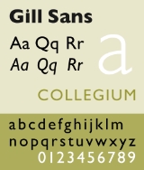
Gill Sans is a sans-serif
typeface
designed by Eric Gill
.
The original design appeared in 1926 when Douglas Cleverdon
opened a bookshop in his home town of Bristol
, where Eric Gill painted the fascia
over the window in sans-serif capitals that would later be known as Gill Sans. In addition, Gill had sketched a design for Cleverdon, intended as a guide for him to make future notices and announcements.
Gill further developed it into a complete font family after Stanley Morison
commissioned the development of Gill Sans to combat the families of Erbar
, Futura
and Kabel
which were being launched in Germany during the latter 1920s. Gill Sans was later released in 1928 by Monotype Corporation.
Gill Sans became popular when in 1929 Cecil Dandridge commissioned Eric Gill to produce Gill Sans to be used on the London and North Eastern Railway for a unique typeface for all the LNER's posters and publicity material.
Gill was a well established sculptor, graphic artist and type designer, and the Gill Sans typeface takes inspiration from Edward Johnston’s
Johnston
typeface for London Underground
, which Gill had worked on while apprenticed to Johnston. Eric Gill attempted to make the ultimate legible sans-serif text face. Gill Sans was designed to function equally well as a text face and for display. It is distributed as a system font in Mac OS X
and is bundled with certain versions of Microsoft
products as Gill Sans MT.
like those found on the Column of Trajan
, and the Caslon
and Baskerville
typefaces.
The capital M from Gill Sans is based on the proportions of a square with the middle strokes meeting at the centre of that square. The Gill Sans typeface family contains fourteen styles and has less of a mechanical feel than geometric sans-serifs like Futura
, because its proportions stemmed from Roman tradition. Unlike realist sans-serif typefaces including Akzidenz Grotesk
and Univers
the lower case is modelled on the lowercase Carolingian script. The Carolingian influence is noticeable in the two-story lowercase a, and g. The lowercase t is similar to old-style serifs in its proportion and oblique terminus of the vertical stroke. Following the humanist model the lowercase italic a becomes single story. The italic e is highly calligraphic, and the lowercase p has a vestigial calligraphic tail reminiscent of the italics of Caslon
and Baskerville
. Gill Sans serves as a model for several later humanist sans-serif typefaces including Syntax
and FF Scala Sans
. An Infant variety of the typeface with single-story versions of the letters a and g also exists.
The basic glyph shapes do not look consistent across font weights and widths, especially in Extra Bold and Ultra Bold weights, and Extra Condensed width. However, even in lighter weights, some letters do not look consistent. For example, in letters p and q, the top strokes of counters do not touch the top of the stems in Light, Bold, Heavy fonts, but touch the top of the stems in Book, Medium fonts.
The original Gill Sans lacked distinctions between numeral 1, uppercase i, and lowercase L, so alternate version of Gill Sans was made that included an alternate 1 that could be used for numerical setting, such as shop window prices and timetables. In the Adobe version, such alternate figure is not included, even in the OpenType version of the font.
Eric Gill removed terminus endings of the vertical stroke in b, d, p and q, but Monotype drawing office revised the forms so that they were preserved in the medium weight, which can be seen on early samples of the series 262. In Gill Sans Pro, the restored endings can be found in Gill Sans Light (in d, p, q only), Bold, Heavy, Extra Bold (p only), Ultra Bold (p only), Condensed, Bold Condensed, Ultra Bold Condensed (p only), Display Bold, Display Extra Bold (p only), Display Bold Condensed, Bold Extra Condensed (d, p only), Shadowed Light (d, q only).
The type is based on the Arabic Naskh
style with a modern look that echoes the proportions and feel of Gill Sans.
Monotype released in August 2005 a collection of 21 fonts including Book, Book Italic, Heavy, Heavy Italic, Display Bold, Display Bold Condensed fonts of Gill Sans. It adds support of Eastern European characters but not Greek and Cyrillic.
: a double storey roman a and g, and a single storey lowercase italic a. Toronto Subway
is based on Johnston
and is often confused with Gill Sans.
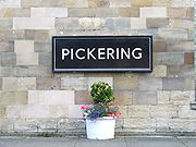 First unveiled in a single uppercase weight in 1928, Gill Sans achieved national prominence almost immediately, when it was chosen the following year to become the standard typeface for the LNER railway system, soon appearing on every facet of the company's identity, from locomotive nameplates and station signage to restaurant car menus, printed timetables and advertising posters.
When British Rail
ways was created by nationalisation in 1948, Gill Sans was used in much of its printed output, including timetables. Specially drawn variations were developed by the British Transport Commission for signs, but these characters are not authentic Gill. The corporate rebranding of BR as British Rail in 1965 introduced Rail Alphabet
for signage, and Helvetica and/or Univers for printed matter. Other users included Penguin Books
' iconic paperback jacket designs from 1935, and Gill Sans became Monotype
's fifth best selling typeface of the twentieth century.
The typeface continues to thrive to this day, often being held to bring an artistic or cultural sensibility
to an organisation's corporate style. Monotype themselves use it in their corporate style, and the typeface was prominently used by many public service organisations. These include Railtrack (and now Network Rail
), which used Gill Sans for printed matter, the Church of England
, which adopted Gill Sans as the typeface for the definitive Common Worship
family of service books published from 2000, and the British Government, which formally adopted Gill Sans as its standard typeface for use in all communications and logos in 2003. The BBC
adopted the typeface as its corporate typeface in 1997. Until 2006, the corporation used the font in all its media output; however, the unveiling of its new idents
for BBC One
and BBC Two
has signalled a shift away from its universal use, as other fonts were used for their respective on-screen identities.
On the business side, Saab Automobile
adopted the font for almost all of its advertising and marketing communications.
Edward Tufte
, the information design theorist, uses Gill Sans on his website and in some of his published works.
in 2010. In countries where typefaces aren't copyrightable (like in the USA) this isn't important but in other parts of the world this makes it possible to freely use the original design for any purposes, including creating digitised versions of the typeface. New digitized versions based on the original design may or may not suffer copyright protection (depending on the given country's view on creative works, and whether they consider visually exact lookalikes "creative" or not), often possessing their own copyright terms.
The name "Gill Sans" is however trademarked (No. 1340167 in the USA and No. 0950970 internationally, filed in 1983 by Monotype) and may not be used to describe the font created.
Sans-serif
In typography, a sans-serif, sans serif or san serif typeface is one that does not have the small projecting features called "serifs" at the end of strokes. The term comes from the French word sans, meaning "without"....
typeface
Typeface
In typography, a typeface is the artistic representation or interpretation of characters; it is the way the type looks. Each type is designed and there are thousands of different typefaces in existence, with new ones being developed constantly....
designed by Eric Gill
Eric Gill
Arthur Eric Rowton Gill was a British sculptor, typeface designer, stonecutter and printmaker, who was associated with the Arts and Crafts movement...
.
The original design appeared in 1926 when Douglas Cleverdon
Douglas Cleverdon
Douglas James Cleverdon was an English bookseller and radio producer, in both fields associated with numerous leading cultural figures in the United Kingdom.-Early life:...
opened a bookshop in his home town of Bristol
Bristol
Bristol is a city, unitary authority area and ceremonial county in South West England, with an estimated population of 433,100 for the unitary authority in 2009, and a surrounding Larger Urban Zone with an estimated 1,070,000 residents in 2007...
, where Eric Gill painted the fascia
Fascia (architecture)
Fascia is a term used in architecture to refer to a frieze or band running horizontally and situated vertically under the roof edge or which forms the outer surface of a cornice and is visible to an outside observer...
over the window in sans-serif capitals that would later be known as Gill Sans. In addition, Gill had sketched a design for Cleverdon, intended as a guide for him to make future notices and announcements.
Gill further developed it into a complete font family after Stanley Morison
Stanley Morison
Stanley Morison was an English typographer, designer and historian of printing.Born in Wanstead, Essex, Morison spent most of his childhood and early adult years at the family home in Fairfax Road, Harringay...
commissioned the development of Gill Sans to combat the families of Erbar
Erbar (typeface)
In typography, Erbar or Erbar-Grotesk was the first geometric sans-serif typeface ever created. Designer Jakob Erbar's aim was to design a printing type which would be free of all individual characteristics, possess thoroughly legible letter forms, and be a purely typographic creation...
, Futura
Futura (typeface)
In typography, Futura is a geometric sans-serif typeface designed in 1927 by Paul Renner. It is based on geometric shapes that became representative visual elements of the Bauhaus design style of 1919–1933...
and Kabel
Kabel (typeface)
Kabel is a geometric sans-serif typeface designed by German typeface designer Rudolf Koch, and released by the Klingspor foundry in 1927. The face was named to honor the newly completed trans-Atlantic telephone cable...
which were being launched in Germany during the latter 1920s. Gill Sans was later released in 1928 by Monotype Corporation.
Gill Sans became popular when in 1929 Cecil Dandridge commissioned Eric Gill to produce Gill Sans to be used on the London and North Eastern Railway for a unique typeface for all the LNER's posters and publicity material.
Gill was a well established sculptor, graphic artist and type designer, and the Gill Sans typeface takes inspiration from Edward Johnston’s
Edward Johnston
Edward Johnston, CBE was a British-Uruguayan craftsman who is regarded, with Rudolf Koch, as the a father of modern calligraphy, in the form of the broad edged pen as a writing tool, a particular form of calligraphy....
Johnston
Johnston (typeface)
Johnston is a humanist sans-serif typeface designed by and named after Edward Johnston. It is well known for its use by Transport for London....
typeface for London Underground
London Underground
The London Underground is a rapid transit system serving a large part of Greater London and some parts of Buckinghamshire, Hertfordshire and Essex in England...
, which Gill had worked on while apprenticed to Johnston. Eric Gill attempted to make the ultimate legible sans-serif text face. Gill Sans was designed to function equally well as a text face and for display. It is distributed as a system font in Mac OS X
Mac OS X
Mac OS X is a series of Unix-based operating systems and graphical user interfaces developed, marketed, and sold by Apple Inc. Since 2002, has been included with all new Macintosh computer systems...
and is bundled with certain versions of Microsoft
Microsoft
Microsoft Corporation is an American public multinational corporation headquartered in Redmond, Washington, USA that develops, manufactures, licenses, and supports a wide range of products and services predominantly related to computing through its various product divisions...
products as Gill Sans MT.
Characteristics
The uppercase of Gill Sans is modelled on the monumental Roman capitalsRoman square capitals
Roman square capitals, also called capitalis monumentalis, inscriptional capitals, elegant capitals and quadrata, are an ancient Roman form of writing, and the basis for modern capital letters....
like those found on the Column of Trajan
Trajan's Column
Trajan's Column is a Roman triumphal column in Rome, Italy, which commemorates Roman emperor Trajan's victory in the Dacian Wars. It was probably constructed under the supervision of the architect Apollodorus of Damascus at the order of the Roman Senate. It is located in Trajan's Forum, built near...
, and the Caslon
Caslon
Caslon refers to a number of serif typefaces designed by William Caslon I , and various revivals thereof.Caslon shares the irregularity characteristic of Dutch Baroque types. It is characterized by short ascenders and descenders, bracketed serifs, moderately-high contrast, robust texture, and...
and Baskerville
Baskerville
Baskerville is a transitional serif typeface designed in 1757 by John Baskerville in Birmingham, England. Baskerville is classified as a transitional typeface, positioned between the old style typefaces of William Caslon, and the modern styles of Giambattista Bodoni and Firmin Didot.The...
typefaces.
The capital M from Gill Sans is based on the proportions of a square with the middle strokes meeting at the centre of that square. The Gill Sans typeface family contains fourteen styles and has less of a mechanical feel than geometric sans-serifs like Futura
Futura (typeface)
In typography, Futura is a geometric sans-serif typeface designed in 1927 by Paul Renner. It is based on geometric shapes that became representative visual elements of the Bauhaus design style of 1919–1933...
, because its proportions stemmed from Roman tradition. Unlike realist sans-serif typefaces including Akzidenz Grotesk
Akzidenz Grotesk
Akzidenz-Grotesk is a grotesque typeface originally released by the Berthold Type Foundry in 1896 under the name Accidenz-Grotesk...
and Univers
Univers
Univers is the name of a realist sans-serif typeface designed by Adrian Frutiger in 1954.Originally conceived and released by Deberny & Peignot in 1957, the type library was acquired in 1972 by Haas. Haas'sche Schriftgiesserei was later folded into the D...
the lower case is modelled on the lowercase Carolingian script. The Carolingian influence is noticeable in the two-story lowercase a, and g. The lowercase t is similar to old-style serifs in its proportion and oblique terminus of the vertical stroke. Following the humanist model the lowercase italic a becomes single story. The italic e is highly calligraphic, and the lowercase p has a vestigial calligraphic tail reminiscent of the italics of Caslon
Caslon
Caslon refers to a number of serif typefaces designed by William Caslon I , and various revivals thereof.Caslon shares the irregularity characteristic of Dutch Baroque types. It is characterized by short ascenders and descenders, bracketed serifs, moderately-high contrast, robust texture, and...
and Baskerville
Baskerville
Baskerville is a transitional serif typeface designed in 1757 by John Baskerville in Birmingham, England. Baskerville is classified as a transitional typeface, positioned between the old style typefaces of William Caslon, and the modern styles of Giambattista Bodoni and Firmin Didot.The...
. Gill Sans serves as a model for several later humanist sans-serif typefaces including Syntax
Syntax (typeface)
The Syntax font families are designed by Hans Eduard Meier. Originally started with sans-serif fonts, it was expanded to include serif designs.-Syntax:...
and FF Scala Sans
FF Scala Sans
FF Scala Sans is a humanist sans-serif typeface designed in by Dutch designer Martin Majoor in 1993 for the Vredenburg Music Center in Utrecht, the Netherlands...
. An Infant variety of the typeface with single-story versions of the letters a and g also exists.
The basic glyph shapes do not look consistent across font weights and widths, especially in Extra Bold and Ultra Bold weights, and Extra Condensed width. However, even in lighter weights, some letters do not look consistent. For example, in letters p and q, the top strokes of counters do not touch the top of the stems in Light, Bold, Heavy fonts, but touch the top of the stems in Book, Medium fonts.
History
The letter a was originally developed with straight tail, followed by diagonal tail (which can be seen on early specimen sheets), then the hooked tail. The diagonal tail eventually was found in Extra Bold, Bold Extra Condensed; a modified straight tail was later found in Ultra Bold.The original Gill Sans lacked distinctions between numeral 1, uppercase i, and lowercase L, so alternate version of Gill Sans was made that included an alternate 1 that could be used for numerical setting, such as shop window prices and timetables. In the Adobe version, such alternate figure is not included, even in the OpenType version of the font.
Eric Gill removed terminus endings of the vertical stroke in b, d, p and q, but Monotype drawing office revised the forms so that they were preserved in the medium weight, which can be seen on early samples of the series 262. In Gill Sans Pro, the restored endings can be found in Gill Sans Light (in d, p, q only), Bold, Heavy, Extra Bold (p only), Ultra Bold (p only), Condensed, Bold Condensed, Ultra Bold Condensed (p only), Display Bold, Display Extra Bold (p only), Display Bold Condensed, Bold Extra Condensed (d, p only), Shadowed Light (d, q only).
Arabic
Gill Arabic started as a project while Pascal Zoghbi was working with Gill Sans in the Letter Press workshop at The Royal Academy of Arts (KABK). It is designed as Arabic type companion for Gill Sans. The finalized font is expected to have an Arabic name rather than Gill Sans Arabic.The type is based on the Arabic Naskh
Naskh (script)
Naskh is a specific calligraphic style for writing in the Arabic alphabet, thought to be invented by the Iranian calligrapher Ibn Muqlah Shirazi . The root of this Arabic term means "to copy". It either refers to the fact that it replaced its predecessor, Kufic script, or that this style allows...
style with a modern look that echoes the proportions and feel of Gill Sans.
Others
Versions of Gill Sans exist in display, condensed, outlined (Monotype ser. 290), ultra bold (ser. 442), among others, and also Greek and Cyrillic letters. A schoolbook/infant edition also exists.Monotype released in August 2005 a collection of 21 fonts including Book, Book Italic, Heavy, Heavy Italic, Display Bold, Display Bold Condensed fonts of Gill Sans. It adds support of Eastern European characters but not Greek and Cyrillic.
Similar fonts
Granby from Stephenson, Blake was a contemporary variant based on Gill Sans. Jeremy Tankard's Bliss and Volker Küster's Today Sans are also contemporaries. Gill Sans also shares several humanist sans-serif characteristics with Charlotte SansCharlotte Sans
Charlotte Sans is a humanist sans-serif typeface designed by Michael Gills in 1992 as part of a larger family called Charlotte, which includes a related serif text face...
: a double storey roman a and g, and a single storey lowercase italic a. Toronto Subway
Toronto Subway Font
The Toronto subway font is a geometric sans-serif typeface designed for the original section of the Toronto Transit Commission’s Yonge subway.-Description:...
is based on Johnston
Johnston (typeface)
Johnston is a humanist sans-serif typeface designed by and named after Edward Johnston. It is well known for its use by Transport for London....
and is often confused with Gill Sans.
Usage
When British Rail
British Rail
British Railways , which from 1965 traded as British Rail, was the operator of most of the rail transport in Great Britain between 1948 and 1997. It was formed from the nationalisation of the "Big Four" British railway companies and lasted until the gradual privatisation of British Rail, in stages...
ways was created by nationalisation in 1948, Gill Sans was used in much of its printed output, including timetables. Specially drawn variations were developed by the British Transport Commission for signs, but these characters are not authentic Gill. The corporate rebranding of BR as British Rail in 1965 introduced Rail Alphabet
Rail Alphabet
Rail Alphabet is a typeface designed by Jock Kinneir and Margaret Calvert for British Railways. First used by them in signing tests at London's Liverpool Street Station, it was then adopted by the Design Research Unit as part of their comprehensive 1965 rebranding of the company.Rail Alphabet is...
for signage, and Helvetica and/or Univers for printed matter. Other users included Penguin Books
Penguin Books
Penguin Books is a publisher founded in 1935 by Sir Allen Lane and V.K. Krishna Menon. Penguin revolutionised publishing in the 1930s through its high quality, inexpensive paperbacks, sold through Woolworths and other high street stores for sixpence. Penguin's success demonstrated that large...
' iconic paperback jacket designs from 1935, and Gill Sans became Monotype
Monotype Corporation
Monotype Imaging Holdings is a Delaware corporation based in Woburn, Massachusetts and specializing in typesetting and typeface design as well as text and imaging solutions for use with consumer electronics devices. Monotype Imaging Holdings is the owner of Monotype Imaging Inc., Linotype,...
's fifth best selling typeface of the twentieth century.
The typeface continues to thrive to this day, often being held to bring an artistic or cultural sensibility
Cultural sensibility
Cultural sensibility refers to how sensibility relates to a person’s moral, emotional or aesthetic ideas or standards. The term should not be confused with the more common term "cultural sensitivity". -References:***...
to an organisation's corporate style. Monotype themselves use it in their corporate style, and the typeface was prominently used by many public service organisations. These include Railtrack (and now Network Rail
Network Rail
Network Rail is the government-created owner and operator of most of the rail infrastructure in Great Britain .; it is not responsible for railway infrastructure in Northern Ireland...
), which used Gill Sans for printed matter, the Church of England
Church of England
The Church of England is the officially established Christian church in England and the Mother Church of the worldwide Anglican Communion. The church considers itself within the tradition of Western Christianity and dates its formal establishment principally to the mission to England by St...
, which adopted Gill Sans as the typeface for the definitive Common Worship
Common Worship
Common Worship is the name given to the series of services authorised by the General Synod of the Church of England and launched on the first Sunday of Advent in 2000. It represents the most recent stage of development of the Liturgical Movement within the Church and is the successor to the...
family of service books published from 2000, and the British Government, which formally adopted Gill Sans as its standard typeface for use in all communications and logos in 2003. The BBC
BBC
The British Broadcasting Corporation is a British public service broadcaster. Its headquarters is at Broadcasting House in the City of Westminster, London. It is the largest broadcaster in the world, with about 23,000 staff...
adopted the typeface as its corporate typeface in 1997. Until 2006, the corporation used the font in all its media output; however, the unveiling of its new idents
Station identification
Station identification is the practice of radio or television stations or networks identifying themselves on air, typically by means of a call sign or brand name...
for BBC One
BBC One
BBC One is the flagship television channel of the British Broadcasting Corporation in the United Kingdom. It was launched on 2 November 1936 as the BBC Television Service, and was the world's first regular television service with a high level of image resolution...
and BBC Two
BBC Two
BBC Two is the second television channel operated by the British Broadcasting Corporation in the United Kingdom. It covers a wide range of subject matter, but tending towards more 'highbrow' programmes than the more mainstream and popular BBC One. Like the BBC's other domestic TV and radio...
has signalled a shift away from its universal use, as other fonts were used for their respective on-screen identities.
On the business side, Saab Automobile
Saab Automobile
Saab Automobile AB, better known as Saab , is a Swedish car manufacturer owned by Dutch automobile manufacturer Swedish Automobile NV, formerly Spyker Cars NV. It is the exclusive automobile Royal Warrant holder as appointed by the King of Sweden...
adopted the font for almost all of its advertising and marketing communications.
Edward Tufte
Edward Tufte
Edward Rolf Tufte is an American statistician and professor emeritus of political science, statistics, and computer science at Yale University. He is noted for his writings on information design and as a pioneer in the field of data visualization....
, the information design theorist, uses Gill Sans on his website and in some of his published works.
Legal aspects
Because Gill died in 1940, in most parts of the world the typeface became part of the public domainPublic domain
Works are in the public domain if the intellectual property rights have expired, if the intellectual property rights are forfeited, or if they are not covered by intellectual property rights at all...
in 2010. In countries where typefaces aren't copyrightable (like in the USA) this isn't important but in other parts of the world this makes it possible to freely use the original design for any purposes, including creating digitised versions of the typeface. New digitized versions based on the original design may or may not suffer copyright protection (depending on the given country's view on creative works, and whether they consider visually exact lookalikes "creative" or not), often possessing their own copyright terms.
The name "Gill Sans" is however trademarked (No. 1340167 in the USA and No. 0950970 internationally, filed in 1983 by Monotype) and may not be used to describe the font created.