
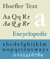
Hoefler Text
Encyclopedia
Hoefler Text is a contemporary serif
Antiqua font that was designed for Apple Computer
to demonstrate advanced type technologies. Hoefler Text was created to allow the composition of complex typography; as such it takes cues from a range of classic fonts, such as Garamond
and Janson
.
Designed by Jonathan Hoefler
in 1991, a version of Hoefler Text has been included with every version of Mac OS
since System 7.5
.
s, the round and long s
, real small capitals, old style figures
and swashes
. Hoefler Text also has a matching ornament font. It was, until OpenType
made advanced typographic features more common, one of only a few fonts in common usage that contained old style, or ranging figures
, which are designed to harmonize with standard upper- and lowercase text.
now include three weights, swash caps, italic small capitals, and two sets of engraved capitals.
until the 2010 redesign, when it was replaced with Linux Libertine
.. It was announced in 2011 that Hoefler Text would be used as part of the new visual identity of Dickinson College
.
Serif
In typography, serifs are semi-structural details on the ends of some of the strokes that make up letters and symbols. A typeface with serifs is called a serif typeface . A typeface without serifs is called sans serif or sans-serif, from the French sans, meaning “without”...
Antiqua font that was designed for Apple Computer
Apple Computer
Apple Inc. is an American multinational corporation that designs and markets consumer electronics, computer software, and personal computers. The company's best-known hardware products include the Macintosh line of computers, the iPod, the iPhone and the iPad...
to demonstrate advanced type technologies. Hoefler Text was created to allow the composition of complex typography; as such it takes cues from a range of classic fonts, such as Garamond
Garamond
Garamond is the name given to a group of old-style serif typefaces named after the punch-cutter Claude Garamond . Most of the Garamond faces are more closely related to the work of a later punch-cutter, Jean Jannon...
and Janson
Janson
Janson is the name given to an old-style serif typeface named for Dutch punch-cutter and printer Anton Janson. Research in the 1970s and early 1980s, however, concluded that the typeface was the work of a Hungarian punch-cutter named Miklós Tótfalusi Kis...
.
Designed by Jonathan Hoefler
Jonathan Hoefler
Jonathan Hoefler is an American typeface designer. Hoefler founded Hoefler & Frere-Jones , a type foundry in New York that Hoefler shares with fellow type designer Tobias Frere-Jones.Hoefler has designed original typefaces for Rolling Stone Magazine, Harper’s Bazaar, The New York Times Magazine,...
in 1991, a version of Hoefler Text has been included with every version of Mac OS
Mac OS
Mac OS is a series of graphical user interface-based operating systems developed by Apple Inc. for their Macintosh line of computer systems. The Macintosh user experience is credited with popularizing the graphical user interface...
since System 7.5
System 7 (Macintosh)
System 7 is a single-user graphical user interface-based operating system for Macintosh computers. It was introduced on May 13, 1991 by Apple Computer. It succeeded System 6, and was the main Macintosh operating system until it was succeeded by Mac OS 8 in 1997...
.
Features
Hoefler Text incorporates automatic ligatureLigature (typography)
In writing and typography, a ligature occurs where two or more graphemes are joined as a single glyph. Ligatures usually replace consecutive characters sharing common components and are part of a more general class of glyphs called "contextual forms", where the specific shape of a letter depends on...
s, the round and long s
Long s
The long, medial or descending s is a form of the minuscule letter s formerly used where s occurred in the middle or at the beginning of a word, for example "ſinfulneſs" . The modern letterform was called the terminal, round, or short s.-History:The long s is derived from the old Roman cursive...
, real small capitals, old style figures
Text figures
Text figures are numerals typeset with varying heights in a fashion that resembles a typical line of running text, hence the name...
and swashes
Swash (typography)
A swash is a typographical flourish on a glyph, like an exaggerated serif.Capital swash characters, which extended to the left, were historically often used to begin sentences. There were also minuscule swash characters, which came either extending to the left, to begin words, or to the right to...
. Hoefler Text also has a matching ornament font. It was, until OpenType
OpenType
OpenType is a format for scalable computer fonts. It was built on its predecessor TrueType, retaining TrueType's basic structure and adding many intricate data structures for prescribing typographic behavior...
made advanced typographic features more common, one of only a few fonts in common usage that contained old style, or ranging figures
Text figures
Text figures are numerals typeset with varying heights in a fashion that resembles a typical line of running text, hence the name...
, which are designed to harmonize with standard upper- and lowercase text.
History
Since the introduction of the font, Hoefler Text has been expanded to include additional typographic features, and versions of the font published by Hoefler & Frere-JonesHoefler & Frere-Jones
Hoefler & Frere-Jones is an influential type foundry in New York City, run by designers Jonathan Hoefler and Tobias Frere-Jones. With both their similarities and their likings it was only a matter of time that both their paths would come across and would have became business partners. Both Hoefler...
now include three weights, swash caps, italic small capitals, and two sets of engraved capitals.
Uses
Hoefler Text was used in the Wikipedia logoLogo of Wikipedia
The logo of Wikipedia, an Internet-based free multilingual encyclopedia, is an unfinished globe constructed from jigsaw pieces—some pieces are still missing at the top—inscribed with glyphs from many different writing systems...
until the 2010 redesign, when it was replaced with Linux Libertine
Linux Libertine
Linux Libertine is a digital typeface created by the Libertine Open Fonts Project, which aims to create free and open alternatives to Proprietary software typefaces such Times Roman...
.. It was announced in 2011 that Hoefler Text would be used as part of the new visual identity of Dickinson College
Dickinson College
Dickinson College is a private, residential liberal arts college in Carlisle, Pennsylvania. Originally established as a Grammar School in 1773, Dickinson was chartered September 9, 1783, five days after the signing of the Treaty of Paris, making it the first college to be founded in the newly...
.
External links
- Hoefler Text in the Hoefler & Frere-Jones catalog