
.gif)
Johnston (typeface)
Encyclopedia
Edward Johnston
Edward Johnston, CBE was a British-Uruguayan craftsman who is regarded, with Rudolf Koch, as the a father of modern calligraphy, in the form of the broad edged pen as a writing tool, a particular form of calligraphy....
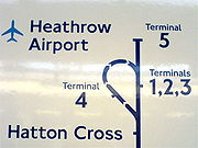
. It is well known for its use by Transport for London
Transport for London
Transport for London is the local government body responsible for most aspects of the transport system in Greater London in England. Its role is to implement the transport strategy and to manage transport services across London...
.
Johnston's former student Eric Gill
Eric Gill
Arthur Eric Rowton Gill was a British sculptor, typeface designer, stonecutter and printmaker, who was associated with the Arts and Crafts movement...
also worked on the development of the typeface, which was later to influence his own Gill Sans
Gill Sans
Gill Sans is a sans-serif typeface designed by Eric Gill.The original design appeared in 1926 when Douglas Cleverdon opened a bookshop in his home town of Bristol, where Eric Gill painted the fascia over the window in sans-serif capitals that would later be known as Gill Sans...
typeface, produced 1928–32.
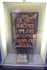
Features
Features of the font are the perfect circle of the letter OO
O is the fifteenth letter and a vowel in the basic modern Latin alphabet.The letter was derived from the Semitic `Ayin , which represented a consonant, probably , the sound represented by the Arabic letter ع called `Ayn. This Semitic letter in its original form seems to have been inspired by a...
and the use of a diagonal square dot above minuscule letters i
I
I is the ninth letter and a vowel in the basic modern Latin alphabet.-History:In Semitic, the letter may have originated in a hieroglyph for an arm that represented a voiced pharyngeal fricative in Egyptian, but was reassigned to by Semites, because their word for "arm" began with that sound...
and j
J
Ĵ or ĵ is a letter in Esperanto orthography representing the sound .While Esperanto orthography uses a diacritic for its four postalveolar consonants, as do the Latin-based Slavic alphabets, the base letters are Romano-Germanic...
and for the full stop
Full stop
A full stop is the punctuation mark commonly placed at the end of sentences. In American English, the term used for this punctuation is period. In the 21st century, it is often also called a dot by young people...
. Commas
Comma (punctuation)
The comma is a punctuation mark. It has the same shape as an apostrophe or single closing quotation mark in many typefaces, but it differs from them in being placed on the baseline of the text. Some typefaces render it as a small line, slightly curved or straight but inclined from the vertical, or...
, apostrophe
Apostrophe
The apostrophe is a punctuation mark, and sometimes a diacritic mark, in languages that use the Latin alphabet or certain other alphabets...
s and other punctuation marks
Punctuation
Punctuation marks are symbols that indicate the structure and organization of written language, as well as intonation and pauses to be observed when reading aloud.In written English, punctuation is vital to disambiguate the meaning of sentences...
are also based on the diagonal square dot. The capitals of the typeface are based on Roman
Roman Empire
The Roman Empire was the post-Republican period of the ancient Roman civilization, characterised by an autocratic form of government and large territorial holdings in Europe and around the Mediterranean....
square capitals, and the lower-case on the humanistic minuscule
Cursive
Cursive, also known as joined-up writing, joint writing, or running writing, is any style of handwriting in which the symbols of the language are written in a simplified and/or flowing manner, generally for the purpose of making writing easier or faster...
, the handwriting in use in Italy in the fifteenth century. In this, it marked a break with the kinds of sans serif previously used, sometimes known as grotesque, which tended to have squarer shapes.
History
The typeface was commissioned in 1913 by Frank PickFrank Pick
Frank Pick LLB Hon. RIBA was a British transport administrator. After qualifying as a solicitor in 1902, he worked at the North Eastern Railway, before moving to the Underground Electric Railways Company of London in 1906...
, Commercial Manager of the Underground Electric Railways Company of London
Underground Electric Railways Company of London
The Underground Electric Railways Company of London Limited , known operationally as The Underground for much of its existence, was established in 1902. It was the holding company for the three deep-level "tube"A "tube" railway is an underground railway constructed in a circular tunnel by the use...
(also known as 'The Underground Group'), as part of his plan to strengthen the company's corporate identity
Corporate identity
In Corporate Communications, a corporate identity is the "persona" of a corporation which is designed to accord with and facilitate the attainment of business objectives...
, and introduced in 1916. Pick specified to Johnston that he wanted a typeface that would ensure that the Underground Group's posters would not be mistaken for advertisements; it should have "the bold simplicity of the authentic lettering of the finest periods" and belong "unmistakably to the twentieth century". In 1933, The Underground Group was absorbed by the London Passenger Transport Board
London Passenger Transport Board
The London Passenger Transport Board was the organisation responsible for public transport in London, UK, and its environs from 1933 to 1948...
and the typeface was adopted as part of the London Transport
London Transport (brand)
London Transport was the public name and brand used by a series of public transport authorities in London, England, from 1933. Its most recognisable feature was the bar-and-circle 'roundel' logo...
brand.
The font family was originally called Underground. It became known as Johnston's Railway Type, and later simply Johnston. It comes with two weights, heavy and ordinary. Heavy does not contain lower-case letters.
New Johnston
The Johnston typeface was redesigned in 1979 by Eiichi Kono at Banks & Miles to produce New Johnston, the variant of the original typeface currently used by London Underground. The new typeface is slightly heavier or bolder than the original. The new family comes with Bold, Medium, Light weights. The new typeface replaced the old typeface.A further change occurred in 2008 when Transport for London removed the serif from the numeral '1' and also altered the '4', in both cases reverting these to their original appearance.
Johnston Delf Smith
The original font was developed in the 1920s by Percy Delf Smith (another former pupil of Edward Johnston). It was commissioned by Frank PickFrank Pick
Frank Pick LLB Hon. RIBA was a British transport administrator. After qualifying as a solicitor in 1902, he worked at the North Eastern Railway, before moving to the Underground Electric Railways Company of London in 1906...
of London Underground
London Underground
The London Underground is a rapid transit system serving a large part of Greater London and some parts of Buckinghamshire, Hertfordshire and Essex in England...
as a 'petit-serif
Petit-serif
Petit-serifs are small serifs, which are attached to regular sans-serif fonts.An example of this is Johnston. Petit-serifs were added to this font, but Frank Pick chose to stay with the original design ....
' variation of the organisation's standard sans-serif
Sans-serif
In typography, a sans-serif, sans serif or san serif typeface is one that does not have the small projecting features called "serifs" at the end of strokes. The term comes from the French word sans, meaning "without"....
Johnston face. The typeface was originally used for the headquarters building at 55 Broadway
55 Broadway
55 Broadway is a notable building overlooking St. James's Park in London. It was designed by Charles Holden and built between 1927 and 1929, and in 1931 the building earned him the RIBA London Architecture Medal...
, SW1.
It can still be seen on some signs at Sudbury Town
Sudbury Town tube station
Sudbury Town is a London Underground station on the Uxbridge branch of the Piccadilly Line. The station is between Sudbury Hill and Alperton. It is located on Station Approach in Sudbury, a short distance from the junction of Bridgewater Road and Harrow Road . The forecourt of the station is...
and Arnos Grove
Arnos Grove tube station
Arnos Grove is a London Underground station on the Piccadilly line between Bounds Green and Southgate. It is in Travelcard Zone 4 and is located in Arnos Grove, near Arnos Park on Bowes Road, London. The station and surrounding neighbourhood of Arnos Grove take their names from the Arnos Grove...
on the Piccadilly line.
In early 2007, an electronic version of the typeface was developed under the name Johnston Delf Smith, specifically for use on historic signs.
ITC Johnston
International Typeface CorporationInternational Typeface Corporation
The International Typeface Corporation was a type manufacturer founded in New York in 1970 by Aaron Burns, Herb Lubalin, and Edward Rondthaler. The company was one of the world's first type foundries to have no history in the production of metal type...
released a variant in 1999 called ITC Johnston, produced by British type designers Richard Dawson and Dave Farey. It originally included three font weights like New Johnston. However, it does not include the hooked 1 and uses side-pointed 4.
In November 2002, the typeface was rereleased in OpenType format, which also expanded the font family to include italic fonts in all weights. Character set was expanded to support ISO Adobe 2 character set. OpenType features include alternates, case forms, small caps (romans only), old style figure. Separate small caps (romans only) and old style figure faces were also released for each weight in TrueType and PostScript formats, for a total of fifteen typefaces.
ITC Johnston Pro
Released in March 2009, this version includes support of Adobe CE character set.Johnston Underground
In 1997, London Transport Museum licensed the original Johnston typeface exclusively to P22 Type FoundryP22 type foundry
P22 type foundry is a digital type foundry from Buffalo, New York, that develops and markets typefaces for the Macintosh and Windows platforms. The name P22 has no specific significance and was used prior to the type foundry as a label for various art projects including an ambitious mail art...
, available commercially as Johnston Underground. Johnston Underground included Regular, Bold, and Extras weights, with the Extra containing only ornamental symbols.
Underground Pro
P22 later had Paul Hunt add to their version of the Underground typeface to create the Underground Pro (or P22 Underground Pro) family. The full Underground Pro Set contains nineteen Pro OpenType fonts and 58 Basic OpenType fonts, covering extended Latin, Greek, Cyrillic character sets. Weights are expanded to six: Thin, Light, Book, Medium, Demi, Heavy. However, there are no italic styles in P22's designs. Underground, Underground CY, Underground GR support extended Latin, Cyrillic, Greek characters respectively. The Latin sub-family contains medium weight Titling fonts, which feature underscored and/or overscored Latin small letters. Pro fonts include extensive OpenType features, including eleven stylistic sets: Petite Capitals, Dryad Cap Alternates, Humanistic Alternates 1, Humanistic Alternates 2, Geometric Alternates, Round Points, Diamond Points, Alternate Tilde, All Under commas, All cedillas, Alternate Eng.Usages
Its use has included the Tube mapTube map
The Tube map is a schematic transit map representing the lines and stations of London's rapid transit railway systems, namely the London Underground , the Docklands Light Railway and London Overground....
, nameplates and general station signing, as well as much of the printed material issued by the Underground Group and its successors; also by the nationalised British Road Services
British Road Services
The National Freight Corporation was a major British transport business. It was listed on the London Stock Exchange and at one time, as NFC plc, it was a constituent of the FTSE 100 Index.-History:...
in the immediate post-war era.
See also
- Public signage typefaces
- Rail AlphabetRail AlphabetRail Alphabet is a typeface designed by Jock Kinneir and Margaret Calvert for British Railways. First used by them in signing tests at London's Liverpool Street Station, it was then adopted by the Design Research Unit as part of their comprehensive 1965 rebranding of the company.Rail Alphabet is...
- the 1960s British RailBritish RailBritish Railways , which from 1965 traded as British Rail, was the operator of most of the rail transport in Great Britain between 1948 and 1997. It was formed from the nationalisation of the "Big Four" British railway companies and lasted until the gradual privatisation of British Rail, in stages...
equivalent to Johnston
External links
- Transport for London - Font requests
- London Transport Museum page on Johnston Sans (via web archive)
- London Transport Museum Photographic Archive
}
}
- A Typeface for the Underground, London Reconnections, 18 September 2009
Johnston Delf Smith
New Johnston
- Eiichi Kono, New Johnston from Pen to Printer, Edward Johnston Foundation, 2003.
ITC Johnston
- Identifont page for ITC Johnston
- ITC Johnston Font Family - by Richard Dawson, Dave Farey
- What's Hot From ITC: November 2002
- What's New From ITC: March 2009