
Century Gothic
Encyclopedia
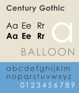
Century Gothic is a geometric sans-serif
typeface designed for Monotype Imaging
in 1991. It is a digital typeface that has never been made into actual foundry type. Century Gothic takes inspiration from Sol Hess's
Twentieth Century
, which was drawn between 1937 and 1947 for the Lanston Monotype Company
as a version of the successful Futura
typeface, but with a larger x-height
and more even stroke width. The Century Gothic face is distinct for its single-storey lowercase a and g. Century Gothic is more closely related to Avant Garde Gothic
, designed by Herb Lubalin
, and released by the International Typeface Corporation (ITC)
in 1970. Century Gothic is similar to ITC Avant Garde in its pure geometry, and does not possess the subtle variation in stroke width found in either Futura
or Twentieth Century
. However, it differs from ITC Avant Garde in that Century Gothic does not have a descender on lowercase u (making it appear like a Greek upsilon
υ), whereas Avant Garde does. Century Gothic also has larger, rounder tittle
s on letters such as i and j, whereas Avant Garde keeps the tittles square and the same width as the letter strokes.
to Century Gothic because it uses about 30% less ink.
However, the font is also reported to use more paper (since its letters are wider), meaning that the savings on ink are offset by an increase in paper costs.
Sans-serif
In typography, a sans-serif, sans serif or san serif typeface is one that does not have the small projecting features called "serifs" at the end of strokes. The term comes from the French word sans, meaning "without"....
typeface designed for Monotype Imaging
Monotype Corporation
Monotype Imaging Holdings is a Delaware corporation based in Woburn, Massachusetts and specializing in typesetting and typeface design as well as text and imaging solutions for use with consumer electronics devices. Monotype Imaging Holdings is the owner of Monotype Imaging Inc., Linotype,...
in 1991. It is a digital typeface that has never been made into actual foundry type. Century Gothic takes inspiration from Sol Hess's
Sol Hess
Sol Hess was an American typeface designer. After a three-year scholarship course at Pennsylvania Museum School of Industrial Design, he began at Lanston Monotype in 1902, rising to typographic manager in 1922. He was a close friend and collaborator with Monotype art director Frederic Goudy,...
Twentieth Century
Twentieth Century (typeface)
Twentieth Century is a geometric sans-serif foundry typeface designed by Sol Hess for Lanston Monotype as a competitor to the successful Futura typeface, but with a larger x-height and more even stroke width...
, which was drawn between 1937 and 1947 for the Lanston Monotype Company
Lanston Monotype Company
Lanston Monotype Company was founded in Philadelphia, Pennsylvania at the end of the nineteenth century by Tolbert Lanston. In 1887 he received his first patent for a mechanical typesetting device. The current incarnation as the "Lanston Type Co." is a division of P22 type foundry....
as a version of the successful Futura
Futura (typeface)
In typography, Futura is a geometric sans-serif typeface designed in 1927 by Paul Renner. It is based on geometric shapes that became representative visual elements of the Bauhaus design style of 1919–1933...
typeface, but with a larger x-height
X-height
In typography, the x-height or corpus size refers to the distance between the baseline and the mean line in a typeface. Typically, this is the height of the letter x in the font , as well as the u, v, w, and z...
and more even stroke width. The Century Gothic face is distinct for its single-storey lowercase a and g. Century Gothic is more closely related to Avant Garde Gothic
ITC Avant Garde
ITC Avant Garde Gothic is a font family based on the logo font used in the Avant Garde magazine. Herb Lubalin devised the logo concept and its companion headline typeface, then he and Tom Carnase, a partner in Lubalin's design firm, worked together to transform the idea into a full-fledged...
, designed by Herb Lubalin
Herb Lubalin
Herbert F. Lubalin was a prominent American graphic designer. He collaborated with Ralph Ginzburg on three of Ginzburg's magazines: Eros, Fact, and Avant Garde, and was responsible for the creative visual beauty of these publications...
, and released by the International Typeface Corporation (ITC)
International Typeface Corporation
The International Typeface Corporation was a type manufacturer founded in New York in 1970 by Aaron Burns, Herb Lubalin, and Edward Rondthaler. The company was one of the world's first type foundries to have no history in the production of metal type...
in 1970. Century Gothic is similar to ITC Avant Garde in its pure geometry, and does not possess the subtle variation in stroke width found in either Futura
Futura (typeface)
In typography, Futura is a geometric sans-serif typeface designed in 1927 by Paul Renner. It is based on geometric shapes that became representative visual elements of the Bauhaus design style of 1919–1933...
or Twentieth Century
Twentieth Century (typeface)
Twentieth Century is a geometric sans-serif foundry typeface designed by Sol Hess for Lanston Monotype as a competitor to the successful Futura typeface, but with a larger x-height and more even stroke width...
. However, it differs from ITC Avant Garde in that Century Gothic does not have a descender on lowercase u (making it appear like a Greek upsilon
Upsilon
Upsilon is the 20th letter of the Greek alphabet. In the system of Greek numerals it has a value of 400. It is derived from the Phoenician waw. The name of the letter is pronounced in Modern Greek, and in English , , or...
υ), whereas Avant Garde does. Century Gothic also has larger, rounder tittle
Tittle
A tittle is a small distinguishing mark, such as a diacritic or the dot on a lowercase i or j. The tittle is an integral part of the glyph of i and j, but diacritic dots can appear over other letters in various languages...
s on letters such as i and j, whereas Avant Garde keeps the tittles square and the same width as the letter strokes.
Printer ink usage
According to the University of Wisconsin-Green Bay, Century Gothic uses much less ink, saving money on printer ink. They reportedly switched their default e-mail and printing font from ArialArial
Arial, sometimes marketed or displayed in software as Arial MT, is a sans-serif typeface and set of computer fonts. Fonts from the Arial family are packaged with Microsoft Windows, some other Microsoft software applications, Apple Mac OS X and many PostScript 3 computer printers...
to Century Gothic because it uses about 30% less ink.
However, the font is also reported to use more paper (since its letters are wider), meaning that the savings on ink are offset by an increase in paper costs.
Selected usages
- Century Gothic is the standard title font in Key ClubKey ClubKey Club International is the oldest and largest service program for high school students. It is a student-led organization whose goal is to teach leadership through serving others. Key Club International is a part of the Kiwanis International family of service-leadership programs...
publications. - Century Gothic was heavily used in the standing sets of Star Trek: EnterpriseStar Trek: EnterpriseStar Trek: Enterprise is a science fiction television series. It follows the adventures of humanity's first warp 5 starship, the Enterprise, ten years before the United Federation of Planets shown in previous Star Trek series was formed.Enterprise premiered on September 26, 2001...
as part of the StarfleetStarfleetIn the fictional universe of Star Trek, Starfleet or the Federation Starfleet is the deep-space exploratory, peacekeeping and military service maintained by the United Federation of Planets . It is the principal means by which the Federation conducts its exploration, defense, diplomacy and research...
standards for that television series' stated time period of the 2150s. - Century Gothic is used for the logo of the Canadian music duo Crystal CastlesCrystal Castles (band)Crystal Castles are an experimental electronic band from Toronto, Ontario, Canada, consisting of producer Ethan Kath and lyricist and vocalist Alice Glass. Crystal Castles are known for their chaotic live shows and their lo-fi home productions. The duo released many limited EPs between 2006 and...
. - Century Gothic is the main font of The Ellen Degeneres Show
- Century Gothic is the main font of EA's third-person shooter, Battlefield HeroesBattlefield HeroesBattlefield Heroes is a cartoon-style action video game developed by DICE initially—now developed by —and published by EA for Microsoft Windows. It is played from a third-person EA are calling it FPS perspective. The game is less demanding on computer specifications than the previous games of the...
- Century Gothic is the main font for the logo of GMA NetworkGMA NetworkGMA Network is a major commercial television & radio network in the Philippines. GMA Network is owned by GMA Network, Inc. a publicly listed company...
- Century Gothic is the font used for WeezerWeezerWeezer is an American alternative rock band. The band currently consists of Rivers Cuomo , Patrick Wilson , Brian Bell , and Scott Shriner . The band has changed lineups three times since its formation in 1992...
's "weezer" logo. - Century Gothic is used as the main font for the video game BioshockBioshockBioShock is a first-person shooter video game developed by 2K Boston and designed by Ken Levine. It was released for Microsoft Windows and Xbox 360 on August 21, 2007 in North America, and three days later in Europe and Australia. It became available on Steam on August 21, 2007...
. - Century Gothic has been used briefly throughout the Jak and DaxterJak and DaxterJak and Daxter is a critically acclaimed video game franchise created by Naughty Dog for the PlayStation 2.The series consists of four main games and two spin-offs,though they are also considered to be part of the main series...
video game series. - Century Gothic has been used for the Mick Hummel Logo.
- Century Gothic has been used for the beginning & end credits on the episodes of House.