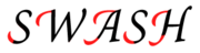
Swash (typography)
Encyclopedia
Typography
Typography is the art and technique of arranging type in order to make language visible. The arrangement of type involves the selection of typefaces, point size, line length, leading , adjusting the spaces between groups of letters and adjusting the space between pairs of letters...
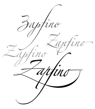
flourish on a glyph
Glyph
A glyph is an element of writing: an individual mark on a written medium that contributes to the meaning of what is written. A glyph is made up of one or more graphemes....
, like an exaggerated serif
Serif
In typography, serifs are semi-structural details on the ends of some of the strokes that make up letters and symbols. A typeface with serifs is called a serif typeface . A typeface without serifs is called sans serif or sans-serif, from the French sans, meaning “without”...
.
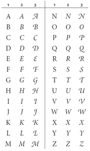
Capital swash characters, which extended to the left, were historically often used to begin sentences. There were also minuscule swash characters, which came either extending to the left, to begin words, or to the right to end them. They were used in former times to help fit the text to the line, instead of spaces of varying widths ("justification
Justification (typesetting)
In typesetting, justification is the typographic alignment setting of text or images within a column or "measure" to align along both the left and right margin...
").
Some of the characters in ligatures were called swash characters, even though they did not protrude to the space on either side of the piece of type, such as the tail of a capital "Q" passing under its succeeding "u". Similarly the tail of a swash "g" would extend to the left beneath a number of preceding letters limited by the set of ligatures the typographer chose for the set.