
Parisine
Encyclopedia
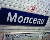
Parisine is a typeface developed by Jean-François Porchez
.
It is used in Paris Métro
, tram
ways, busses and RER
parts operated by the RATP in Île-de-France
.
In 1999, the font was extended to a font family for multiple uses like communication material, maps, etc. In 2000, hinted TrueType
versions were added for internal corporate use. The name Parisine is a trademark
of the RATP.
variant of Parisine. A small caps
version was produced called Parisine SC.
OpenType features include ligatures, fractions, ordinals/superior
letters and figures, caps figures, oldstyle figures
(SC versions only), a tabular figures.
Each member of the family is composed of more than 720 glyph
s and feature around 26700 kerning
pairs.
OpenType features include small caps, case forms, ligatures, special ligatures, alternates, stylistic sets, caps figures, oldstyle figures, tabular figures, fractions, superscript/subscript, superior/inferior figures, ordinals/superior letters and figures, and ornaments.
Some additional alternates glyphs are included in PostScript
Type 1 format.
OpenType features include ligatures, fractions, ordinals/superior letters and figures, caps figures, oldstyle figures (SC versions only), and tabular figures.
Each member of the family is composed of more than 900 glyphs and feature around 40000 kerning pairs.
OpenType features include small caps, case forms, ligatures, special ligatures, alternates, stylistic sets, swashes, caps figures, oldstyle figures, tabular figures, fractions, superscript/subscript, superior/inferior figures, ordinals/superior letters and figures, and ornaments.
. It became the first variant designed in OpenType. The font was commercially available in June 2008.
It consists of over 600 characters, and is metric-compatible with Gill Sans. The family has been includes font weights with complementary italics.
OpenType features include case forms, ligatures, special ligatures, alternates, swashes, caps figures, oldstyle figures, semi oldstyle figures, tabular figures, fractions, superscript/subscript, superior/inferior figures, ordinals/superior letters and figures, and ornaments.
OpenType features include small caps, case forms, ligatures, special ligatures, alternates, stylistic sets, caps figures, oldstyle figures, tabular figures, fractions, superscript/subscript, superior/inferior figures, ordinals/superior letters and figures, and ornaments.
In 2010, The Gris subfamily was added to Parisine PTF family, which includes 2 intermediate font weights between Parisine PTF Clair and Parisine PTF.
Jean-François Porchez
Jean François Porchez is a French type designer. He was president of ATypI , the leading organisation of type designers from 2004 to 2007. He is probably best-known for releasing the new typefaces for Le Monde, the French evening newspaper in 1994...
.
It is used in Paris Métro
Paris Métro
The Paris Métro or Métropolitain is the rapid transit metro system in Paris, France. It has become a symbol of the city, noted for its density within the city limits and its uniform architecture influenced by Art Nouveau. The network's sixteen lines are mostly underground and run to 214 km ...
, tram
Tram
A tram is a passenger rail vehicle which runs on tracks along public urban streets and also sometimes on separate rights of way. It may also run between cities and/or towns , and/or partially grade separated even in the cities...
ways, busses and RER
RER
The RER is a rapid transit system in France serving Paris and its suburbs. The RER is an integration of a modern city-centre underground rail and a pre-existing set of commuter rail lines. It has several connections with the Paris Métro within the city of Paris. Within the city, the RER...
parts operated by the RATP in Île-de-France
Île-de-France (région)
Île-de-France is the wealthiest and most populated of the twenty-two administrative regions of France, composed mostly of the Paris metropolitan area....
.
Parisine
It was originally developed in 1996 as a custom typeface developed for the RATP to improve signage legibility and space economy. The design was based on Helvetica Bold, condensed at 90%.In 1999, the font was extended to a font family for multiple uses like communication material, maps, etc. In 2000, hinted TrueType
TrueType
TrueType is an outline font standard originally developed by Apple Computer in the late 1980s as a competitor to Adobe's Type 1 fonts used in PostScript...
versions were added for internal corporate use. The name Parisine is a trademark
Trademark
A trademark, trade mark, or trade-mark is a distinctive sign or indicator used by an individual, business organization, or other legal entity to identify that the products or services to consumers with which the trademark appears originate from a unique source, and to distinguish its products or...
of the RATP.
Parisine Std
It is an OpenTypeOpenType
OpenType is a format for scalable computer fonts. It was built on its predecessor TrueType, retaining TrueType's basic structure and adding many intricate data structures for prescribing typographic behavior...
variant of Parisine. A small caps
Small caps
In typography, small capitals are uppercase characters set at the same height and weight as surrounding lowercase letters or text figures...
version was produced called Parisine SC.
OpenType features include ligatures, fractions, ordinals/superior
Subscript and superscript
A subscript or superscript is a number, figure, symbol, or indicator that appears smaller than the normal line of type and is set slightly below or above it – subscripts appear at or below the baseline, while superscripts are above...
letters and figures, caps figures, oldstyle figures
Text figures
Text figures are numerals typeset with varying heights in a fashion that resembles a typical line of running text, hence the name...
(SC versions only), a tabular figures.
Parisine PTF
It is an OpenType variant of Parisine, which further expanded upon Parisine Std.Each member of the family is composed of more than 720 glyph
Glyph
A glyph is an element of writing: an individual mark on a written medium that contributes to the meaning of what is written. A glyph is made up of one or more graphemes....
s and feature around 26700 kerning
Kerning
In typography, kerning is the process of adjusting the spacing between characters in a proportional font, usually to achieve a visually pleasing result. Kerning is the adjustment of the space between individual letter forms vs. tracking which is the uniform adjustment of spacing applied over a...
pairs.
OpenType features include small caps, case forms, ligatures, special ligatures, alternates, stylistic sets, caps figures, oldstyle figures, tabular figures, fractions, superscript/subscript, superior/inferior figures, ordinals/superior letters and figures, and ornaments.
Parisine Plus Std
It is a variant with alternate designs. It includes extra ligatures over the respective classic designs.Some additional alternates glyphs are included in PostScript
PostScript
PostScript is a dynamically typed concatenative programming language created by John Warnock and Charles Geschke in 1982. It is best known for its use as a page description language in the electronic and desktop publishing areas. Adobe PostScript 3 is also the worldwide printing and imaging...
Type 1 format.
OpenType features include ligatures, fractions, ordinals/superior letters and figures, caps figures, oldstyle figures (SC versions only), and tabular figures.
Parisine Plus PTF
It is an expanded OpenType variant of Parisine Plus Std. It was released at the same time as Parisine Ptf.Each member of the family is composed of more than 900 glyphs and feature around 40000 kerning pairs.
OpenType features include small caps, case forms, ligatures, special ligatures, alternates, stylistic sets, swashes, caps figures, oldstyle figures, tabular figures, fractions, superscript/subscript, superior/inferior figures, ordinals/superior letters and figures, and ornaments.
Parisine Office
Parisine Office was a version created for RATP in 2005, as replacement of Gill SansGill Sans
Gill Sans is a sans-serif typeface designed by Eric Gill.The original design appeared in 1926 when Douglas Cleverdon opened a bookshop in his home town of Bristol, where Eric Gill painted the fascia over the window in sans-serif capitals that would later be known as Gill Sans...
. It became the first variant designed in OpenType. The font was commercially available in June 2008.
It consists of over 600 characters, and is metric-compatible with Gill Sans. The family has been includes font weights with complementary italics.
OpenType features include case forms, ligatures, special ligatures, alternates, swashes, caps figures, oldstyle figures, semi oldstyle figures, tabular figures, fractions, superscript/subscript, superior/inferior figures, ordinals/superior letters and figures, and ornaments.
Parisine Office PTF
It is an extension of the original Parisine Office font, featuring smaller x-height, more cursive italic lowercase glyphs than in Parisine PTF, extended character sets.OpenType features include small caps, case forms, ligatures, special ligatures, alternates, stylistic sets, caps figures, oldstyle figures, tabular figures, fractions, superscript/subscript, superior/inferior figures, ordinals/superior letters and figures, and ornaments.
Family naming convention
With exception of Parisine SC and Parisine Office, each family contains 6 weights with complementary italics, but it is further divided into 3 subfamily, where the subfamily with Clair suffix includes 2 lightest weights, Sombre suffix includes 2 heaviest weights, subfamily without suffix includes 2 middle weights. Fonts in each subfamily are always named Regular, Italic, Bold, Bold Italic, regardless of actual font weights across the family.In 2010, The Gris subfamily was added to Parisine PTF family, which includes 2 intermediate font weights between Parisine PTF Clair and Parisine PTF.
Awards
Parisine Office won a Star of the Observeur 07 at the Design Observeur 07 (Observeur du design 07).External links
- Porchez Typofonderie: Parisine
- Porchez Typofonderie: Parisine Plus
- Porchez Typofonderie: Parisine Office
- Porchez Typofonderie: Parisine Office PTF
- Métro Type, history behind the font
- Le Parisine, une typo parisienne covers history of Parisine