
Martin Majoor
Encyclopedia
Martin Majoor is a Dutch
typedesigner
and graphic designer
.
(1980–1986), he shortly worked in a student placement at URW in Hamburg
. It was there that he was able to work with the first digital typedesign system Ikarus
. Serré from 1984 – his first digital font
– was the result, but it was never released. In 1986 he started as a typographic designer in the Research & Development Department at Océ
-Netherlands, where he carried out research into screenfont
s. For the production of digital typefaces for laser printers he followed a short education at Bitstream
in Boston.
After working at Vredenburg Music Centre in Utrecht
, Majoor started as independent typedesigner and book typographer. Since then he designed a few big type families and numerous books and book covers. Several of his book designs where awarded a Best Books prize. He wrote articles for magazines like Items, Eye magazine, 2+3D and tpG tipoGráfica.
From 1990 until 1995 Majoor taught typography at the Schools of Fine Arts in Arnhem and in Breda. He gave lectures at ATypI/Typelab
conferences in Budapest, Antwerp, Paris, San Francisco, Barcelona, The Hague and Prague, at TypoBerlin (2002 and 2005), and during other type events in Lure-en-Provence (Rencontres internationales de Lure 1996), Leipzig (TypoTage 2004), Warsaw, Katowice, Stockholm, Hamburg, Caen, Vienna and Dortmund. He gave workshops in Amsterdam (Gerrit Rietveld Academie
), Stuttgart (Merz Akademie) and Warsaw. His type designs were exhibited in Amsterdam, Rotterdam, New York (Cooper Union
) , Paris, London, Manchester, Berlin, Helsinki and Barcelona. Since 1997 Majoor works as a graphic designer and type designer in both The Netherlands (Arnhem) and Poland (Warsaw).
computer for its printed matter. The fact that there were only 16 typefaces available without features like old style figures, small caps and ligatures, made Majoor decide to make his own typeface
. The result was Scala, one of the first Macintosh fonts with all these missing features.
In 1991 he was asked by Erik Spiekermann
of FSI FontShop International
in Berlin to release FF Scala
as its first serious text face in the FontFont Library. In 1993 FF Scala was augmented with a sans-serif version, FF Scala Sans
. The sans and the serif versions complement each other, they follow the same principle of form but are two distinct designs. Both FF Scala and FF Scala Sans have become successful throughout the world.
In 1996 Majoor designed FF Scala Jewels, a quartet of classic decorative typefaces based on the capitals of FF Scala Bold. In 1998 the Scala family was augmented with 13 new versions, such as Scala Sans Light, Scala Sans Black and several condensed versions. FF Scala Hands contains several printer’s fists or manicules, based upon a design by Bruce Rogers from 1933.
for the Dutch PTT (now KPN
). Majoor not only designed the inside typography, more importantly he created the new typeface Telefont for it. Fred Smeijers
, fellow student, long-time colleague and friend, assisted Majoor in digitizing the characters.
There are two versions of Telefont. Telefont List is a real workhorse, to be used in the automatically generated phonebook listings, while Telefont Text was designed for the custom-made introductory pages using many more typographic refinements such as small caps and lowercase numbers. Majoor: ‘The most used typeface has the least possibilities, the least used typeface has the most possibilities’.
“In its proportions Seria is clearly a book face. The long extenders are remarkable by today’s standards and they immediately brand the type as something that would be used for large amounts of text. Majoor cites Centaur
& Trinité as indirect influences on Seria’s proportions, though there aren’t many similarities to those two in the specifics of its construction. As in Scala, the details of Seria’s forms are frequently novel and surprising but the effect at small sizes is harmonious through-and-through. Majoor describes the idea behind Seria’s unconventional curves (e.g. the counter of the ‘o’ or the arch of the ‘n’) as stemming from the principle of being ‘wittingly irregular’ (he attributes this phrase to Trinité’s designer Bram de Does). The classic example of these witting irregularities may be Dwiggins
’s work, but Majoor seems to be an expert at executing the concept digitally. And this is one instance when single-master type design actually works out well: the features that ‘you can’t see [at small sizes], but [that] you maybe can feel’ (to quote Majoor) become arresting when the letters scale up.”
In 2001 the FF Seria family was awarded a Certificate of Excellence from the ISTD International TypoGraphic Awards 2001 in London and a Certificate of Excellence in Type Design from the ATypI
Type Design Competition ‘Bukva:raz!’ in Moscow.
In 2006/2007 Majoor worked together with Pascal Zoghbi, who designed Sada (the Arabic word for “echo”), a Naskh
-style Arabic
counterpart for Seria. It was published in the book ‘Typographic Matchmaking’, a project that brought together 5 Arab and 5 Dutch type designers who collaborated on creating good matching Arabic fonts for existing Latin font families. The designers were matched in 5 groups of two: Gerard Unger
& Nadine Chahine, Martin Majoor & Pascal Zoghbi, Lucas de Groot & Mounir Al Shaarani, Peter Bilak
& Tarek Atrissi, and Fred Smeijers & Lara Assouad Khoury.
In 2009 Pascal Zoghbi designed FF Seria Arabic – an improved version of Sada – to be the first Arabic typeface in the FontFont library, The Regular and Bold are text typefaces, the Light is both display and text type, while the Black is purely a display typeface.
format. It is a family of three typefaces that are made according to the same form principle. Therefor the three versions, FF Nexus Serif, FF Nexus Sans, and FF Nexus Mix (a slab serif
), are all ‘connected’ (Nexus is the Latin word for connection)
FF Nexus started as an alternative to FF Seria, a typeface Majoor had designed some 5 years earlier. Seria has some strong features like extremely long ascenders and descenders, and an
upright italic. Majoor started working on an alternative version of Seria, with shorter ascenders and descenders. But soon this design developed into a new typeface, with numerous changes in proportions and in details and with a redrawn italic. The result was a workhorse typeface like FF Scala with features such as small caps in all weights, four different sorts of numbers and ligatures.
Logically, FF Nexus Sans resulted directly from Nexus Serif, with identical features. But Majoor also developed a new family member: FF Nexus Mix, a slabserif or egyptienne that in its turn was based on Nexus Sans. The addition of the word ‘Mix’ in its name was a result of the idea that a slabserif is a real mixture of a sans and a serif.
In addition to Nexus Serif Italic, two sets of elegantly drawn swash
capitals and two sets of swash lowercase endings were designed. Another augmentation was a monospaced or typewriter version in four weights.
In 2006 the FF Nexus family won the first prize at the Creative Review
Type Design Awards, in the category Text Families.
He designed several books for Dutch publishers such as Bunge, Nijgh & Van Ditmar, L.J. Veen, Vrij Geestesleven and Elsevier. Three times his book designs were chosen among the Best Dutch Book Designs, especially for its inside book typography, rather than for its covers.
Among these best books was ‘Adieu Aesthetics & Beautiful Pages!’ (Adieu æsthetica & mooie pagina’s!’), published in 1995 as the catalogue for the exhibition ‘The Aesthetic World of Jan van Krimpen, Book Designer and Typographer’ in the Museum of the Book/Museum Meermanno-Westreenianum in The Hague and in the American Institute of Graphic Arts
(AIGA) in New York (1995). For this book Majoor was the first to use the digital version of Jan van Krimpen
’s typeface Romanée (originally cut in 1928 for the Joh. Enschedé
typefoundry), which in 1991 had been digitized by Peter Mattias Noordzij and Fred Smeijers for incorporation into the Enschedé Font Foundry (TEFF).
In 2010, together with the french teacher Sebastien Morlighem, he wrote a book on the works of the french type designer José Mendoza y Almeida.
From 1999 until 2010 Majoor was the graphic designer for the Warsaw Autumn Festival, the largest international Polish festival of contemporary music. The programme books were set in Majoor’s own typeface Seria.
Netherlands
The Netherlands is a constituent country of the Kingdom of the Netherlands, located mainly in North-West Europe and with several islands in the Caribbean. Mainland Netherlands borders the North Sea to the north and west, Belgium to the south, and Germany to the east, and shares maritime borders...
typedesigner
Type design
Type design is the art of designing typefaces.- History :Although the technology of printing text using movable type was invented in China, and despite the esteem which calligraphy held in that civilization, the vast number of Chinese characters meant that few distinctive, complete fonts could be...
and graphic designer
Graphic designer
A graphic designer is a professional within the graphic design and graphic arts industry who assembles together images, typography or motion graphics to create a piece of design. A graphic designer creates the graphics primarily for published, printed or electronic media, such as brochures and...
.
Biography
Martin Majoor has been designing type since the mid-1980s. During his study at the School of Fine Art in ArnhemArnhem
Arnhem is a city and municipality, situated in the eastern part of the Netherlands. It is the capital of the province of Gelderland and located near the river Nederrijn as well as near the St. Jansbeek, which was the source of the city's development. Arnhem has 146,095 residents as one of the...
(1980–1986), he shortly worked in a student placement at URW in Hamburg
Hamburg
-History:The first historic name for the city was, according to Claudius Ptolemy's reports, Treva.But the city takes its modern name, Hamburg, from the first permanent building on the site, a castle whose construction was ordered by the Emperor Charlemagne in AD 808...
. It was there that he was able to work with the first digital typedesign system Ikarus
Ikarus (software)
Ikarus is a type design and production software developed by URW foundry, for converting existing typefaces and logos into digital format for use on computer driven printing, plotting and sign cutting devices....
. Serré from 1984 – his first digital font
Font
In typography, a font is traditionally defined as a quantity of sorts composing a complete character set of a single size and style of a particular typeface...
– was the result, but it was never released. In 1986 he started as a typographic designer in the Research & Development Department at Océ
Océ
Océ N.V. is a Netherlands-based company that develops, manufactures and sells printing and copying hardware and related software. The offering includes office printing and copying systems; production printers and wide format printing systems for both technical documentation and color display...
-Netherlands, where he carried out research into screenfont
Screenfont
A screenfont or screen font is:* a computer typeface created specifically for reading from a screen; or* another kind of typeface, like a print font, that is used for reading from a screen...
s. For the production of digital typefaces for laser printers he followed a short education at Bitstream
Bitstream Inc.
Bitstream Inc. is a type foundry that produces digital typefaces . Founded in 1981 by Matthew Carter and Mike Parker among others, it claims to be the oldest such company...
in Boston.
After working at Vredenburg Music Centre in Utrecht
Utrecht (city)
Utrecht city and municipality is the capital and most populous city of the Dutch province of Utrecht. It is located in the eastern corner of the Randstad conurbation, and is the fourth largest city of the Netherlands with a population of 312,634 on 1 Jan 2011.Utrecht's ancient city centre features...
, Majoor started as independent typedesigner and book typographer. Since then he designed a few big type families and numerous books and book covers. Several of his book designs where awarded a Best Books prize. He wrote articles for magazines like Items, Eye magazine, 2+3D and tpG tipoGráfica.
From 1990 until 1995 Majoor taught typography at the Schools of Fine Arts in Arnhem and in Breda. He gave lectures at ATypI/Typelab
ATypI
The ATypI or the Association Typographique Internationale is an international non-profit organisation dedicated to typography.-The organisation:...
conferences in Budapest, Antwerp, Paris, San Francisco, Barcelona, The Hague and Prague, at TypoBerlin (2002 and 2005), and during other type events in Lure-en-Provence (Rencontres internationales de Lure 1996), Leipzig (TypoTage 2004), Warsaw, Katowice, Stockholm, Hamburg, Caen, Vienna and Dortmund. He gave workshops in Amsterdam (Gerrit Rietveld Academie
Gerrit Rietveld Academie
-Profile:More than 45% of the student population comes from abroad, originating from over 60 different countries around the world. Most of the classes are in English...
), Stuttgart (Merz Akademie) and Warsaw. His type designs were exhibited in Amsterdam, Rotterdam, New York (Cooper Union
Cooper Union
The Cooper Union for the Advancement of Science and Art, commonly referred to simply as Cooper Union, is a privately funded college in the East Village neighborhood of Manhattan, New York City, United States, located at Cooper Square and Astor Place...
) , Paris, London, Manchester, Berlin, Helsinki and Barcelona. Since 1997 Majoor works as a graphic designer and type designer in both The Netherlands (Arnhem) and Poland (Warsaw).
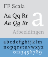
FF Scala and FF Scala Sans
In 1988 Majoor started working as a graphic designer for the Vredenburg Music Centre in Utrecht. The design département of this concert hall was one of the first in the Netherlands to use an Apple MacintoshMacintosh Plus
The Macintosh Plus computer was the third model in the Macintosh line, introduced on January 16, 1986, two years after the original Macintosh and a little more than a year after the Macintosh 512K, with a price tag of US$2599...
computer for its printed matter. The fact that there were only 16 typefaces available without features like old style figures, small caps and ligatures, made Majoor decide to make his own typeface
Typeface
In typography, a typeface is the artistic representation or interpretation of characters; it is the way the type looks. Each type is designed and there are thousands of different typefaces in existence, with new ones being developed constantly....
. The result was Scala, one of the first Macintosh fonts with all these missing features.
In 1991 he was asked by Erik Spiekermann
Erik Spiekermann
Erik Spiekermann is a German typographer and designer. He is a professor at the University of the Arts Bremen....
of FSI FontShop International
FSI FontShop International
FSI FontShop International is an international manufacturer of digital typefaces , based in Berlin and one of the large type foundries that exist today.All the typefaces are published as part of the FontFont library...
in Berlin to release FF Scala
FF Scala
FF Scala is an old style, humanist, serif typeface designed by Dutch typeface designer Martin Majoor in 1990 for the Vredenburg Music Center in Utrecht, the Netherlands. The FF Scala font family was named for the Teatro alla Scala in Milan...
as its first serious text face in the FontFont Library. In 1993 FF Scala was augmented with a sans-serif version, FF Scala Sans
FF Scala Sans
FF Scala Sans is a humanist sans-serif typeface designed in by Dutch designer Martin Majoor in 1993 for the Vredenburg Music Center in Utrecht, the Netherlands...
. The sans and the serif versions complement each other, they follow the same principle of form but are two distinct designs. Both FF Scala and FF Scala Sans have become successful throughout the world.
In 1996 Majoor designed FF Scala Jewels, a quartet of classic decorative typefaces based on the capitals of FF Scala Bold. In 1998 the Scala family was augmented with 13 new versions, such as Scala Sans Light, Scala Sans Black and several condensed versions. FF Scala Hands contains several printer’s fists or manicules, based upon a design by Bruce Rogers from 1933.
Telefont
In 1994 Martin Majoor and Jan Kees Schelvis were asked to design the new telephone directoryTelephone directory
A telephone directory is a listing of telephone subscribers in a geographical area or subscribers to services provided by the organization that publishes the directory...
for the Dutch PTT (now KPN
KPN
KPN is a Dutch landline and mobile telecommunications company, including both 2G and 3G mobile operations...
). Majoor not only designed the inside typography, more importantly he created the new typeface Telefont for it. Fred Smeijers
Fred Smeijers
Fred Smeijers is a Dutch graphic, type designer and writer. He studied at the ArtEZ Hogeschool voor de Kunsten in Arnhem in the early 1980s.- Work :...
, fellow student, long-time colleague and friend, assisted Majoor in digitizing the characters.
There are two versions of Telefont. Telefont List is a real workhorse, to be used in the automatically generated phonebook listings, while Telefont Text was designed for the custom-made introductory pages using many more typographic refinements such as small caps and lowercase numbers. Majoor: ‘The most used typeface has the least possibilities, the least used typeface has the most possibilities’.
FF Seria
Majoor’s third major typefamily, FF Seria was released in 2000. It consists of a serif version and a sanserif versions. The first sketches for Seria were made on the train from Berlin to Warsaw in the summer of 1996, using some table napkins from the dining car.“In its proportions Seria is clearly a book face. The long extenders are remarkable by today’s standards and they immediately brand the type as something that would be used for large amounts of text. Majoor cites Centaur
Centaur (typeface)
Centaur is a Humanist Type Family originally drawn as titling capitals by Bruce Rogers in 1914 for the Metropolitan Museum of Art. The matrices were cut by Robert Wiebking and the type was privately cast by the American Type Foundery. The typeface is based upon several Renaissance models...
& Trinité as indirect influences on Seria’s proportions, though there aren’t many similarities to those two in the specifics of its construction. As in Scala, the details of Seria’s forms are frequently novel and surprising but the effect at small sizes is harmonious through-and-through. Majoor describes the idea behind Seria’s unconventional curves (e.g. the counter of the ‘o’ or the arch of the ‘n’) as stemming from the principle of being ‘wittingly irregular’ (he attributes this phrase to Trinité’s designer Bram de Does). The classic example of these witting irregularities may be Dwiggins
William Addison Dwiggins
William Addison Dwiggins was a U.S. type designer, calligrapher, and book designer...
’s work, but Majoor seems to be an expert at executing the concept digitally. And this is one instance when single-master type design actually works out well: the features that ‘you can’t see [at small sizes], but [that] you maybe can feel’ (to quote Majoor) become arresting when the letters scale up.”
In 2001 the FF Seria family was awarded a Certificate of Excellence from the ISTD International TypoGraphic Awards 2001 in London and a Certificate of Excellence in Type Design from the ATypI
ATypI
The ATypI or the Association Typographique Internationale is an international non-profit organisation dedicated to typography.-The organisation:...
Type Design Competition ‘Bukva:raz!’ in Moscow.
In 2006/2007 Majoor worked together with Pascal Zoghbi, who designed Sada (the Arabic word for “echo”), a Naskh
Naskh (script)
Naskh is a specific calligraphic style for writing in the Arabic alphabet, thought to be invented by the Iranian calligrapher Ibn Muqlah Shirazi . The root of this Arabic term means "to copy". It either refers to the fact that it replaced its predecessor, Kufic script, or that this style allows...
-style Arabic
Arabic alphabet
The Arabic alphabet or Arabic abjad is the Arabic script as it is codified for writing the Arabic language. It is written from right to left, in a cursive style, and includes 28 letters. Because letters usually stand for consonants, it is classified as an abjad.-Consonants:The Arabic alphabet has...
counterpart for Seria. It was published in the book ‘Typographic Matchmaking’, a project that brought together 5 Arab and 5 Dutch type designers who collaborated on creating good matching Arabic fonts for existing Latin font families. The designers were matched in 5 groups of two: Gerard Unger
Gerard Unger
Gerard Unger is a graphic and type designer. He studied at the Gerrit Rietveld Academie in Amsterdam from 1963-67, and subsequently worked at Total Design, Prad and Joh. Enschedé. In 1975, he established himself as an independent developer...
& Nadine Chahine, Martin Majoor & Pascal Zoghbi, Lucas de Groot & Mounir Al Shaarani, Peter Bilak
Peter Bilak
Peter Biľak Slovakian graphic and typeface designer, based in The Hague , The Netherlands. He is the head of the type foundry Typotheque. In 2003, he designed a series of the standard post stamps for the Dutch Royal mail...
& Tarek Atrissi, and Fred Smeijers & Lara Assouad Khoury.
In 2009 Pascal Zoghbi designed FF Seria Arabic – an improved version of Sada – to be the first Arabic typeface in the FontFont library, The Regular and Bold are text typefaces, the Light is both display and text type, while the Black is purely a display typeface.
The FF Nexus family
In 2004 the FF Nexus family was released as FSI FontShop International’s first textface in the OpenTypeOpenType
OpenType is a format for scalable computer fonts. It was built on its predecessor TrueType, retaining TrueType's basic structure and adding many intricate data structures for prescribing typographic behavior...
format. It is a family of three typefaces that are made according to the same form principle. Therefor the three versions, FF Nexus Serif, FF Nexus Sans, and FF Nexus Mix (a slab serif
Slab serif
In typography, a slab serif typeface is a type of serif typeface characterized by thick, block-like serifs. Serif terminals may be either blunt and angular , or rounded . Slab serif typefaces generally have no bracket...
), are all ‘connected’ (Nexus is the Latin word for connection)
FF Nexus started as an alternative to FF Seria, a typeface Majoor had designed some 5 years earlier. Seria has some strong features like extremely long ascenders and descenders, and an
upright italic. Majoor started working on an alternative version of Seria, with shorter ascenders and descenders. But soon this design developed into a new typeface, with numerous changes in proportions and in details and with a redrawn italic. The result was a workhorse typeface like FF Scala with features such as small caps in all weights, four different sorts of numbers and ligatures.
Logically, FF Nexus Sans resulted directly from Nexus Serif, with identical features. But Majoor also developed a new family member: FF Nexus Mix, a slabserif or egyptienne that in its turn was based on Nexus Sans. The addition of the word ‘Mix’ in its name was a result of the idea that a slabserif is a real mixture of a sans and a serif.
In addition to Nexus Serif Italic, two sets of elegantly drawn swash
Swash (typography)
A swash is a typographical flourish on a glyph, like an exaggerated serif.Capital swash characters, which extended to the left, were historically often used to begin sentences. There were also minuscule swash characters, which came either extending to the left, to begin words, or to the right to...
capitals and two sets of swash lowercase endings were designed. Another augmentation was a monospaced or typewriter version in four weights.
In 2006 the FF Nexus family won the first prize at the Creative Review
Creative Review
Creative Review is a monthly magazine targeted on the commercial arts and design scene. Creative Review has a circulation of around 20,000 readers. In general it focuses content on media originating in United Kingdom, Europe, and the United States, showcasing some of the best contemporary...
Type Design Awards, in the category Text Families.
Book design
Besides working as a type designer Martin Majoor has always worked as a book typographer and graphic designer. ‘It is my conviction that you cannot be a good type designer if you are not a book typographer.’He designed several books for Dutch publishers such as Bunge, Nijgh & Van Ditmar, L.J. Veen, Vrij Geestesleven and Elsevier. Three times his book designs were chosen among the Best Dutch Book Designs, especially for its inside book typography, rather than for its covers.
Among these best books was ‘Adieu Aesthetics & Beautiful Pages!’ (Adieu æsthetica & mooie pagina’s!’), published in 1995 as the catalogue for the exhibition ‘The Aesthetic World of Jan van Krimpen, Book Designer and Typographer’ in the Museum of the Book/Museum Meermanno-Westreenianum in The Hague and in the American Institute of Graphic Arts
American Institute of Graphic Arts
AIGA is an American professional organization for design. Organized in 1914, AIGA currently has more than 22,000 members throughout 66 chapters and more than 200 student groups nationwide...
(AIGA) in New York (1995). For this book Majoor was the first to use the digital version of Jan van Krimpen
Jan van Krimpen
Jan van Krimpen was a Dutch typographer and type designer. He worked for the printing house Koninklijke Joh. Enschedé.- Type designs :...
’s typeface Romanée (originally cut in 1928 for the Joh. Enschedé
Joh. Enschedé
Royal Joh. Enschedé is a printer of security documents, stamps and banknotes based in Haarlem, Netherlands. Joh. Enschedé specialises in print, media & security. The company hosts the Museum Enschedé and has branches in Amsterdam, Brussels and Haarlem....
typefoundry), which in 1991 had been digitized by Peter Mattias Noordzij and Fred Smeijers for incorporation into the Enschedé Font Foundry (TEFF).
In 2010, together with the french teacher Sebastien Morlighem, he wrote a book on the works of the french type designer José Mendoza y Almeida.
From 1999 until 2010 Majoor was the graphic designer for the Warsaw Autumn Festival, the largest international Polish festival of contemporary music. The programme books were set in Majoor’s own typeface Seria.
Awards
- 1993 - Encouragement Prize Graphic Design 1994. Amsterdam Arts Foundation, for the Scala family.
- 1995 - Award Best Dutch Book Designs 1995 for ‘Adieu Æsthetica & Mooie Pagina’s!’ about the life and work of Jan van Krimpen.
- 2001 - Award International Typographic Awards in London for the Seria familie.
- 2001 - Award ATypI Type Design Competition Bukva:raz! in Moscow for the Seria familie.
- 2006 - Award Creative Review Type Design Award for the Nexus family in the category Text Families.
External links
- www.martinmajoor.com Martin Majoor’s official website
- FF Scala microsite A website fully dedicated to FF Scala
- Martin Majoor, type designer Interview by Peter BiľakPeter BilakPeter Biľak Slovakian graphic and typeface designer, based in The Hague , The Netherlands. He is the head of the type foundry Typotheque. In 2003, he designed a series of the standard post stamps for the Dutch Royal mail...
(2003) - Seria’s motives: How Martin Majoor developed his ‘literary typeface’ by Andy Crewdson (2002)
- FF Seria Arabic by Pascal Zohgbi (2009)
- Types and Characters: Martin Majoor Brochure by Nina Völlink (2007)
- Writing With Scala Typespecimen by Ellen Lupton (2005)
- Martin Majoor on fontshop.com
- Martin Majoor on fontfont.com
- Martin Majoor on identifont.com