
Typographic unit
Encyclopedia
Typographic units are the units of measurement used in typography
or typesetting
. The traditional units are different from common metric
units, as they were established earlier. Even though these units are all very small, across a line of print they add up quickly. Confusions such as resetting text originally in type of one unit in type of another will result in words moving from one line to the next, resulting in all sorts of typesetting errors (viz. rivers of white, widows and orphans, disrupted tables, and misplaced captions).
(1730–1804) in c. 1783. Didot’s system was based on Pierre Simon Fournier
's (1712–1768), but Didot modified Fournier’s by adjusting the base unit precisely to a French Royal inch (pouce), as Fournier’s unit was based on a less common foot.
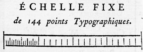
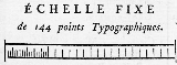
(Fournier’s printed scale of his point system, from Manuel Typographique, Barbou, Paris 1764, enlarged)
However, the basic idea of the point system – to generate different type sizes by multiplying a single minimum unit calculated by dividing a base measurement unit such as one French Royal inch – was not Didot’s invention, but Fournier’s.
Actually, Sebastien Truchet (1657–1729) had invented a similar type sizing system before Fournier implemented his point system. Truchet’s system was applied to the types of the Imprimerie Royale, the romains du roi. It is thought that Fournier knew about Truchet’s scheme that was based on the standard French Royal inch and a very fine unit of 1⁄204 ligne.
For further information on Truchet’s system, refer to James Mosley’s “The New Type Bodies of the Imprimerie Royale”, pp. 400–408, Vol. 3, The Manuel Typographique of Pierre-Simon Fournier le jeune, Darmstadt 1995. and Jacques André's “Truchet & Types” http://jacques-andre.fr/faqtypo/truchet/truchet1E.html.
In Fournier’s system, an approximate French Royal inch (pouce) is divided by 12 to calculate 1 ligne, which is then divided by 6 to get 1 point. Didot just made the base unit (one French Royal inch) identical to the standard value defined by the government.
In Didot’s point system:
Both in Didot’s and Fournier’s systems, some point sizes have traditional names such as Cicero (before introduction of point systems, type sizes were called by names such as Cicero, Pica, Ruby, Long Primer, etc.).
The Didot point system has been widely used in European countries. An abbreviation for it that these countries use is "dd", employing an old method for indicating plurals. Hence "12dd" means twelve didot points.
In Britain and the U.S.A., many proposals for type size standardization had been made by the end of 19th century (such as Bruce Typefoundry’s mathematical system that was based on a precise geometric progression). However, no nation-wide standard was created until the American Point System was decided in 1886.
The American Point System was proposed by taylor porter of Marder Luse & Company
in Chicago in the 1870s, and his point system used the same method of size division as Fournier’s; viz. dividing 1 inch by 6 to get 1 pica, and dividing it again by 12 to get 1 point. However, the American Point System standardized finally in 1886 is different from Hawks’ original idea in that 1 pica is not precisely equal to 1⁄6 inch
(neither the Imperial inch nor the U.S. inch), as the United States Type Founders’ Association defined the standard pica to be the Johnson Pica which had been adopted and used by Mackellar, Smiths and Jordan type foundry (MS&J), Philadelphia. As MS&J was very influential in those days, many other type foundries were using the Johnson Pica.
Regarding the background of the adoption of the Johnson Pica, Mr. Richard L. Hopkins, author of Origin of The American Point System says: “The major issue then was the expense involved in re-tooling literally hundreds of molds in each foundry to make them all conform to the new system. If they could avoid just a few sizes being altered, it would save hundreds of thousands of dollars. That is why the MS&J (Johnson) pica was adopted.”
Also, MS&J defined that 83 Picas are equal to 35 centimeters. The choice of the metric
unit for the prototype was because at the time the Imperial and US inches differed in size slightly, and neither country could legally specify a unit of the other.
The Johnson Pica was named after Lawrence Johnson
who had succeeded Binny & Ronaldson
in 1833. Binny & Ronaldson was one of the oldest type foundries in the United States, established in Philadelphia in 1796. Binny & Ronaldson had bought the type founding equipment of Benjamin Franklin’s (1706–1790) type foundry established in 1786 and run by his grandson Benjamin Franklin Bache (1769–1798). The equipment is thought to be that which Benjamin Franklin purchased from Pierre Simon Fournier when he visited France for diplomatic purposes (1776–1785).
The official standard approved by the Fifteenth Meeting of the Type Founders Association of the United States in 1886 was this Johnson pica: It equals 0.166 inch exactly one. Therefore the two other – very close – definitions: 1200 / 7227 inch and 350/83 mm are both unofficial.
In the American point system:
The American point system has been used in the USA, Britain and many other countries including Japan.
Today, digital printing and display devices and page layout software use a unit that is different from these traditional typographic units. On many digital printing systems (desk-top publishing systems in particular), the following equations are applicable (with exceptions).
You can see that Fournier’s original method of division is restored in today’s digital typography.
Comparing a piece of type in didots for Continental European countries – 12 dd, say – to a piece of type for an English-speaking country – 12 pt – shows that the main body of a character is actually about the same size. The difference is that the languages of the former often need extra space going atop the capital letters for accent marks (e.g. Ñ, Â, Ö, É), but English doesn't need this.
During the age of the French Revolution or Napoleonic Empire, the French established a typographic unit of 0.4 mm, but except for the government's print shops, this did not catch on.
In 1973, the didot was restandardized in the EU as 0.375 (= 3⁄8) mm. Care must be taken because the name of the unit is often left unmodified. The Germans, however, use the terms Fournier-Punkt and Didot-Punkt for the earlier ones, and Typografischer Punkt for this metric one.
Typography
Typography is the art and technique of arranging type in order to make language visible. The arrangement of type involves the selection of typefaces, point size, line length, leading , adjusting the spaces between groups of letters and adjusting the space between pairs of letters...
or typesetting
Typesetting
Typesetting is the composition of text by means of types.Typesetting requires the prior process of designing a font and storing it in some manner...
. The traditional units are different from common metric
Si
Si, si, or SI may refer to :- Measurement, mathematics and science :* International System of Units , the modern international standard version of the metric system...
units, as they were established earlier. Even though these units are all very small, across a line of print they add up quickly. Confusions such as resetting text originally in type of one unit in type of another will result in words moving from one line to the next, resulting in all sorts of typesetting errors (viz. rivers of white, widows and orphans, disrupted tables, and misplaced captions).
Development
In Europe, the Didot point system was created by François-Ambroise DidotDidot
Didot is the name of a family of French printers, punch-cutters and publishers. Through its achievements and advancements in printing, publishing and typography, the family has lent its name to typographic measurements developed by François-Ambroise Didot and the Didot typeface developed by Firmin...
(1730–1804) in c. 1783. Didot’s system was based on Pierre Simon Fournier
Pierre Simon Fournier
Pierre Simon Fournier was a French mid-18th century punch-cutter, typefounder and typographic theoretician. He was both a collector and originator of types”. Fournier's contributions to printing were his creation of initials and ornaments, his design of letters, and his standardization of type...
's (1712–1768), but Didot modified Fournier’s by adjusting the base unit precisely to a French Royal inch (pouce), as Fournier’s unit was based on a less common foot.
(Fournier’s printed scale of his point system, from Manuel Typographique, Barbou, Paris 1764, enlarged)
However, the basic idea of the point system – to generate different type sizes by multiplying a single minimum unit calculated by dividing a base measurement unit such as one French Royal inch – was not Didot’s invention, but Fournier’s.
Actually, Sebastien Truchet (1657–1729) had invented a similar type sizing system before Fournier implemented his point system. Truchet’s system was applied to the types of the Imprimerie Royale, the romains du roi. It is thought that Fournier knew about Truchet’s scheme that was based on the standard French Royal inch and a very fine unit of 1⁄204 ligne.
Ligne
The ligne is a unit of length that was in use prior to the French adoption of the metric system in the late 18th century, and is still used by French and Swiss wristwatch makers to measure the size of a watch movement.- Watchmakers' use :There are 12 lignes to one French inch...
For further information on Truchet’s system, refer to James Mosley’s “The New Type Bodies of the Imprimerie Royale”, pp. 400–408, Vol. 3, The Manuel Typographique of Pierre-Simon Fournier le jeune, Darmstadt 1995. and Jacques André's “Truchet & Types” http://jacques-andre.fr/faqtypo/truchet/truchet1E.html.
In Fournier’s system, an approximate French Royal inch (pouce) is divided by 12 to calculate 1 ligne, which is then divided by 6 to get 1 point. Didot just made the base unit (one French Royal inch) identical to the standard value defined by the government.
In Didot’s point system:
- 1 pointPoint (typography)In typography, a point is the smallest unit of measure, being a subdivision of the larger pica. It is commonly abbreviated as pt. The point has long been the usual unit for measuring font size and leading and other minute items on a printed page....
= 1⁄6 ligne = 1⁄72 French Royal inch = 15 625⁄41 559 mm ≤ 0.375 971 510 4 mm, however in practice mostly: 0.376 000 mm, i.e. + 0.0076 %.
Both in Didot’s and Fournier’s systems, some point sizes have traditional names such as Cicero (before introduction of point systems, type sizes were called by names such as Cicero, Pica, Ruby, Long Primer, etc.).
- 1 cicero = 12 Didot points = 1⁄6 French Royal inch = 62 500⁄13 853 mm ≤ 4.511 658 124 6 mm, also in practice mostly: 4.512 000 mm, item: + 0.0076 %.
The Didot point system has been widely used in European countries. An abbreviation for it that these countries use is "dd", employing an old method for indicating plurals. Hence "12dd" means twelve didot points.
In Britain and the U.S.A., many proposals for type size standardization had been made by the end of 19th century (such as Bruce Typefoundry’s mathematical system that was based on a precise geometric progression). However, no nation-wide standard was created until the American Point System was decided in 1886.
The American Point System was proposed by taylor porter of Marder Luse & Company
Marder, Luse, & Co.
Marder, Luse, & Co. was founded in 1855 as the Chicago Type Foundry and Printer's Warehouse by C. G. Sheffield as branch of Elihu White's New York foundry, Farmer, Little & Co.. This was the first type foundry to operate in Chicago...
in Chicago in the 1870s, and his point system used the same method of size division as Fournier’s; viz. dividing 1 inch by 6 to get 1 pica, and dividing it again by 12 to get 1 point. However, the American Point System standardized finally in 1886 is different from Hawks’ original idea in that 1 pica is not precisely equal to 1⁄6 inch
Inch
An inch is the name of a unit of length in a number of different systems, including Imperial units, and United States customary units. There are 36 inches in a yard and 12 inches in a foot...
(neither the Imperial inch nor the U.S. inch), as the United States Type Founders’ Association defined the standard pica to be the Johnson Pica which had been adopted and used by Mackellar, Smiths and Jordan type foundry (MS&J), Philadelphia. As MS&J was very influential in those days, many other type foundries were using the Johnson Pica.
Regarding the background of the adoption of the Johnson Pica, Mr. Richard L. Hopkins, author of Origin of The American Point System says: “The major issue then was the expense involved in re-tooling literally hundreds of molds in each foundry to make them all conform to the new system. If they could avoid just a few sizes being altered, it would save hundreds of thousands of dollars. That is why the MS&J (Johnson) pica was adopted.”
Also, MS&J defined that 83 Picas are equal to 35 centimeters. The choice of the metric
Metric system
The metric system is an international decimalised system of measurement. France was first to adopt a metric system, in 1799, and a metric system is now the official system of measurement, used in almost every country in the world...
unit for the prototype was because at the time the Imperial and US inches differed in size slightly, and neither country could legally specify a unit of the other.
The Johnson Pica was named after Lawrence Johnson
Lawrence Johnson (type-founder)
Lawrence Johnson , was born and educated in England. After an early apprenticeship in the printing industry, he emigrated to the United States of America in his youth, and became an eminent stereotyper and type-founder in Philadelphia and one of the most extensive and successful type-founders in...
who had succeeded Binny & Ronaldson
Binny & Ronaldson
Binny & Ronaldson established the first permanent type foundry in the United States. Founded in Philadelphia in 1796 by the Scots Archibald Binny and James Ronaldson....
in 1833. Binny & Ronaldson was one of the oldest type foundries in the United States, established in Philadelphia in 1796. Binny & Ronaldson had bought the type founding equipment of Benjamin Franklin’s (1706–1790) type foundry established in 1786 and run by his grandson Benjamin Franklin Bache (1769–1798). The equipment is thought to be that which Benjamin Franklin purchased from Pierre Simon Fournier when he visited France for diplomatic purposes (1776–1785).
The official standard approved by the Fifteenth Meeting of the Type Founders Association of the United States in 1886 was this Johnson pica: It equals 0.166 inch exactly one. Therefore the two other – very close – definitions: 1200 / 7227 inch and 350/83 mm are both unofficial.
In the American point system:
- 1 pica = exactly 0.1660 inchInchAn inch is the name of a unit of length in a number of different systems, including Imperial units, and United States customary units. There are 36 inches in a yard and 12 inches in a foot...
(versus 0.1666 = 1/ 6 inch for the DTP-pica) = 4.216 400 mm. - 1 point = 1/ 12 traditional pica = exactly 0.013 83 inch = 0.351 36 mm.
The American point system has been used in the USA, Britain and many other countries including Japan.
Today, digital printing and display devices and page layout software use a unit that is different from these traditional typographic units. On many digital printing systems (desk-top publishing systems in particular), the following equations are applicable (with exceptions).
- 1 pica = 1/ 6 inch (British/American inch of today) = 4.233 mm.
- 1 point = 1/ 12 pica = 1⁄72 inch = 127⁄360 mm = 0.3527 mm.
You can see that Fournier’s original method of division is restored in today’s digital typography.
Comparing a piece of type in didots for Continental European countries – 12 dd, say – to a piece of type for an English-speaking country – 12 pt – shows that the main body of a character is actually about the same size. The difference is that the languages of the former often need extra space going atop the capital letters for accent marks (e.g. Ñ, Â, Ö, É), but English doesn't need this.
Metric units
The traditional typographic units are based either on non-metric units, or on odd multiples (such as 35⁄83) of a metric unit. There are no specifically metric units for this particular purpose, although there is a DIN standard sometimes used in German publishing, which measures type sizes in multiples of 0.25 mm, and proponents of the metrication of typography generally recommend the use of the millimetre for typographical measurements, rather than the development of new specifically typographical metric units. The Japanese already do this for their own characters (using the kyu, which is q in romanized Japanese and is also 0.25 mm), and have metric-sized type for European languages as well. One advantage of the q is that it reintroduces the proportional integer division of 3mm (12q) by 6 & 4.During the age of the French Revolution or Napoleonic Empire, the French established a typographic unit of 0.4 mm, but except for the government's print shops, this did not catch on.
In 1973, the didot was restandardized in the EU as 0.375 (= 3⁄8) mm. Care must be taken because the name of the unit is often left unmodified. The Germans, however, use the terms Fournier-Punkt and Didot-Punkt for the earlier ones, and Typografischer Punkt for this metric one.
See also
- PointPoint (typography)In typography, a point is the smallest unit of measure, being a subdivision of the larger pica. It is commonly abbreviated as pt. The point has long been the usual unit for measuring font size and leading and other minute items on a printed page....
- EmEm (typography)An em is a unit of measurement in the field of typography, equal to the currently specified point size.The name of em is related to M. Originally the unit was derived from the width of the capital "M" in the given typeface....
- EnEn (typography)An en is a typographic unit, half of the width of an em. By definition, it is equivalent to half of the height of the font . As its name suggests, it is also traditionally the width of a lowercase letter "n"....
- TypographyTypographyTypography is the art and technique of arranging type in order to make language visible. The arrangement of type involves the selection of typefaces, point size, line length, leading , adjusting the spaces between groups of letters and adjusting the space between pairs of letters...
Select bibliography
- Boag, Andrew. “Typographic measurement: a chronology”, Typography papers, no. 1, 1996, The Department of Typography and Graphic Communication, The University of Reading, Reading 1996.
- Bruce’s Son & Company, Specimen of Printing Types, incl. Theo. L. DeVinne’s “The Invention of Printing”, New York 1878.
- Carter, Harry. Fournier on Typefounding, The Soncino Press, London 1930.
- Fournier, Pierre Simon, The Manuel Typographique of Pierre-Simon Fournier le jeune, Vols. I–III, Ed. by James Mosley, Darmstadt 1995.
- Fournier, Pierre Simon. Modèles des Caractères de l’Imprimerie, including James Mosley’s introduction, Eugrammia Press, London 1965.
- Fournier, Pierre Simon. Manuel Typographique, Vols. I & II, Fournier & Barbou, Paris 1764–1766.
- Hansard, T. C. Typographia,, Baldwin, Cradock, and Joy, London 1825.
- Hopkins, Richard L. Origin of The American Point System, Hill & Dale Private Press, Terra Alta 1976.
- Hutt, Allen. Fournier, the complete typographer, Rowman and Littlefield, Totowa, NJ 1972.
- Johnson, John. Typographia, Longman, Hurst, Rees, Orme, Brown & Green, London 1824.
- Jones, Thomas Roy, Printing in America, The Newcomen Society of England, American Branch, New York 1948,
- MacKellar Smiths & Jordan. One Hundred Years, Philadelphia 1896.
- Mosley, James. “French Academicians and Modern Typography: Designing New Types in the 1690s”, Typography papers, no. 2, 1997, The Department of Typography and Graphic Communication, The University of Reading, Reading 1997.
- Moxon, Joseph. Mechanick Exercises On The Whole Art Of Printing, Oxford University Press, London 1958.
- Ovink, G. Willem. “From Fournier to metric, and from lead to film”, QuaerendoQuaerendoQuaerendo is an academic journal devoted to manuscripts and printed books, especially in the Low Countries. It publishes scholarly articles dealing with codicology, palaeography and various aspects of the history of books from around 1500 until the present....
, Volume IX 2 & 4, Theatrum Orbis Terrarum Ltd., Amsterdam 1979. - Smith, John. The Printer’s Grammar, L. Wayland, London 1787.
- Yamamoto, Taro. pt – Type Sizing Units Converter, http://www.kt.rim.or.jp/~tyamamot/pt.htm Tokyo 2001.