

Shewhart individuals control chart
Encyclopedia
{m}
| meanlimits =
| meanstatistic = xi
}}
In statistical quality control
, the individual/moving-range chart is a type of control chart
used to monitor variables data from a business
or industrial process for which it is impractical to use rational subgroups.
The chart is necessary in the following situations:
The "chart" actually consists of a pair of charts: one, the individuals chart, displays the individual measured values; the other, the moving range chart, displays the difference from one point to the next. As with other control charts, these two charts enable the user to monitor a process for shifts in the process that alter the mean or variance of the measured statistic.
However, because of the width of the control limits and the use of the charts to diagnose the existence of special causes, individuals charts are reasonably robust to deviations from the above assumptions. This is demonstrated by Wheeler using real-world data, and for a number of highly non-normal probability distributions.
 , and its predecessor,
  , is calculated as
  . For
. For  individual values, there are
  ranges.
Next, the arithmetic mean of these values is calculated as
If the data are normally distributed with standard deviation then the expected value of
  is
is 
 .
.
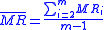
The value 3.267 is taken from the sample size-specific anti-biasing constant for , as given in most textbooks on statistical process control (see, for example, Montgomery).
 .
.
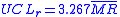
Next, the upper control limit (UCL) and lower control limit (LCL) for the individual values (or upper and lower natural process limits) are calculated by adding or subtracting 2.66 times the average moving range to the process average:

The value 2.66 is obtained by dividing 3 by the sample size-specific anti-biasing constant for , as given in most textbooks on statistical process control (see, for example, Montgomery).
On a separate graph, the calculated ranges are plotted. A line is added for the average value, and second line is plotted for the range upper control limit .
so runs or cycles can show up on the moving average chart that do not indicate real problems in the underlying process.
In some cases, it may be advisable to use the median of the moving range rather than its average, as when the calculated range data contains a few large values that may inflate the estimate of the population's dispersion.
Departures in normality in the process output significantly reduce the effectiveness of the charts to the point where it may require control limits to be set based on percentiles of the empirically-determined distribution of the process output.
Many software packages will, given the individuals data, perform all of the needed calculations and plot the results. Care should be taken to ensure that the control limits are correctly calculated, per the above and standard texts on SPC. In some cases, the software's default settings may produce incorrect results; in others, user modifications to the settings could result in incorrect results. Sample data and results are presented by Wheeler for the explicit purpose of testing SPC software. Performing such software validation is generally a good idea with any SPC software.
| meanlimits =
| meanstatistic = xi
}}
In statistical quality control
Statistical process control
Statistical process control is the application of statistical methods to the monitoring and control of a process to ensure that it operates at its full potential to produce conforming product. Under SPC, a process behaves predictably to produce as much conforming product as possible with the least...
, the individual/moving-range chart is a type of control chart
Control chart
Control charts, also known as Shewhart charts or process-behaviour charts, in statistical process control are tools used to determine whether or not a manufacturing or business process is in a state of statistical control.- Overview :...
used to monitor variables data from a business
Business process
A business process or business method is a collection of related, structured activities or tasks that produce a specific service or product for a particular customer or customers...
or industrial process for which it is impractical to use rational subgroups.
The chart is necessary in the following situations:
- Where automation allows inspection of each unit, so rational subgrouping has no benefit.
- Where production is slow so that waiting for enough samples to make a rational subgroup unacceptably delays monitoring
- For processes that produce homogeneous batches (e.g., chemical) where repeat measurements vary primarily because of measurementMeasuring instrumentIn the physical sciences, quality assurance, and engineering, measurement is the activity of obtaining and comparing physical quantities of real-world objects and events. Established standard objects and events are used as units, and the process of measurement gives a number relating the item...
error
The "chart" actually consists of a pair of charts: one, the individuals chart, displays the individual measured values; the other, the moving range chart, displays the difference from one point to the next. As with other control charts, these two charts enable the user to monitor a process for shifts in the process that alter the mean or variance of the measured statistic.
Interpretation
As with other control charts, the individuals and moving range charts consist of points plotted with the control limits, or natural process limits. These limits are the voice of the process, and define what the process will deliver without fundamental changes to the process. Points outside of these control limits are signals indicating that the process is not operating as consistently as possible; that some assignable cause has resulted in a change in the process. Similarly, runs of points on one side of the average line should also be interpreted as a signal of some change in the process. When such signals exist, action should be taken to identify and eliminate them. When no such signals are present, no changes to the process control variables (i.e. "tampering") are necessary or desirable.Assumptions
The normal distribution is assumed in the calculation of control limits. As with other control charts, deviations from the following criteria will increase the likelihood of falsely detecting signals:- The quality characteristic to be monitored is adequately modeled by a normally-distributed random variableRandom variableIn probability and statistics, a random variable or stochastic variable is, roughly speaking, a variable whose value results from a measurement on some type of random process. Formally, it is a function from a probability space, typically to the real numbers, which is measurable functionmeasurable...
; - The parameters μ and σ for the random variable are the same for each unit and each unit is independent of its predecessors or successors;
- The inspection procedure is same for each sample and is carried out consistently from sample to sample.
However, because of the width of the control limits and the use of the charts to diagnose the existence of special causes, individuals charts are reasonably robust to deviations from the above assumptions. This is demonstrated by Wheeler using real-world data, and for a number of highly non-normal probability distributions.
Calculation of moving range
The difference between data point,, and its predecessor, , is calculated as . For individual values, there are ranges.Next, the arithmetic mean of these values is calculated as
If the data are normally distributed with standard deviation
then the expected value of is Calculation of moving range control limit
The upper control limit for the range (or upper range limit) is calculated by multiplying the average of the moving range by 3.267:.The value 3.267 is taken from the sample size-specific anti-biasing constant for , as given in most textbooks on statistical process control (see, for example, Montgomery).
Calculation of individuals control limits
First, the average of the individual values is calculated:.Next, the upper control limit (UCL) and lower control limit (LCL) for the individual values (or upper and lower natural process limits) are calculated by adding or subtracting 2.66 times the average moving range to the process average:
The value 2.66 is obtained by dividing 3 by the sample size-specific anti-biasing constant for , as given in most textbooks on statistical process control (see, for example, Montgomery).
Creation of graphs
Once the averages and limits are calculated, all of the individuals data are plotted serially, in the order in which they were recorded. To this plot is added a line at the average value, and lines at the and values.On a separate graph, the calculated ranges are plotted. A line is added for the average value, and second line is plotted for the range upper control limit .
Analysis
The resulting plots are analyzed as for other control charts, using the rules that are deemed appropriate for the process and the desired level of control. At the least, any points above either upper control limits or below the lower control limit are marked and considered a signal of changes in the underlying process that are worth further investigation.Potential pitfalls
The moving ranges involved are serially correlatedAutocorrelation
Autocorrelation is the cross-correlation of a signal with itself. Informally, it is the similarity between observations as a function of the time separation between them...
so runs or cycles can show up on the moving average chart that do not indicate real problems in the underlying process.
In some cases, it may be advisable to use the median of the moving range rather than its average, as when the calculated range data contains a few large values that may inflate the estimate of the population's dispersion.
Departures in normality in the process output significantly reduce the effectiveness of the charts to the point where it may require control limits to be set based on percentiles of the empirically-determined distribution of the process output.
Many software packages will, given the individuals data, perform all of the needed calculations and plot the results. Care should be taken to ensure that the control limits are correctly calculated, per the above and standard texts on SPC. In some cases, the software's default settings may produce incorrect results; in others, user modifications to the settings could result in incorrect results. Sample data and results are presented by Wheeler for the explicit purpose of testing SPC software. Performing such software validation is generally a good idea with any SPC software.
See also
 and R chart
 and s chart