
Benton Sans
Encyclopedia
Benton Sans is a digital typeface family begun by Tobias Frere-Jones
in 1995, and expanded by Cyrus Highsmith of Font Bureau
. It was a reworked version of Benton Gothic developed for various corporate customers, under Frere-Jones's guidance. In developing the typeface, Frere-Jones studied drawings of Morris Fuller Benton's
1908 typeface News Gothic
at the Smithsonian Institution
. The typeface began as a proprietary type, initially titled MSL Gothic, for Martha Stewart Living
magazine and the website for Martha Stewart Living Omnimedia
. As Benton Gothic, there are 7 weights from Thin to Black and only 2 widths.
When working for retail version of the font, the family was harmonized and given the new name called Benton Sans. In 2002-2003, Cyrus Highsmith added additional widths, weights, and italics to the typeface family, and the face was released for public use under the name Benton Sans. The extra weight and widths also served as optically-corrected replacements for Franklin Gothic
, Alternate Gothic, Lightline Gothic.
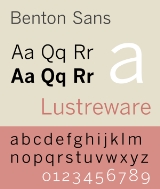
Like News Gothic, Benton Sans follows the neo-grotesque model. Distinct characters are the two-story lowercase a, the two-story lowercase g, and a blunt terminus at the apex of the lowercase t. The tail of the uppercase Q is distinct for being located completely outside the bowl. The character set is compact, and descenders are shallow. The typeface differs from other realist sans-serifs in its organic shapes and subtle transitions of stroke width, all contributing to a less severe, humanist tone of voice. Benton Sans has a wider, less compact character set than News Gothic. The typeface includes text figures
(old style figures) providing a refinement not available in News Gothic.
Benton Sans font family originally consists of 26 fonts in 8 weights, and 4 widths for all but Extra Light and Thin families, which only include the widest width. In 2008-12-18, The Font Bureal Inc. announced the expansion of the font family. The expanded family has 128 fonts in 8 weights, and 4 widths for all weights, with complementary italic and small caps.
Tobias Frere-Jones
Tobias Frere-Jones is a prolific type designer who works in New York City with fellow type designer Jonathan Hoefler at Hoefler & Frere-Jones, a type foundry in lower Manhattan...
in 1995, and expanded by Cyrus Highsmith of Font Bureau
Font Bureau
The Font Bureau, Inc. or Font Bureau is a digital type foundry based in Boston, Massachusetts, United States. The foundry is one of the leading designers of typefaces, specializing in type designs for magazine and newspaper publishers....
. It was a reworked version of Benton Gothic developed for various corporate customers, under Frere-Jones's guidance. In developing the typeface, Frere-Jones studied drawings of Morris Fuller Benton's
Morris Fuller Benton
Morris Fuller Benton was an influential American typeface designer who headed the design department of the American Type Founders , for which he was the chief type designer from 1900 to 1937...
1908 typeface News Gothic
News Gothic
News Gothic is a realist sans-serif typeface designed by Morris Fuller Benton, and released by the American Type Founders in 1908. The typeface was originally drawn in two lighter weights, a medium text weight using the title News Gothic, and a closely related light weight marketed under the name...
at the Smithsonian Institution
Smithsonian Institution
The Smithsonian Institution is an educational and research institute and associated museum complex, administered and funded by the government of the United States and by funds from its endowment, contributions, and profits from its retail operations, concessions, licensing activities, and magazines...
. The typeface began as a proprietary type, initially titled MSL Gothic, for Martha Stewart Living
Martha Stewart Living
Martha Stewart Living is a magazine and a television show featuring entertaining and home decorating guru Martha Stewart. Both the magazine and the television program focus on the domestic arts. Martha Stewart Living began as a quarterly magazine in 1990, published by Time Inc..and is currently...
magazine and the website for Martha Stewart Living Omnimedia
Martha Stewart Living Omnimedia
Martha Stewart Living Omnimedia Inc. is a diversified media and merchandising company founded by Martha Stewart. It is organized into four business segments: Publishing, Internet, Broadcasting media platforms and Merchandising product lines....
. As Benton Gothic, there are 7 weights from Thin to Black and only 2 widths.
When working for retail version of the font, the family was harmonized and given the new name called Benton Sans. In 2002-2003, Cyrus Highsmith added additional widths, weights, and italics to the typeface family, and the face was released for public use under the name Benton Sans. The extra weight and widths also served as optically-corrected replacements for Franklin Gothic
Franklin Gothic
Franklin Gothic and its related faces are realist sans-serif typefaces originated by Morris Fuller Benton in 1902. “Gothic” is an increasingly archaic term meaning sans-serif. Franklin Gothic has been used in many advertisements and headlines in newspapers. The typeface continues to maintain a...
, Alternate Gothic, Lightline Gothic.
Like News Gothic, Benton Sans follows the neo-grotesque model. Distinct characters are the two-story lowercase a, the two-story lowercase g, and a blunt terminus at the apex of the lowercase t. The tail of the uppercase Q is distinct for being located completely outside the bowl. The character set is compact, and descenders are shallow. The typeface differs from other realist sans-serifs in its organic shapes and subtle transitions of stroke width, all contributing to a less severe, humanist tone of voice. Benton Sans has a wider, less compact character set than News Gothic. The typeface includes text figures
Text figures
Text figures are numerals typeset with varying heights in a fashion that resembles a typical line of running text, hence the name...
(old style figures) providing a refinement not available in News Gothic.
Benton Sans font family originally consists of 26 fonts in 8 weights, and 4 widths for all but Extra Light and Thin families, which only include the widest width. In 2008-12-18, The Font Bureal Inc. announced the expansion of the font family. The expanded family has 128 fonts in 8 weights, and 4 widths for all weights, with complementary italic and small caps.