
Rank abundance curve
Encyclopedia
A rank abundance curve or "Whittaker plot" is a chart used by ecologists to display relative species abundance
, a component of biodiversity
. It can also be used to visualize species richness
and species evenness
. It overcomes the shortcomings of biodiversity indices
that cannot display the relative role different variables played in their calculation.
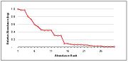 The curve is a 2D chart with relative abundance on the Y-axis and the abundance rank on the X-axis.
Relative species abundance
Relative species abundance is a component of biodiversity and refers to how common or rare a species is relative to other species in a defined location or community...
, a component of biodiversity
Biodiversity
Biodiversity is the degree of variation of life forms within a given ecosystem, biome, or an entire planet. Biodiversity is a measure of the health of ecosystems. Biodiversity is in part a function of climate. In terrestrial habitats, tropical regions are typically rich whereas polar regions...
. It can also be used to visualize species richness
Species richness
Species richness is the number of different species in a given area. It is represented in equation form as S.Species richness is the fundamental unit in which to assess the homogeneity of an environment. Typically, species richness is used in conservation studies to determine the sensitivity of...
and species evenness
Species evenness
Species evenness refers to how close in numbers each species in an environment are. Mathematically it is defined as a diversity index, a measure of biodiversity which quantifies how equal the community is numerically. So if there are 40 foxes, and 1000 dogs, the community is not very even. But if...
. It overcomes the shortcomings of biodiversity indices
Diversity index
A diversity index is a statistic which is intended to measure the local members of a set consisting of various types of objects. Diversity indices can be used in many fields of study to assess the diversity of any population in which each member belongs to a unique group, type or species...
that cannot display the relative role different variables played in their calculation.
- X-axis: The abundance rank. The most abundant species is given rank 1, the second most abundant is 2 and so on.
- Y-axis: The relative abundance. Usually measured on a log scale, this is a measure of a species abundance (e.g., the number of individuals) relative to the abundance of other species.