
Architype van der Leck
Encyclopedia
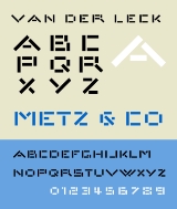
Architype van der Leck is a geometric sans-serif typeface based upon the 1941 typeface designed by Bart van der Leck
for the Dutch magazine Flax, a journal of the De Stijl
art movement.
The face is geometrically constructed, and based upon an earlier stencil lettering alphabet van der Leck designed in the early 1930s for use in branding and advertising Jo de Leeuw's presigious Dutch department stores Metz & Co. The face shares structural similarities with Theo Van Doesburg's
1919 geometric alphabet
, and anticipates later typographic explorations of geometric reductionism of Wim Crouwel's
1967 New Alphabet
and early digital faces like Zuzana Licko's
faces Lo-Res and Emperor 8. The Architype van der Leck typeface is part of a collection of several revivals of early twentieth century typographic experimentation designed by Freda Sack and David Quay of The Foundry.
Bart van der Leck
Bart van der Leck was a Dutch painter, designer, and ceramacist. With Theo van Doesburg and Piet Mondrian he founded the De Stijl art movement....
for the Dutch magazine Flax, a journal of the De Stijl
De Stijl
De Stijl , propagating the group's theories. Next to van Doesburg, the group's principal members were the painters Piet Mondrian , Vilmos Huszár , and Bart van der Leck , and the architects Gerrit Rietveld , Robert van 't Hoff , and J.J.P. Oud...
art movement.
The face is geometrically constructed, and based upon an earlier stencil lettering alphabet van der Leck designed in the early 1930s for use in branding and advertising Jo de Leeuw's presigious Dutch department stores Metz & Co. The face shares structural similarities with Theo Van Doesburg's
Theo van Doesburg
Theo van Doesburg was a Dutch artist, practicing in painting, writing, poetry and architecture. He is best known as the founder and leader of De Stijl.-Biography:-Early life:...
1919 geometric alphabet
Architype Van Doesburg
Architype Van Doesburg is a geometric sans-serif typeface based upon a 1919 alphabet designed by Theo Van Doesburg, a cofounder of the De Stijl art movement. The digital revival shown at right was produced by Freda Sack and David Quay of The Foundry....
, and anticipates later typographic explorations of geometric reductionism of Wim Crouwel's
Wim Crouwel
Willem Hendrik Crouwel is a Dutch graphic designer and typographer.Between 1947 and 1949 he studied Fine Arts at Academie Minerva in Groningen, The Netherlands...
1967 New Alphabet
New Alphabet (typeface)
-History:New Alphabet is a personal, experimental project of Crouwel. The typeface embraces the limitations of the cathode ray tube technology used by early data display screens and phototypesetting equipment and thus only contains horizontal and vertical strokes. Conventional typefaces can suffer...
and early digital faces like Zuzana Licko's
Zuzana Licko
Zuzana Licko is a typeface designer based out of the San Francisco Bay Area who was born in Bratislava, Czechoslovakia.Licko came to the United States when she was a child along with her family...
faces Lo-Res and Emperor 8. The Architype van der Leck typeface is part of a collection of several revivals of early twentieth century typographic experimentation designed by Freda Sack and David Quay of The Foundry.